我正在使用 Android 设计库版本 25.1.1 中的 TextInputLayout。使用以下代码:
<android.support.design.widget.TextInputLayout
  xmlns:android="http://schemas.android.com/apk/res/android"
  xmlns:local="http://schemas.android.com/apk/res-auto"
  android:layout_width="wrap_content"
  android:layout_height="wrap_content"
  local:passwordToggleEnabled="true"
  local:hintEnabled="false">
  <android.support.design.widget.TextInputEditText
    android:id="@+id/confirmationEditText"
    android:singleLine="true" />
</android.support.design.widget.TextInputLayout>
但是当按下密码切换图标时,它的波纹效果绘制在 TextInput 的背景之上:
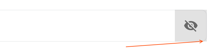
如何为 passwordToggle 设置圆角半径?我可以引用它现有的背景并用所需的属性“包装”它吗(如何找到切换使用的默认可绘制对象的路径)?
最佳答案
只需使用 Material Components 库和标准 TextInputLayout组件。
添加 app:boxCornerRadiusBottomEnd="xxdp", app:boxCornerRadiusTopEnd="xxdp", < strong>app:boxCornerRadiusBottomStart="xxdp", app:boxCornerRadiusTopStart="xxdp" 属性。
类似于:
    <com.google.android.material.textfield.TextInputLayout
        style="@style/Widget.MaterialComponents.TextInputLayout.OutlinedBox"
        app:endIconMode="password_toggle"
        app:boxCornerRadiusBottomEnd="8dp"
        app:boxCornerRadiusTopEnd="8dp"
        app:boxCornerRadiusBottomStart="8dp"
        app:boxCornerRadiusTopStart="8dp"
        ...>
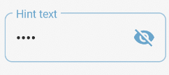
否则,您可以定义自定义样式并使用 shapeAppearanceOverlay 属性:
    <com.google.android.material.textfield.TextInputLayout
        android:id="@+id/custom_end_icon"
        android:hint="Hint text"
        style="@style/OutlinedRoundedBox"
        ...>
与:
  <style name="OutlinedRoundedBox" parent="Widget.MaterialComponents.TextInputLayout.OutlinedBox">
    <item name="shapeAppearanceOverlay">@style/ShapeAppearanceOverlay.MyApp.TextInputLayout.Rounded</item>
  </style>

  <style name="ShapeAppearanceOverlay.MyApp.TextInputLayout.Rounded" parent="">
    <item name="cornerFamily">rounded</item>
    <item name="cornerSize">8dp</item>
  </style>
关于android - TextInputLayout 密码圆角切换,我们在Stack Overflow上找到一个类似的问题: https://stackoverflow.com/questions/42621909/