我正在使用 matplotlib,我想要一个箭头在我的“轴图例”旁边。但我不知道如何。
在示例中,我想要的箭头用红色绘制。
谢谢
最佳答案
您可以使用 TeX renderer 生成示例图中所示的箭头。内置到 matplotlib 中。着色是整个字符串的一个选项,尽管在单个文本字符串中生成多种颜色需要更多工作。
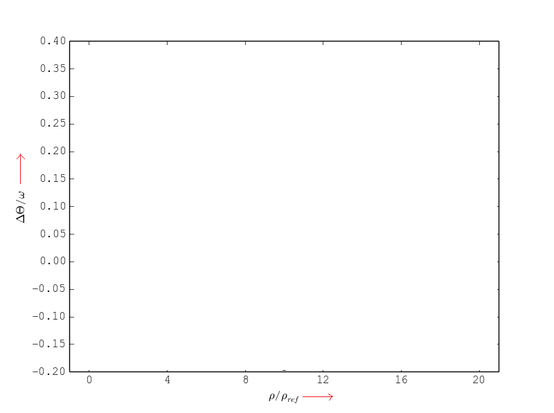
这将为您提供数学符号和箭头(我在每个轴标签上显示了不同的长度):
import matplotlib.pyplot as plt
fig, ax = plt.subplots(1, 1)
# plot your data here ...

ax.set_xlabel(r'$\rho/\rho_{ref}\;\rightarrow$', color='red')
ax.set_ylabel(r'$\Delta \Theta / \omega \longrightarrow$')

plt.show()
plt.close()
导致:

Partial coloring of text in matplotlib处理多色字符串,以及 this solution描述如何使用具有多种颜色的 latex 引擎。但是,它不会为交互式图形中呈现的内容着色,因此这取决于您的确切需求。
More arrows in LaTeX math mode
关于python-2.7 - 我怎样才能在我的 x/ylabel 附近放一个箭头?,我们在Stack Overflow上找到一个类似的问题: https://stackoverflow.com/questions/22246094/