我正在使用 Bootstrap 构建一个网站,为了一致地设置字段样式和指示输入单位,我大量使用了输入组。有一次,我不得不在表格中创建一个编辑表单。我考虑将它放在 Bootstrap 网格中,但由于数据本身实际上是表格形式,我将其设为 table :
<table class="table table-hover">
            <thead>
                <tr>
                    <th style="width: 32px;"></th>
                    <th style="width: 7em;"></th>
                    <th style="width: 7em;">Test 1</th>
                    <th style="width: 10em;">Test 2 </th>
                    <th style="width: auto;">Test 3</th>
                    <th style="width: 10em;">Test 4
                    <th style="width: auto;">Test 5 </th>
                    <th style="width: auto;">Alternative 1</th>
                    <th style="width: 10em;">Probability 1</th>
                    <th style="width: auto;">Alternative 2</th>
                    <th style="width: 10em;">Probability 2</th>
                </tr>
            </thead>
            <tbody>
            <tr  class="shareEditor">
                <input  type="hidden" value="1" />
                <input  type="hidden" value="7" />
                <input  type="hidden" value="0" />
                <input  type="hidden" value="2" />
                <td>
                </td>
                 <td>Test</td>
                <td>
            <input  type="hidden" value="True" /><input  type="hidden" value="1" />Test</td>
    <td><input class="form-control"  type="text" value="" /></td>
    <td>
        <div class="input-group">
            <input value="0" class="form-control" />
            <div class="input-group-append input-group-text">m3</div>
        </div>
    </td>
    <!-- Omitted -->
    </tr>
  </tbody>
  </table>
这在 Chrome 和 Edge 中工作正常:输入字段缩放其宽度,以便表格适合页面的宽度,只要可行。看到这个JSBin:http://jsbin.com/sozetategi并尝试调整屏幕大小。
但是 Internet Explorer 11 想要使输入组具有固定宽度,将列推到超出
th 中指定的宽度。并使表格水平滚动,即使在我的 1900x1200 分辨率屏幕上最大化。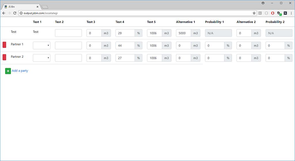

这是 Bootstrap 中的错误,还是我需要一些替代类来使 IE 在这里正常运行?
最佳答案
.input-group > .custom-file, .input-group > .custom-select, .input-group > .form-control {
width: 1vw;
max-width: 1vw;
}
在你的样式表中添加上面的 CSS 并自定义
vw .这会起作用。
关于bootstrap-4 - Bootstrap 输入组在 Internet Explorer 中将表格推到屏幕宽度之外,我们在Stack Overflow上找到一个类似的问题: https://stackoverflow.com/questions/51444428/