目标是构建类似的东西
http://rentheatmap.com/sanfrancisco.html
我得到了带有 ggmap 的 map ,并且能够在它上面绘制点。
library('ggmap')
map <- get_map(location=c(lon=20.46667, lat=44.81667), zoom=12, maptype='roadmap', color='bw')
positions <- data.frame(lon=rnorm(100, mean=20.46667, sd=0.05), lat=rnorm(100, mean=44.81667, sd=0.05), price=rnorm(10, mean=1000, sd=300))
ggmap(map) + geom_point(data=positions, mapping=aes(lon, lat)) + stat_density2d(data=positions, mapping=aes(x=lon, y=lat, fill=..level..), geom="polygon", alpha=0.3)

这是一个基于密度的不错的图像。有人知道如何制作看起来相同的东西,但使用 position$property 来构建轮廓和比例吗?
我仔细查看了 stackoverflow.com 并没有找到解决方案。
编辑 1
positions$price_cuts <- cut(positions$price, breaks=5)
ggmap(map) + stat_density2d(data=positions, mapping=aes(x=lon, y=lat, fill=price_cuts), alpha=0.3, geom="polygon")
产生五个独立的 stat_密度图:

编辑 2(来自 hrbrmstr)
positions <- data.frame(lon=rnorm(10000, mean=20.46667, sd=0.05), lat=rnorm(10000, mean=44.81667, sd=0.05), price=rnorm(10, mean=1000, sd=300))
positions$price <- ((20.46667 - positions$lon) ^ 2 + (44.81667 - positions$lat) ^ 2) ^ 0.5 * 10000
positions <- data.frame(lon=rnorm(10000, mean=20.46667, sd=0.05), lat=rnorm(10000, mean=44.81667, sd=0.05))
positions$price <- ((20.46667 - positions$lon) ^ 2 + (44.81667 - positions$lat) ^ 2) ^ 0.5 * 10000
positions <- subset(positions, price < 1000)
positions$price_cuts <- cut(positions$price, breaks=5)
ggmap(map) + geom_hex(data=positions, aes(fill=price_cuts), alpha=0.3)
结果是:

它也在真实数据上创建了一个不错的图片。这是迄今为止最好的结果。欢迎提出更多建议。
编辑 3:
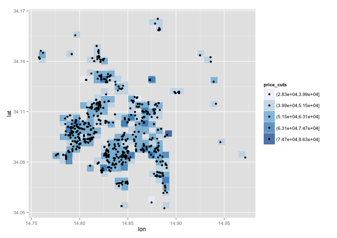
以下是上述方法的测试数据和结果:
https://raw.githubusercontent.com/artem-fedosov/share/master/kernel_smoothing_ggplot.csv
test<-read.csv('test.csv')
ggplot(data=test, aes(lon, lat, fill=price_cuts)) + stat_bin2d(, alpha=0.7) + geom_point() + scale_fill_brewer(palette="Blues")
我相信应该有一些方法可以使用密度内核以外的方法来计算适当的多边形。似乎该功能应该在开箱即用的 ggplot 中,但我找不到它。
编辑 4:
感谢您花费时间和精力为这个看似不太复杂的问题找出正确的解决方案。我投票赞成你的两个答案,作为对目标的一个很好的近似。
我揭示了一个问题:带圆圈的数据过于人为,并且这些方法在读取世界数据时表现不佳。
保罗的方法给了我情节:

它似乎捕获了很酷的数据模式。
jazzurro 的认可给了我这个情节:

它也得到了图案。然而,这两个图似乎都没有默认的 stat_density2d 图那么漂亮。我仍然会等待几天,看看是否会出现其他解决方案。如果没有,我会将赏金奖励给 jazzurro,因为这将是我将坚持使用的结果。
有一个开放的 python + google_maps 版本的所需代码。可能有人会在这里找到灵感:
https://github.com/jeffkaufman/apartment_prices
最佳答案
这是我的方法。 geom_hex方法很好。当它出来时,我真的很喜欢它。我仍然。由于您提出了更多要求,因此我尝试了以下操作。我认为我的结果类似于 stat_density2d .但是,我可以避免你遇到的问题。我基本上自己创建了一个 shapefile 并绘制了多边形。我按价格区域 (price_cuts) 对数据进行子集化,并从边缘到区域中心绘制多边形。这种方法在EDIT 1和2的路线上。如果你想绘制一个大面积的 map ,我认为距离你的最终目标还有一段距离。但是,我希望这能让你继续前进。最后,我要感谢几个 SO 用户,他们提出了与多边形相关的好问题。没有他们,我无法想出这个答案。
library(dplyr)
library(data.table)
library(ggmap)
library(sp)
library(rgdal)
library(ggplot2)
library(RColorBrewer)


### Data set by the OP
positions <- data.frame(lon=rnorm(10000, mean=20.46667, sd=0.05), lat=rnorm(10000,    mean=44.81667, sd=0.05))

positions$price <- ((20.46667 - positions$lon) ^ 2 + (44.81667 - positions$lat) ^ 2) ^ 0.5 * 10000

positions <- subset(positions, price < 1000)


### Data arrangement
positions$price_cuts <- cut(positions$price, breaks=5)
positions$price_cuts <- as.character(as.integer(positions$price_cuts))

### Create a copy for now
ana <- positions

### Step 1: Get a map
map <- get_map(location=c(lon=20.46667, lat=44.81667), zoom=11, maptype='roadmap', color='bw')

### Step 2: I need to create SpatialPolygonDataFrame using the original data.
### http://stackoverflow.com/questions/25606512/create-polygon-from-points-and-save-as-shapefile
### For each price zone, create a polygon, SpatialPolygonDataFrame, and convert it
### it data.frame for ggplot.

cats <- list()

for(i in unique(ana$price_cuts)){

foo <- ana %>%
       filter(price_cuts == i) %>%
       select(lon, lat)

    ch <- chull(foo)
    coords <- foo[c(ch, ch[1]), ]

    sp_poly <- SpatialPolygons(list(Polygons(list(Polygon(coords)), ID=1)))

    bob <- fortify(sp_poly)

    bob$area <- i

    cats[[i]] <- bob
}

cathy <- as.data.frame(rbindlist(cats))


### Step 3: Draw a map
### The key thing may be that you subet data for each price_cuts and draw
### polygons from outer side given the following link.
### This link was great. This is exactly what I was thinking.
### http://stackoverflow.com/questions/21748852/choropleth-map-in-ggplot-with-polygons-that-have-holes

ggmap(map) +
    geom_polygon(aes(x = long, y = lat, group = group, fill = as.numeric(area)),
                 alpha = .3,
                 data = subset(cathy, area == 5))+
    geom_polygon(aes(x = long, y = lat, group = group, fill = as.numeric(area)),
                 alpha = .3,
                 data =subset(cathy, area == 4))+
    geom_polygon(aes(x = long, y = lat, group = group, fill = as.numeric(area)),
                 alpha = .3,
                 data = subset(cathy, area == 3))+
    geom_polygon(aes(x = long, y = lat, group = group, fill = as.numeric(area)),
                 alpha = .3,
                 data = subset(cathy, area == 2))+
    geom_polygon(aes(x = long, y = lat, group = group, fill = as.numeric(area)),
                 alpha= .3,
                 data = subset(cathy, area == 1))+
    geom_point(data = ana, aes(x = lon, y = lat), size = 0.3) +
    scale_fill_gradientn(colours = brewer.pal(5,"Spectral")) +
    scale_x_continuous(limits = c(20.35, 20.58), expand = c(0, 0)) +
    scale_y_continuous(limits = c(44.71, 44.93), expand = c(0, 0)) +
    guides(fill = guide_legend(title = "Property price zone"))

关于r - 带有 ggmap 的 R 中自定义属性的地理热图,我们在Stack Overflow上找到一个类似的问题: https://stackoverflow.com/questions/25847188/