我正在尝试使用 ggplot2 绘制条形图如下:
library(ggplot2)
ggplot(mtcars, aes(factor(carb))) +
  geom_bar() +
  coord_flip()
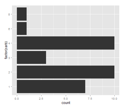
x 轴是一个连续变量,而 y 轴是一个分类变量(
factor )。我想在每个条形后面添加替代阴影区域以区分 y 轴上的因素。我知道我可以使用
geom_rect()为了这。如何计算区域的 y 轴限制,当它是 factor 时?矩形的 x 轴限制为 -Inf至 Inf .我正在寻找与此图像类似的东西,但用于条形图而不是箱形图。
最佳答案
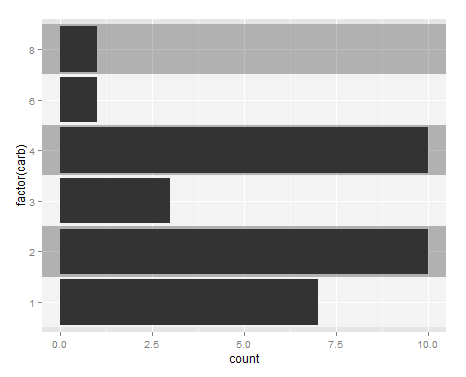
解决了
# Create data.frame with shading info
shading <- data.frame(min = seq(from = 0.5, to = max(as.numeric(as.factor(mtcars$carb))), by = 1),
           max = seq(from = 1.5, to = max(as.numeric(as.factor(mtcars$carb))) + 0.5, by = 1),
           col = c(0,1))

# Plot
ggplot() +
  geom_bar(data = mtcars, mapping = aes(factor(carb))) +
  geom_rect(data = shading,
            aes(xmin = min, xmax = max, ymin = -Inf, ymax = Inf,
                fill = factor(col), alpha = 0.1)) +
  scale_fill_manual(values = c("white", "gray53")) +
  geom_bar(data = mtcars, mapping = aes(factor(carb))) +
  coord_flip() +
  guides(fill = FALSE, alpha = FALSE)
关于r - 在 ggplot2 的条形图中为分类变量添加阴影替代区域,我们在Stack Overflow上找到一个类似的问题: https://stackoverflow.com/questions/31592484/