我正在尝试使用 ggplot2 在 R 中创建一个图显示地下水保护标准的水平线以及显示 build 项目开始的垂直线。我已经为测量单位以及 sample 是否低于检测限创建了图例。所有这些图例都按我想要的方式显示,但是水平线和垂直线的图例覆盖在其他图例上。我尝试了多种使用 show_guide 的方法,对数据使用不同的数据框,以及 override.aes = list()但似乎没有得到预期的结果。
下面是数据的样子:
head(dmr_data)
    location_id sample_date analysis_result lt_measure default_unit           param_name
154        MWH1  2004-06-02          0.0150                    mg/L   Arsenic, dissolved
155        MWH1  2004-06-02          0.0850                    mg/L    Barium, dissolved
156        MWH1  2004-06-02          0.0002          <         mg/L Beryllium, dissolved
158        MWH1  2004-06-02          0.0005          <         mg/L   Cadmium, dissolved
162        MWH1  2004-06-02          0.0020          <         mg/L      Lead, dissolved
164        MWH1  2004-06-02          0.0010          <         mg/L  Thallium, dissolved
    DMR_limit  GWPS non_detect
154   0.01000 0.010          0
155   0.17340 2.000          0
156   0.00005 0.004          1
158   0.00100 0.005          1
162   0.00500 0.015          1
164   0.00060 0.002          1
这是情节的代码:
 combo_plot <- function(df){

  limits = df

  shaded_dates <- data.frame(xmin = c(as.POSIXct("2004-06-01", format = "%Y-%m-%d"),
                                  as.POSIXct("2013-10-01", format = "%Y-%m-%d")),
                         xmax = c(as.POSIXct("2013-10-01", format="%Y-%m-%d"),
                                  max(df$sample_date)),
                         ymin = c(-Inf, -Inf),
                         ymax = c(Inf, Inf),
                         years = c("background", "compliance"))

  ggplot(data = df, aes(x = sample_date, y = analysis_result)) +
    geom_point(data = df, aes(colour = default_unit, shape = factor(non_detect)), size = 4) +
    geom_line(data = df, aes(colour = default_unit), size = 1) +
    facet_wrap(~ param_name, scale="free") +

# Plot legends, labels, and titles
ggtitle(paste("Time Series Plots for Monitoring Well",
              df$location_id[1], "\n", sep=" ")) +
ylab("Analysis Result") +
xlab("Sample Date") + scale_x_datetime(labels = date_format("%Y")) +
theme(axis.text.x = element_text(angle = 90)) +
theme(plot.margin = unit(c(0.75, 0.75, 0.75, 0.75), "in")) +
theme_bw() +
scale_colour_discrete(name = "Units", guide = "legend") +

# add rectangles for date ranges
geom_rect(data = shaded_dates, aes(xmin = xmin, ymin = ymin, xmax = xmax,
                                   ymax = ymax, fill = years),
          alpha = 0.2, inherit.aes = FALSE) +
scale_fill_manual(values=c("blue","green")) +

# add horizontal lines for EPA MCL and Upper Prediction Limit
geom_hline(data = limits, aes(yintercept = GWPS, linetype = "GWPS"), show_guide = TRUE, size = 0.75) +
geom_hline(data = limits, aes(yintercept = DMR_limit, linetype = "DMR Limit"), show_guide = TRUE, size = 0.75) +

# create custom legend using guide
theme(axis.title.x = element_text(size = 15, vjust=-.2)) +
theme(axis.title.y = element_text(size = 15, vjust=0.3)) +
guides(colour = guide_legend("Units"), fill = guide_legend("Dates"),
       linetype = guide_legend("Limits")) +
scale_shape_manual(name = "Measure", labels = c("Non-Detect", "Detected"),
                   values = c("1" = 21, "0" = 4)) +

# add vertical line to show start of "East Pushout" construction
geom_vline(xintercept = as.numeric(as.POSIXct("2008-08-01", format="%Y-%m-%d")),
           linetype="dotted", show_guide = T)

}
然后我使用
plyr为所有井创建多面图d_ply(dmr_data, .(location_id), .progress = "text", failwith(NA, combo_plot), .print = TRUE)
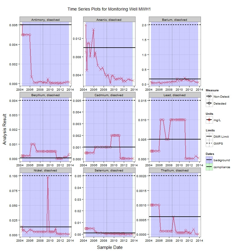
这是输出的样子。
任何帮助,将不胜感激!
最佳答案
您可以使用 override.aes = list(linetype = 0) 获得想要的效果在 guides() ,并为线型添加一个新比例(以排除图例中显示的垂直构造线)。
更换您的 hline()部分:
## add horizontal lines for EPA MCL and Upper Prediction Limit
geom_hline(data = limits, aes(yintercept = GWPS, linetype = "GWPS"), colour = "black", size = 0.75, show_guide = T) +
geom_hline(data = limits, aes(yintercept = DMR_limit, linetype = "DMR Limit"), size = 0.75, show_guide = T) +
scale_linetype_manual(name = "Limits", labels = c("GWPS", "DMR Limit"), values = c("GWPS" = 1, "DMR Limit" = 2)) +
更换您的
guides()符合:guides(colour = guide_legend(override.aes = list(linetype = 0 )),
fill = guide_legend(override.aes = list(linetype = 0 )),
shape = guide_legend(override.aes = list(linetype = 0 )),
linetype = guide_legend()) +
如果您确实希望在图例中显示垂直虚线,请将适当的参数添加到
geom_vline(aes())并到 scale_linetype_manual() .
关于r - 如何在ggplot2中将geom_vline()和geom_hline()图例与其他图例分开,我们在Stack Overflow上找到一个类似的问题: https://stackoverflow.com/questions/20528488/