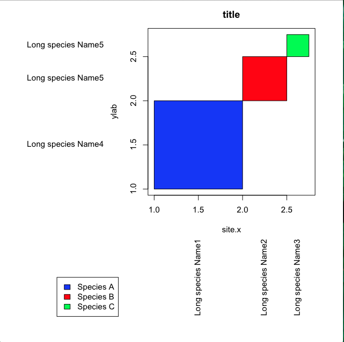
当我创建下面的图时,我在绘图区域和轴之间得到了不需要的空间(即蓝色框和 x 轴之间的空白区域。如何删除这个空间并使绘图区域与绘图轴齐平?谢谢。
xleft<-c(1,2,2.5)
xright<-c(2,2.5,2.75)
ybottom<-c(1,2,2.5)
ytop<-c(2,2.5,2.75)

par(mar = c(15,15,2.75,2.75) + 0.1)
plot(c(1,2.75),c(1,2.75),type="n",main="title",xlab="site.x",ylab="ylab")
rect(xleft,ybottom,xright,ytop,col=c("blue","red","green"))

#Label position along  axes
x.label.position<-(xleft+xright)/2
y.label.position<-(ybottom+ytop)/2

 #Labels
 x.label<-c("Long species Name1","Long species Name2","Long species Name3")
 y.label<-c("Long species Name4","Long species Name5","Long species Name5")

 text(par()$usr[1]-0.5,y.label.position,y.label,xpd=TRUE,adj=1)
 text(y=par()$usr[3]-0.5,x=x.label.position,x.label,xpd=TRUE,adj=1,srt=90)

 par(xpd=TRUE)
 legend(-0.1,0,legend=c("Species A","Species B","Species C"),fill=c("blue", "red", "green"))
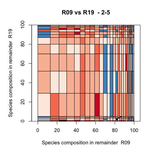
更新
我用我的实际数据尝试了来自 plannapus 的建议,但只能让 y 轴表现出来 在这段代码中是否还有其他一些正在向绘图区域的两侧添加空间?
quartz("colour.plot")
par(mar=c(15,15,4,2)+0.1)#sets margins of plotting area

#create the data plot
    plot(c(0,100), c(0,100), type = "n", main = paste(x,"vs",y," -",depth),xlab=paste("Species composition in remainder ",x),ylab=paste("Species composition in remainder ",y),asp=1,xaxs="i",yaxs="i")

#Add the rectangles
rect(mdf$xleft,mdf$ybottom,mdf$xright,mdf$ytop,col=mdf$colour)
产生
最佳答案
函数 plot 中有一个参数处理那个:xaxs (以及 yaxs 用于 y 轴)。
默认设置为 xaxs="r"这意味着每边都保留了轴值的 4%。将此设置为 0:xaxs="i" .见 xaxs ?par 中的部分想要查询更多的信息。
plot(c(1,2.75),c(1,2.75),type="n",main="title",xlab="site.x",ylab="ylab", xaxs="i", yaxs="i")
rect(xleft,ybottom,xright,ytop,col=c("blue","red","green"))
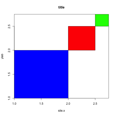
关于删除 r 中绘图区域周围的间距,我们在Stack Overflow上找到一个类似的问题: https://stackoverflow.com/questions/12300622/