我正在使用 library(choroplethr) 进行一些市场分析,我对制作 county_choropleth 以及将其覆盖在 ggmap 之上有一些疑问() 或在我的代码中使用 reference_map=TRUE 。我想做的是拿我的县等值线并放置州际公路/高速公路,并在其顶部绘制圆圈/半径。
我目前拥有的是:
library(choroplethr)
data <- Data.frame(County.FIPS = c(19153,19163,19153,19153,19153,19153,19153,19113,19007,19169), Score=c(812.6,769.5,757.9,757.2,722.6,712.4,69727,690.2,64539,642.5)
county <-aggregate(data$Score~data$County.FIPS,data=data,sum)
colnames(county) <- c("region", "value")
mp <- county_choropleth(county, state_zoom=c("iowa"), num_colors = 1) +
  theme(legend.position="none")+
  scale_fill_gradient2("Score",
                       high = "dark green",
                       low = "red",
                       na.value = "grey90",
                       breaks = pretty(county$value, n = 10),
                       label = scales::dollar_format())
...这给了我这个情节。 
从这里开始,我想做的是将爱荷华州的主要州际公路覆盖在我的 map 顶部,并创建一些半径圆来显示距某些城市的距离(以英里为单位)。希望它从这张 map 中获取元素,并理想地将它们合并到我的 choroplethr map 中,因为在我看来,它看起来比这个示例中干净得多:
我使用此代码检索第二张 map :
library(ggmap)
test<-get_map(location = c(lon=-93.57217,lat=41.67269), maptype="roadmap",source="google",zoom=7,scale="auto")
yup <- data.frame(lon=c(-93.57217,-95.87509), lat=c(41.67269,41.23238),score=c(1,1))
ggmap(test) + stat_density2d(aes(x = lon, y = lat, fill = score,alpha=score),
               size = 2, bins = 2, data = yup, geom = "polygon") +
  theme(legend.position="none")
在choroplethr库中使用reference_map=TRUE的主要问题是,当我将county_choropleth放在上面时,它会使标签、道路等变灰。例如,
那么,是否有一个简单的解决方法可以在 map 上包含道路和绘制圆圈,或者我是否需要放弃使用 choroplethr 并转向 ggmap、ggplot2 或其他东西?我还能够在其网站上找到道路的爱荷华州 DOT 形状文件,因此这是一个包含的选项,但我不知道如何具体要求它在绘图和读入 R 时仅使用主要州际公路/高速公路。
这是我对此问题的“理想”MS Paint 解决方案:
提前感谢您提供的所有帮助,如果您有任何需要回答的澄清问题才能提供帮助,请告诉我!
最佳答案
对于那些后来偶然发现这一点的人。通过将库更改为leaflet 和tigris,我能够实现我希望实现的目标。
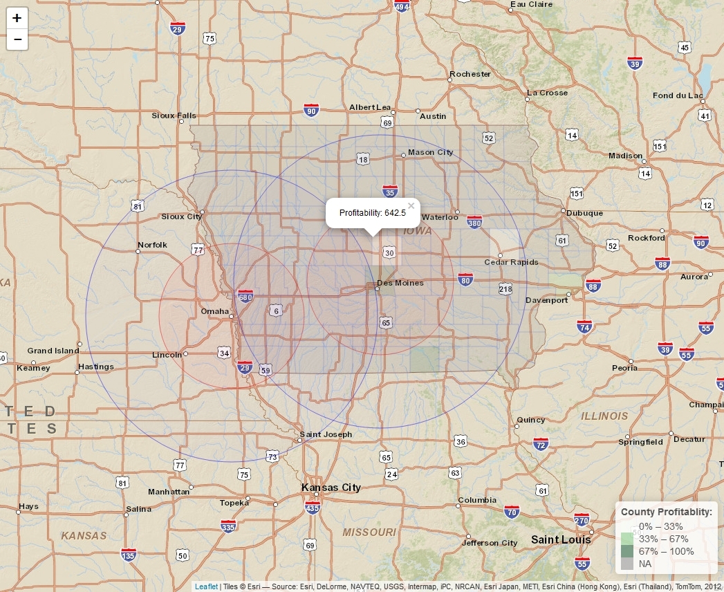
我计划进行最终调整以供个人使用,但这里是使用的代码:
library(tigris)
library(leaflet)

data <- data.frame(County.FIPS = c(19153,19163,19153,19153,19153,19153,19153,19113,19007,19169), Score=c(812.6,769.5,757.9,757.2,722.6,712.4,69727,690.2,64539,642.5))
county <-aggregate(data$Score~data$County.FIPS,data=data,sum)
colnames(county) <- c("GEOID", "Score")

IA_counties <- counties(state="IA", cb=TRUE, resolution ="20m")
IA_merged <- geo_join(IA_counties,county,"GEOID", "GEOID")
pal <- colorQuantile("Greens",NULL,n=3)
popup <- paste0("Profitability: ", as.character(IA_merged$Score))

yup2 <- data.frame(lon=c(-93.57217,-95.93779),lat=c(41.67269,41.25861),score=c(1,1))

leaflet() %>%
  addProviderTiles("Esri.WorldStreetMap") %>%
      addLegend(pal = pal,
      values = IA_merged$Score,
      position = "bottomright",
      title = "County Profitablity: ") %>%
  addCircles(lng=yup2$lon, lat=yup2$lat,weight=1,fillOpacity=0.05,color="red",
      radius = 96560) %>%
  addCircles(lng=yup2$lon, lat=yup2$lat,weight=1,fillOpacity=0.025,color="blue",
      radius = 193121) %>%
  addPolygons(data = IA_counties,
      fillColor = ~pal(IA_merged$Score),
      fillOpacity = 0.15,
      weight = 0.2,
      popup = popup)
关于choroplethr、ggmap 或 ggplot2 中的道路和半径圆,我们在Stack Overflow上找到一个类似的问题: https://stackoverflow.com/questions/34158366/