我需要使用线框将 z_i 形式的 3D 数据绘制为 (x_i, y_i) 的函数。我写了下面的代码:
import numpy as np
from matplotlib import pyplot as plt
from mpl_toolkits.mplot3d import axes3d
import scipy.interpolate as spint
## Data to plot
sim_data = np.array([[ 20, 1, 8],
[ 20, 2, 7],
[ 20, 4, 7],
[ 20, 6, 6],
[ 20, 10, 6],
[ 50, 0.4, 15],
[ 50, 0.8, 11],
[ 50, 1, 10],
[ 50, 2, 8],
[ 50, 4, 7],
[ 50, 6, 7],
[ 50, 10, 7],
[100, 0.4, 22],
[100, 0.8, 15],
[100, 1, 13],
[100, 2, 10],
[100, 4, 8],
[100, 6, 7],
[100, 10, 7]])
x = sim_data[:, 0]
y = sim_data[:, 1]
z = sim_data[:, 2]
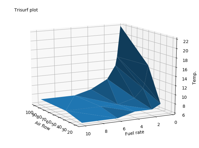
# Do trisurf plot
fig = plt.figure()
ax = fig.add_subplot(111, projection='3d')
ax.plot_trisurf(x, y, z)
ax.set_xlabel('Air flow')
ax.set_ylabel('Fuel rate')
ax.set_zlabel('Temp.')
ax.text2D(0.05, 0.95, "Trisurf plot", transform=ax.transAxes)
# Transform from vector to grid
X, Y = np.meshgrid(x, y)
xi = (X, Y)
Z = spint.griddata((x,y), z, xi)
# Do wireframe plot
fig = plt.figure()
ax = fig.add_subplot(111, projection='3d')
ax.plot_wireframe(X, Y, Z)
ax.set_xlabel('Air flow')
ax.set_ylabel('Fuel rate')
ax.set_zlabel('Temp.')
ax.text2D(0.05, 0.95, "Wireframe plot", transform=ax.transAxes)
# Do surface plot
fig = plt.figure()
ax = fig.add_subplot(111, projection='3d')
ax.plot_surface(X, Y, Z)
ax.set_xlabel('Air flow')
ax.set_ylabel('Fuel rate')
ax.set_zlabel('Temp.')
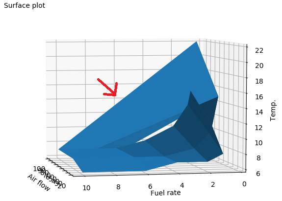
ax.text2D(0.05, 0.95, "Surface plot", transform=ax.transAxes)
但是我得到了一些烦人的额外电线(用红色箭头标记):

如何去掉这个箭头?顺便说一下,我在尝试曲面图时遇到了同样的问题:
我的目标是绘制一个类似于 trisurf 图(如下所示)的图,但具有线框可视化。
提前非常感谢。
最佳答案
线框有什么问题?
我不确定,但我认为问题出在你的数据上。它很小,如果你仔细观察,你会发现它看起来像一堆不同的线(观察)。看看这个情节:
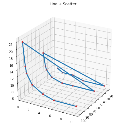
那边肯定有3条平行线。我想,这可能会导致与 plot_wireframe 以及上一张图像中的 plot 混淆。我看到 3 种可能的解决方案:
解决方案 1:使用 plot
好的,所以第一个解决方案是根本不使用plot_wireframe。让我们使用旧的plot来构建我们自己的电线。但首先,让我们将数据分成 3 行数据:
line1 = sim_data[0:5][::-1]  # NOTE: the first line is shorter
line2 = sim_data[5:12][::-1]
line3 = sim_data[12:][::-1]
将它们全部绘制出来!
# a helper function
def prepare_fig(fw=7, fh=7, view = (25, 30)):
    fig = plt.figure(figsize=(fw, fh))
    ax = fig.add_subplot(111, projection='3d')
    ax.view_init(view[0], view[-1])
    return ax

ax = prepare_fig()
ax.title.set_text('3 Lines')
for line in [line1, line2, line3]:
    x, y, z = line[:, 0], line[:, 1], line[:, 2]
    ax.plot(x, y, z, c='tab:blue', linewidth=3)

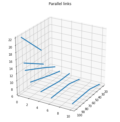
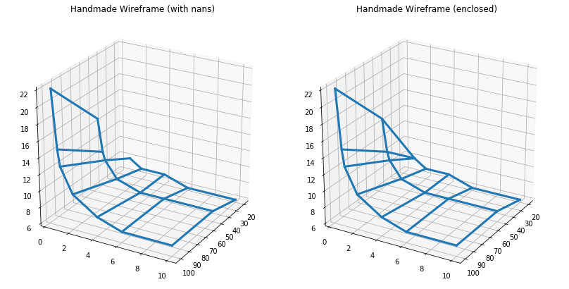
好的,我们修复了不需要的链接,现在让我们添加平行链接(线)来连接我们的主线:
ax = prepare_fig()
ax.title.set_text('Paralel links')
for i in range(len(line3)):
    x, y, z = [], [], []
    if i < len(line1):
        x.append(line1[:, 0][i])
        y.append(line1[:, 1][i])
        z.append(line1[:, 2][i])
    else:
        # line1 is shorter so we will put nan here (for now)
        x.append(np.nan)
        y.append(np.nan)
        z.append(np.nan)
    x.extend([line2[:, 0][i], line3[:, 0][i]])
    y.extend([line2[:, 1][i], line3[:, 1][i]])
    z.extend([line2[:, 2][i], line3[:, 2][i]])
    ax.plot(x, y, z, c='tab:blue', linewidth=3)
现在合而为一:
最终代码:
ax = prepare_fig()
ax.title.set_text('Handmade Wireframe (enclosed)')

line1 = sim_data[0:5][::-1]
line2 = sim_data[5:12][::-1]
line3 = sim_data[12:][::-1]

for line in [line1, line2, line3]:
    x, y, z = line[:, 0], line[:, 1], line[:, 2]
    ax.plot(x, y, z, c='tab:blue', linewidth=3)

for i in range(len(line3)):
    x, y, z = [], [], []
    if i < len(line1):
        x.append(line1[:, 0][i])
        y.append(line1[:, 1][i])
        z.append(line1[:, 2][i])
    else:
        # put nan because line1 is shorter
#         x.append(np.nan)
#         y.append(np.nan)
#         z.append(np.nan)
        # Or you can just replace it with last line1 value
        x.append(line1[:, 0][-1])
        y.append(line1[:, 1][-1])
        z.append(line1[:, 2][-1])
    x.extend([line2[:, 0][i], line3[:, 0][i]])
    y.extend([line2[:, 1][i], line3[:, 1][i]])
    z.extend([line2[:, 2][i], line3[:, 2][i]])
    ax.plot(x, y, z, c='tab:blue', linewidth=3)
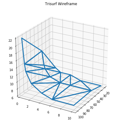
解决方案 2:使用 plot_trisurf。
如果三角形可以接受,另一个解决方案是通过一些调整将 trisurf 转换为类似线框的形状。
x = sim_data[:, 0]
y = sim_data[:, 1]
z = sim_data[:, 2]

ax = prepare_fig()
ax.title.set_text('Trisurf Wireframe')

trisurf = ax.plot_trisurf(x, y, z)
# turn of surface color, you can control it with alpha here:
trisurf.set_facecolor(mpl.colors.colorConverter.to_rgba('w', alpha=0.0))
# setting wire color
trisurf.set_edgecolor('tab:blue')
#setting wire width
trisurf.set_linewidth(3)
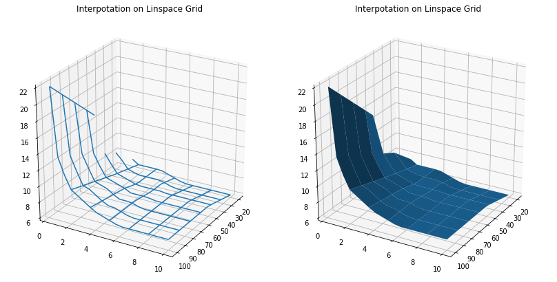
解决方案 3:使用 plot_wireframe 并在 linspace 网格处进行插值。
如果您想要美观光滑的表面,这可能是解决方案。你只需要生成新的网格,然后使用scipy的spint.griddata来执行插值:
import scipy.interpolate as spint

x = sim_data[:, 0]
y = sim_data[:, 1]
z = sim_data[:, 2]

# generate new linear grid based on previous
X, Y = np.meshgrid(np.linspace(min(x), max(x), len(x)),
                   np.linspace(min(y), max(y), len(y)))

Z = spint.griddata((x, y), z, (X, Y))

ax = prepare_fig()
ax.title.set_text('Interpotation on Linspace Grid')

# ax.plot_wireframe(X, Y, Z, rstride=3, cstride=3)
ax.plot_surface(X, Y, Z, rstride=3, cstride=3)
你会得到这样的东西:
关于python - matplotlib 中 3D 线框可视化的问题,我们在Stack Overflow上找到一个类似的问题: https://stackoverflow.com/questions/60067384/