出于可重复性的原因,出于可重复性的原因,我在[此处][1]共享该数据集。
这就是我正在做的事情 - 从第 2 列开始,我正在读取当前行并将其与前一行的值进行比较。如果更大的话,我会继续比较。如果当前值小于前一行的值,我想将当前值(较小)除以前一个值(较大)。相应地,代码如下:
这给出了以下图。
sns.distplot(quotient, hist=False, label=protname)
从图中我们可以看出
- 当
quotient_times小于 3 时,Data-V 的商为 0.8;如果quotient_times为 大于3。
我想要对这些值进行标准化,以便我们的第二个绘图值的 y 轴 介于 0 和 1 之间。我们如何在 Python 中做到这一点?
最佳答案
前言
据我了解,seaborn distplot 默认情况下会进行 kde 估计。 如果您想要一个标准化的 distplot 图,可能是因为您假设该图的 Y 应该在 [0;1] 之间。如果是这样,则堆栈溢出问题引发了 kde estimators showing values above 1 的问题。 .
引用one answer :
a continous pdf (pdf=probability density function) never says the value to be less than 1, with the pdf for continous random variable, function p(x) is not the probability. you can refer for continuous random variables and their distrubutions
引用importanceofbeingernest的第一条评论:
The integral over a pdf is 1. There is no contradiction to be seen here.
据我所知,它是 CDF (Cumulative Density Function)其值应该在 [0; 1].
注意:所有可能的连续拟合函数为 on SciPy site and available in the package scipy.stats
也许还可以看看probability mass functions ?
<小时/>如果您确实想要对相同的图形进行归一化,那么您应该收集绘制函数(选项 1)或函数定义(选项 2)的实际数据点,然后自行对它们进行归一化并再次绘制它们。
选项 1

import numpy as np
import matplotlib
import matplotlib.pyplot as plt
import seaborn as sns
import sys

print('System versions          : {}'.format(sys.version))
print('System versions          : {}'.format(sys.version_info))
print('Numpy versqion           : {}'.format(np.__version__))
print('matplotlib.pyplot version: {}'.format(matplotlib.__version__))
print('seaborn version          : {}'.format(sns.__version__))

protocols = {}

types = {"data_v": "data_v.csv"}

for protname, fname in types.items():
    col_time,col_window = np.loadtxt(fname,delimiter=',').T
    trailing_window = col_window[:-1] # "past" values at a given index
    leading_window  = col_window[1:]  # "current values at a given index
    decreasing_inds = np.where(leading_window < trailing_window)[0]
    quotient = leading_window[decreasing_inds]/trailing_window[decreasing_inds]
    quotient_times = col_time[decreasing_inds]

    protocols[protname] = {
        "col_time": col_time,
        "col_window": col_window,
        "quotient_times": quotient_times,
        "quotient": quotient,
    }

    fig, (ax1, ax2) = plt.subplots(1,2, sharey=False, sharex=False)
    g = sns.distplot(quotient, hist=True, label=protname, ax=ax1, rug=True)
    ax1.set_title('basic distplot (kde=True)')
    # get distplot line points
    line = g.get_lines()[0]
    xd = line.get_xdata()
    yd = line.get_ydata()
    # https://stackoverflow.com/questions/29661574/normalize-numpy-array-columns-in-python
    def normalize(x):
        return (x - x.min(0)) / x.ptp(0)
    #normalize points
    yd2 = normalize(yd)
    # plot them in another graph
    ax2.plot(xd, yd2)
    ax2.set_title('basic distplot (kde=True)\nwith normalized y plot values')

    plt.show()
选项 2
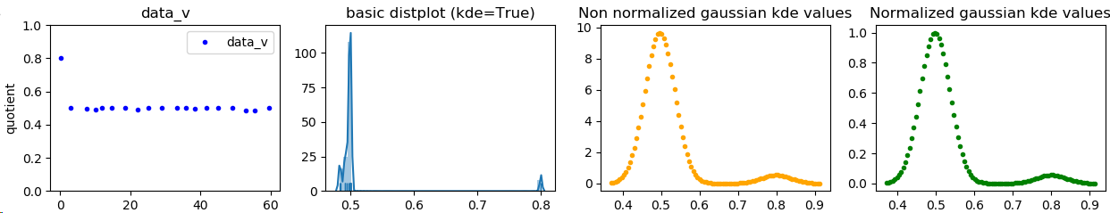
下面,我尝试执行 kde 并对获得的估计进行标准化。我不是统计专家,所以 kde 的使用可能在某种程度上是错误的(它与seaborn的不同,正如我们在屏幕截图中看到的那样,这是因为seaborn的工作方式比我好得多。它只是试图模仿kde 与 scipy 的拟合。我猜结果还不错)
屏幕截图:
代码:
import numpy as np
from scipy import stats
import matplotlib
import matplotlib.pyplot as plt
import seaborn as sns
import sys

print('System versions          : {}'.format(sys.version))
print('System versions          : {}'.format(sys.version_info))
print('Numpy versqion           : {}'.format(np.__version__))
print('matplotlib.pyplot version: {}'.format(matplotlib.__version__))
print('seaborn version          : {}'.format(sns.__version__))

protocols = {}

types = {"data_v": "data_v.csv"}

for protname, fname in types.items():
    col_time,col_window = np.loadtxt(fname,delimiter=',').T
    trailing_window = col_window[:-1] # "past" values at a given index
    leading_window  = col_window[1:]  # "current values at a given index
    decreasing_inds = np.where(leading_window < trailing_window)[0]
    quotient = leading_window[decreasing_inds]/trailing_window[decreasing_inds]
    quotient_times = col_time[decreasing_inds]

    protocols[protname] = {
        "col_time": col_time,
        "col_window": col_window,
        "quotient_times": quotient_times,
        "quotient": quotient,
    }

    fig, (ax1, ax2, ax3, ax4) = plt.subplots(1,4, sharey=False, sharex=False)
    diff=quotient_times
    ax1.plot(diff, quotient, ".", label=protname, color="blue")
    ax1.set_ylim(0, 1.0001)
    ax1.set_title(protname)
    ax1.set_xlabel("quotient_times")
    ax1.set_ylabel("quotient")
    ax1.legend()

    sns.distplot(quotient, hist=True, label=protname, ax=ax2, rug=True)
    ax2.set_title('basic distplot (kde=True)')

    # taken from seaborn's source code (utils.py and distributions.py)
    def seaborn_kde_support(data, bw, gridsize, cut, clip):
        if clip is None:
            clip = (-np.inf, np.inf)
        support_min = max(data.min() - bw * cut, clip[0])
        support_max = min(data.max() + bw * cut, clip[1])
        return np.linspace(support_min, support_max, gridsize)

    kde_estim = stats.gaussian_kde(quotient, bw_method='scott')

    # manual linearization of data
    #linearized = np.linspace(quotient.min(), quotient.max(), num=500)

    # or better: mimic seaborn's internal stuff
    bw = kde_estim.scotts_factor() * np.std(quotient)
    linearized = seaborn_kde_support(quotient, bw, 100, 3, None)

    # computes values of the estimated function on the estimated linearized inputs
    Z = kde_estim.evaluate(linearized)

    # https://stackoverflow.com/questions/29661574/normalize-numpy-array-columns-in-python
    def normalize(x):
        return (x - x.min(0)) / x.ptp(0)

    # normalize so it is between 0;1
    Z2 = normalize(Z)
    for name, func in {'min': np.min, 'max': np.max}.items():
        print('{}: source={}, normalized={}'.format(name, func(Z), func(Z2)))

    # plot is different from seaborns because not exact same method applied
    ax3.plot(linearized, Z, ".", label=protname, color="orange")
    ax3.set_title('Non linearized gaussian kde values')

    # manual kde result with Y axis avalues normalized (between 0;1)
    ax4.plot(linearized, Z2, ".", label=protname, color="green")
    ax4.set_title('Normalized gaussian kde values')

    plt.show()
输出:
System versions          : 3.7.2 (default, Feb 21 2019, 17:35:59) [MSC v.1915 64 bit (AMD64)]
System versions          : sys.version_info(major=3, minor=7, micro=2, releaselevel='final', serial=0)
Numpy versqion           : 1.16.2
matplotlib.pyplot version: 3.0.2
seaborn version          : 0.9.0
min: source=0.0021601491646143518, normalized=0.0
max: source=9.67319154426489, normalized=1.0
与评论相反,绘制:
[(x-min(quotient))/(max(quotient)-min(quotient)) for x in quotient]
不改变行为!它仅更改核密度估计的源数据。曲线形状将保持不变。
Quoting seaborn's distplot doc :
This function combines the matplotlib hist function (with automatic calculation of a good default bin size) with the seaborn kdeplot() and rugplot() functions. It can also fit scipy.stats distributions and plot the estimated PDF over the data.
默认情况下:
kde : bool, optional set to True Whether to plot a gaussian kernel density estimate.
它默认使用kde。引用seaborn的kde文档:
Fit and plot a univariate or bivariate kernel density estimate.
引用SCiPy gaussian kde method doc :
Representation of a kernel-density estimate using Gaussian kernels.
Kernel density estimation is a way to estimate the probability density function (PDF) of a random variable in a non-parametric way. gaussian_kde works for both uni-variate and multi-variate data. It includes automatic bandwidth determination. The estimation works best for a unimodal distribution; bimodal or multi-modal distributions tend to be oversmoothed.
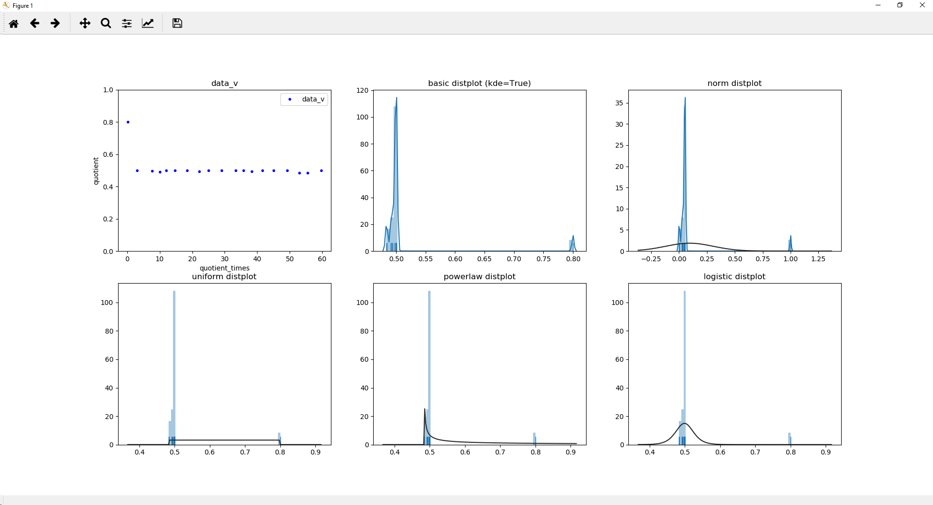
请注意,正如您自己提到的那样,我确实相信您的数据是双峰的。他们看起来也很离散。据我所知,离散分布函数可能无法像连续分布函数一样进行分析,并且拟合可能会很棘手。
这是一个包含各种法律的示例:
import numpy as np
from scipy.stats import uniform, powerlaw, logistic
import matplotlib
import matplotlib.pyplot as plt
import seaborn as sns
import sys

print('System versions          : {}'.format(sys.version))
print('System versions          : {}'.format(sys.version_info))
print('Numpy versqion           : {}'.format(np.__version__))
print('matplotlib.pyplot version: {}'.format(matplotlib.__version__))
print('seaborn version          : {}'.format(sns.__version__))

protocols = {}

types = {"data_v": "data_v.csv"}

for protname, fname in types.items():
    col_time,col_window = np.loadtxt(fname,delimiter=',').T
    trailing_window = col_window[:-1] # "past" values at a given index
    leading_window  = col_window[1:]  # "current values at a given index
    decreasing_inds = np.where(leading_window < trailing_window)[0]
    quotient = leading_window[decreasing_inds]/trailing_window[decreasing_inds]
    quotient_times = col_time[decreasing_inds]

    protocols[protname] = {
        "col_time": col_time,
        "col_window": col_window,
        "quotient_times": quotient_times,
        "quotient": quotient,
    }
    fig, [(ax1, ax2, ax3), (ax4, ax5, ax6)] = plt.subplots(2,3, sharey=False, sharex=False)
    diff=quotient_times
    ax1.plot(diff, quotient, ".", label=protname, color="blue")
    ax1.set_ylim(0, 1.0001)
    ax1.set_title(protname)
    ax1.set_xlabel("quotient_times")
    ax1.set_ylabel("quotient")
    ax1.legend()
    quotient2 = [(x-min(quotient))/(max(quotient)-min(quotient)) for x in quotient]
    print(quotient2)
    sns.distplot(quotient, hist=True, label=protname, ax=ax2, rug=True)
    ax2.set_title('basic distplot (kde=True)')
    sns.distplot(quotient2, hist=True, label=protname, ax=ax3, rug=True)
    ax3.set_title('logistic distplot')

    sns.distplot(quotient, hist=True, label=protname, ax=ax4, rug=True, kde=False, fit=uniform)
    ax4.set_title('uniform distplot')
    sns.distplot(quotient, hist=True, label=protname, ax=ax5, rug=True, kde=False, fit=powerlaw)
    ax5.set_title('powerlaw distplot')
    sns.distplot(quotient, hist=True, label=protname, ax=ax6, rug=True, kde=False, fit=logistic)
    ax6.set_title('logistic distplot')
    plt.show()
输出:
System versions          : 3.7.2 (default, Feb 21 2019, 17:35:59) [MSC v.1915 64 bit (AMD64)]
System versions          : sys.version_info(major=3, minor=7, micro=2, releaselevel='final', serial=0)
Numpy versqion           : 1.16.2
matplotlib.pyplot version: 3.0.2
seaborn version          : 0.9.0
[1.0, 0.05230125523012544, 0.0433775382360589, 0.024590765616971128, 0.05230125523012544, 0.05230125523012544, 0.05230125523012544, 0.02836946874603772, 0.05230125523012544, 0.05230125523012544, 0.05230125523012544, 0.05230125523012544, 0.03393500048652319, 0.05230125523012544, 0.05230125523012544, 0.05230125523012544, 0.0037013196009011043, 0.0, 0.05230125523012544]
屏幕截图:
关于python - 如何标准化seaborn distplot?,我们在Stack Overflow上找到一个类似的问题: https://stackoverflow.com/questions/55128462/