我想在seaborn包中为x和y数据数组指定一行fit的颜色。相反,我所能想到的就是如何更改内核密度函数的颜色和阴影。如何更改高斯拟合的颜色? IE。下面的线应该是红色和蓝色的。在函数中添加阴影(如 "shade":True 参数)也很棒。
import seaborn as sns
sns.distplot(x,kde_kws={"shade":True}, kde=False, fit=stats.gamma, hist=None, color="red", label="label 1");
sns.distplot(y,kde_kws={"shade":True}, kde=False, fit=stats.gamma, hist=None, color="blue", label="label 2");

最佳答案
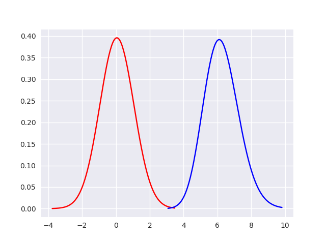
要更改拟合曲线的颜色,您需要设置fit_kws参数。但 fit_kws 不支持着色。您仍然可以通过几行额外的代码来遮蔽拟合曲线下方的区域,如下所示,但我认为这是您发布的另一个问题的答案。
import numpy as np
import seaborn as sns
import scipy.stats as stats
import matplotlib.pyplot as plt

sns.set()
np.random.seed(0)
x = np.random.randn(100)
y = np.random.normal(loc=6.0, scale=1, size=(50,))

ax = sns.distplot(x, fit_kws={"color":"red"}, kde=False,
        fit=stats.gamma, hist=None, label="label 1");
ax = sns.distplot(y, fit_kws={"color":"blue"}, kde=False,
        fit=stats.gamma, hist=None, label="label 2");

plt.show(block=False)
代码运行结果如下:
关于python - 更改seaborn分布线的颜色,我们在Stack Overflow上找到一个类似的问题: https://stackoverflow.com/questions/47644966/