所以我正在尝试制作一个如下所示的 Highcharts :
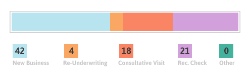
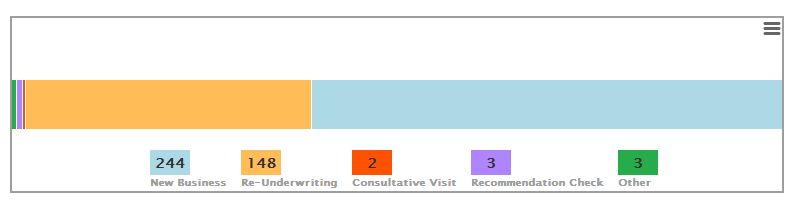
但我似乎无法让边框只包裹栏。这是我能得到的最接近的结果:
有人知道我该怎么做吗?这是我的选择:
highcharts({
chart: {
    backgroundColor: 'transparent',
    plotBorderColor: '#9E9E9E',
    plotBorderWidth: 2,
    height: 200,
    type: 'bar'
},
title: {
    text: null
},
credits: {
    enabled: false
},
yAxis: {
    title: {
        text: null
    },
    labels: {
        enabled: false
    },
    tickLength: 0,
    lineColor: 0,
    lineWidth: 0,
    gridLineWidth: 0
},
xAxis: {
    title: {
        text: null
    },
    labels: {
        enabled: false
    },
    tickLength: 0,
    lineColor: 0,
    lineWidth: 0
},
plotOptions: {
    bar: {
        borderColor: '#000000'
    }
},
legend: {
    // reversed: true,
    symbolHeight: 0,
    symbolWidth: 0,
    floating: true,
    useHTML: true,
    itemDistance: 10,
    y: -10,
    labelFormatter:
        function() {
            if (this.name === "HIDDEN")
            {
                return '';
            }
            return '<div class="insp360-widgetLegendItemContainer">' +
                    '<div class="insp360-widgetLegendNumber" style="background-color: ' + this.color + '">' + this.yData[0] + '</div>' +
                    '<div class="insp360-widgetLegendName">' + this.name + '</div>' +
                '</div>';
        }
},
plotOptions: {
    series: {
        stacking: 'percent',
        pointWidth: 50
    }
},
series: [
    {
        name: 'New Business',
        data: [chartData['New Business'] || 0],
        color: '#ADD8E6'
    },
    {
        name: 'Re-Underwriting',
        data: [chartData['Re-Underwriting'] || 0],
        color: '#FFBC57'
    },
    {
        name: 'Consultative Visit',
        data: [chartData['Consultative Visit'] || 0],
        color: '#FF5200'
    },
    {
        name: 'Recommendation Check',
        data: [chartData['Recommendation Check'] || 0],
        color: '#B084FF '
    },
    {
        name: 'Other',
        data: [chartData['Other'] || 0],
        color: '#27AC4C'
    }
];
});
最佳答案
有很多事情需要改变来影响这一点。
工作示例:
我更新了什么:
- 您已指定了两次plotOptions;合而为一以避免值(value)观冲突
- 从图表属性中删除了高度声明并移至 html 元素
- 设置图表边距以强制缩小绘图区域的大小,并为图例和导出菜单腾出空间
- 在 xAxis 上设置最小/最大加上 minPadding/maxPadding
- 从图例中删除了“ float ”
关于jquery - 绘图周围的 Highcharts 边框,我们在Stack Overflow上找到一个类似的问题: https://stackoverflow.com/questions/25532077/