我正在尝试在 Android 中为我的应用程序设置主题。然而,每个小部件本身都是一种难以忍受的痛苦:我必须搜索该特定小部件的主题,然后创建一个希望源自小部件使用的相同样式的样式。
当然,有关为特定小部件设置主题的答案并不总是包含有关基本样式的信息,仅包含特定颜色。
所以,与其接受鱼吃,你能教我钓鱼吗?
我如何解释这些 ObtainStyledAttributes()调用小部件构造函数并从中提取样式?我该如何递归?
特别是,你能不能带我过去AlertDialog按钮颜色?什么风格定义了 Lollipop 扁平按钮+青色文字颜色?如果我从 AlertDialog 源代码和获取样式属性调用开始,如何获得该样式?
最佳答案
我发现样式是关于通过框架的方式进行。 what(几乎总是)来自小部件的实现。我发现的地方到处都是。我将尽力通过您的特定用例 - AlertDialog 的按钮来解释该过程。
出发 :
您已经明白了这一点:我们从小部件的源代码开始。我们特别试图找到 - AlertDialog 按钮在哪里获得它们的文本颜色。所以,我们首先看看这些按钮的来源。它们是在运行时显式创建的吗?或者它们是在一个被膨胀的 xml 布局中定义的?
在源代码中,我们发现mAlert处理按钮选项等:
public void setButton(int whichButton, CharSequence text, Message msg) {
    mAlert.setButton(whichButton, text, null, msg);
}
mAlert是 AlertController 的一个实例.在它的构造函数中,我们发现属性alertDialogStyle定义xml布局:TypedArray a = context.obtainStyledAttributes(null,
com.android.internal.R.styleable.AlertDialog,
com.android.internal.R.attr.alertDialogStyle, 0);
mAlertDialogLayout =
a.getResourceId(
com.android.internal.R.styleable.AlertDialog_layout,
com.android.internal.R.layout.alert_dialog);
所以,我们应该看的布局是
alert_dialog.xml - [sdk_folder]/platforms/android-21/data/res/layout/alert_dialog.xml :布局 xml 很长。这是相关部分:
<LinearLayout>

....
....

<LinearLayout android:id="@+id/buttonPanel"
    android:layout_width="match_parent"
    android:layout_height="wrap_content"
    android:minHeight="54dip"
    android:orientation="vertical" >
    <LinearLayout
        style="?android:attr/buttonBarStyle"
        android:layout_width="match_parent"
        android:layout_height="wrap_content"
        android:orientation="horizontal"
        android:paddingTop="4dip"
        android:paddingStart="2dip"
        android:paddingEnd="2dip"
        android:measureWithLargestChild="true">
        <LinearLayout android:id="@+id/leftSpacer"
            android:layout_weight="0.25"
            android:layout_width="0dip"
            android:layout_height="wrap_content"
            android:orientation="horizontal"
            android:visibility="gone" />
        <Button android:id="@+id/button1"
            android:layout_width="0dip"
            android:layout_gravity="start"
            android:layout_weight="1"
            style="?android:attr/buttonBarButtonStyle"
            android:maxLines="2"
            android:layout_height="wrap_content" />
        <Button android:id="@+id/button3"
            android:layout_width="0dip"
            android:layout_gravity="center_horizontal"
            android:layout_weight="1"
            style="?android:attr/buttonBarButtonStyle"
            android:maxLines="2"
            android:layout_height="wrap_content" />
        <Button android:id="@+id/button2"
            android:layout_width="0dip"
            android:layout_gravity="end"
            android:layout_weight="1"
            style="?android:attr/buttonBarButtonStyle"
            android:maxLines="2"
            android:layout_height="wrap_content" />
        <LinearLayout android:id="@+id/rightSpacer"
            android:layout_width="0dip"
            android:layout_weight="0.25"
            android:layout_height="wrap_content"
            android:orientation="horizontal"
            android:visibility="gone" />
    </LinearLayout>
我们现在知道按钮的样式由属性
buttonBarButtonStyle 持有。 .前往
[sdk_folder]/platforms/android-21/data/res/values/themes.material.xml并搜索 buttonBarButtonStyle :<!-- Defined under `<style name="Theme.Material">` -->
<item name="buttonBarButtonStyle">@style/Widget.Material.Button.ButtonBar.AlertDialog</item>
<!-- Defined under `<style name="Theme.Material.Light">` -->
<item name="buttonBarButtonStyle">@style/Widget.Material.Light.Button.ButtonBar.AlertDialog</item>
取决于您 Activity 的父主题是什么,
buttonBarButtonStyle将引用这两种风格之一。现在,让我们假设您的 Activity 主题扩展 Theme.Material .我们看看@style/Widget.Material.Button.ButtonBar.AlertDialog :开通
[sdk_folder]/platforms/android-21/data/res/values/styles_material.xml并搜索 Widget.Material.Button.ButtonBar.AlertDialog :<!-- Alert dialog button bar button -->
<style name="Widget.Material.Button.ButtonBar.AlertDialog" parent="Widget.Material.Button.Borderless.Colored">
<item name="minWidth">64dp</item>
<item name="maxLines">2</item>
<item name="minHeight">@dimen/alert_dialog_button_bar_height</item>
</style>
好的。但是这些值并不能帮助我们确定按钮的文本颜色。接下来我们应该看看父样式 -
Widget.Material.Button.Borderless.Colored :<!-- Colored borderless ink button -->
<style name="Widget.Material.Button.Borderless.Colored">
<item name="textColor">?attr/colorAccent</item>
<item name="stateListAnimator">@anim/disabled_anim_material</item>
</style>
最后,我们找到了
textColor - 由 attr/colorAccent 提供初始化于 Theme.Material :<item name="colorAccent">@color/accent_material_dark</item>
对于
Theme.Material.Light , colorAccent定义为:<item name="colorAccent">@color/accent_material_light</item>
浏览到
[sdk_folder]/platforms/android-21/data/res/values/colors_material.xml并找到这些颜色:<color name="accent_material_dark">@color/material_deep_teal_200</color>
<color name="accent_material_light">@color/material_deep_teal_500</color>
<color name="material_deep_teal_200">#ff80cbc4</color>
<color name="material_deep_teal_500">#ff009688</color>
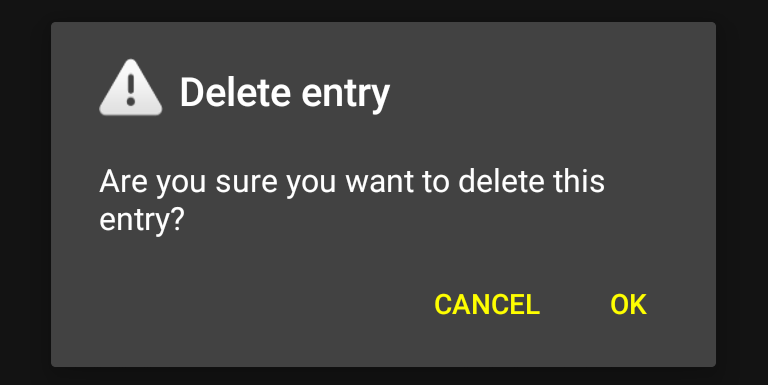
AlertDialog 和相应文本颜色的屏幕截图:

快捷方式 :
有时,更容易读取颜色值(如上图所示)并使用 AndroidXRef 搜索它。 .自
#80cbc4 起,这种方法在您的情况下就没有用了。只会指出它的强调色。您仍然需要找到 Widget.Material.Button.Borderless.Colored并将其与属性 buttonBarButtonStyle 联系起来.更改按钮的文本颜色 :
理想情况下,我们应该创建一个扩展
Widget.Material.Button.ButtonBar.AlertDialog 的样式。 , 覆盖 android:textColor在其中,并将其分配给属性 buttonBarButtonStyle .但是,这不起作用 - 您的项目将无法编译。这是因为 Widget.Material.Button.ButtonBar.AlertDialog是非公开样式,因此无法扩展。您可以通过查看 Link 来确认这一点。 .我们将做下一件最好的事情 - 扩展
Widget.Material.Button.ButtonBar.AlertDialog 的父样式- Widget.Material.Button.Borderless.Colored这是公开的。<style name="CusButtonBarButtonStyle"
parent="@android:style/Widget.Material.Button.Borderless.Colored">
<!-- Yellow -->
<item name="android:textColor">#ffffff00</item>
<!-- From Widget.Material.Button.ButtonBar.AlertDialog -->
<item name="android:minWidth">64dp</item>
<item name="android:maxLines">2</item>
<item name="android:minHeight">@dimen/alert_dialog_button_bar_height</item>
</style>
请注意,我们在覆盖
android:textColor 后又添加了 3 个项目。 .这些来自非公开风格Widget.Material.Button.ButtonBar.AlertDialog .由于我们不能直接扩展它,我们必须包括它定义的项目。注意:必须查找尺寸值并将其传输到适当的 res/values(-xxxxx)/dimens.xml项目中的文件。款式
CusButtonBarButtonStyle将分配给属性 buttonBarButtonStyle .但问题是,AlertDialog 如何知道这一点?从源代码:protected AlertDialog(Context context) {
this(context, resolveDialogTheme(context, 0), true);
}
路过
0作为 resolveDialogTheme(Context, int) 的第二个参数最终会出现在 else条款:static int resolveDialogTheme(Context context, int resid) {
if (resid == THEME_TRADITIONAL) {
....
} else {
TypedValue outValue = new TypedValue();
context.getTheme().resolveAttribute(
com.android.internal.R.attr.alertDialogTheme,
outValue, true);
return outValue.resourceId;
}
}
我们现在知道主题是由
alertDialogTheme 举办的属性。接下来我们看一下alertDialogTheme指着。此属性的值将取决于您的 Activity 的父主题。浏览到您的 sdk 文件夹并找到 values/themes_material.xml在 android-21 里面。搜索 alertDialogTheme .结果:<!-- Defined under `<style name="Theme.Material">` -->
<item name="alertDialogTheme">@style/Theme.Material.Dialog.Alert</item>
<!-- Defined under `<style name="Theme.Material.Light">` -->
<item name="alertDialogTheme">@style/Theme.Material.Light.Dialog.Alert</item>
<!-- Defined under `<style name="Theme.Material.Settings">` -->
<item name="alertDialogTheme">@style/Theme.Material.Settings.Dialog.Alert</item>
因此,根据您 Activity 的基本主题,
alertDialogTheme将持有这 3 个值之一。让 AlertDialog 知道 CusButtonBarButtonStyle ,我们需要覆盖属性 alertDialogTheme在我们应用程序的主题中。比如说,我们正在使用 Theme.Material作为基本主题。<style name="AppTheme" parent="android:Theme.Material">
<item name="android:alertDialogTheme">@style/CusAlertDialogTheme</item>
</style>
从上面我们知道
alertDialogTheme指向 Theme.Material.Dialog.Alert当您的应用程序的基本主题为 Theme.Material 时.所以,CusAlertDialogTheme应该有 Theme.Material.Dialog.Alert作为其父级:<style name="CusAlertDialogTheme"
parent="android:Theme.Material.Dialog.Alert">
<item name="android:buttonBarButtonStyle">@style/CusButtonBarButtonStyle</item>
</style>
结果:
So, instead of accepting fish to eat, can you teach me to fish instead?
至少,我希望已经解释了鱼在哪里。
附言我意识到我发布了一个猛犸象。
关于android - 如何探索android中的样式,我们在Stack Overflow上找到一个类似的问题: https://stackoverflow.com/questions/28523707/