这是我为了实现我的可视化而所做的尝试。
<!DOCTYPE html>
<meta charset="utf-8">

<style> /* set the CSS */

.line {
  fill: none;
  stroke: steelblue;
  stroke-width: 2px;
}

</style>
<body>

<!-- load the d3.js library -->
<script src="https://d3js.org/d3.v4.min.js"></script>
<script>
 var real = {{values.real0|safe}}, pred = {{values.got0|safe}};
// set the dimensions and margins of the graph
var margin = {top: 20, right: 20, bottom: 30, left: 50},
    width = 960 - margin.left - margin.right,
    height = 500 - margin.top - margin.bottom;

// parse the date / time
var parseTime = d3.timeParse("%d-%b-%y");

// set the ranges
var x = d3.scaleLinear()
    .range([0, width])
    .domain([0, Object.keys(real).length])

;
var y = d3.scaleLinear()
    .range([height, 0])
    .domain([0, 1]);

// define the line
var valueline = d3.line()
    .x(function(d) { return x(d.date); })
    .y(function(d) { return y(d.close); });

// append the svg obgect to the body of the page
// appends a 'group' element to 'svg'
// moves the 'group' element to the top left margin
var svg = d3.select("body").append("svg")
    .attr("width", width + margin.left + margin.right)
    .attr("height", height + margin.top + margin.bottom)
  .append("g")
    .attr("transform",
          "translate(" + margin.left + "," + margin.top + ")");


  // Add the valueline path.
  // svg.append("path")
  //     .data([real])
  //     .attr("class", "line")
  //     .attr("d", valueline);

  // Add the scatterplot
 var x_axis = d3.axisBottom(x)
  svg.selectAll("dot")
      .data(real)
    .enter().append("circle")
      .attr("r", 5)
      .attr("cx", function(x_axis,d) { return d; })
      .attr("cy", function( d) { return d; });

 svg.selectAll("dot")
      .data(pred)
    .enter().append("circle")
      .attr("r", 10)
      .attr("cx", function(x_axis,d) { return d; })
      .attr("cy", function( d) { return d; });

  // Add the X Axis
  svg.append("g")
      .attr("transform", "translate(0," + height + ")")
      .call(x_axis);

  // Add the Y Axis
  svg.append("g")
      .call(d3.axisLeft(y));

// });

</script>
</body>
以上是我用过的模板。示例 CSV 文件为:Sample Csv
生成值的函数在 views.py 中编写为:
@csrf_exempt
def getter(request):
     df_real_pred = pd.read_csv(r"logging\real_predicted\test.csv", sep=',', index_col=0)
    print(df_real_pred.columns)

    data = {
        'values': df_real_pred.to_dict(orient='list')

    }
    return render(request, 'tt/get.html', data)
请让我知道我错过了什么,因为我的图表很奇怪:
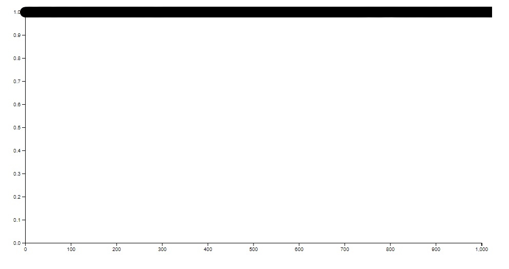
请告诉我如何使其正确对齐。
已编辑:该模板是我的 Django 项目的服务器模板。
最佳答案
应用 x 比例和 y 比例(2 倍)
.attr("cx", function( d, i) { return x(i); })
.attr("cy", function( d) { return y(d); });
关于javascript - 圆圈在图表 D3 Django 上没有正确对齐,我们在Stack Overflow上找到一个类似的问题: https://stackoverflow.com/questions/53614040/