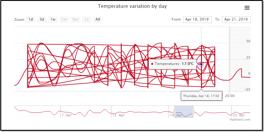
我有一个使用 highcharts 的温度和时间图表,但是当我单击 1 周、3 天或 1 天的范围时。图表在某些点上变得困惑,并在图表中绘制不相关的图表线,如下图所示。
您也可以在 jsfiddl 上查看e Demo 。
您可以在此链接上找到图表的数据 Data 。
代码
<!DOCTYPE html>
<html>
<head>
    <title></title>
     <script src="https://code.jquery.com/jquery-3.1.1.min.js"></script>
<script src="https://code.highcharts.com/stock/highstock.js"></script>
<script src="https://code.highcharts.com/stock/highcharts-more.js"></script>
<script src="https://code.highcharts.com/stock/modules/exporting.js"></script>
<script src="https://code.highcharts.com/stock/modules/export-data.js"></script>
<style>
@import 'https://code.highcharts.com/css/highcharts.css';

#container {
    height: 400px;
    max-width: 800px;
    margin: 0 auto;
}
.highcharts-xaxis-grid .highcharts-grid-line {
    stroke-width: 2px;
    stroke: #d8d8d8;
}
.highcharts-xaxis .highcharts-tick {
    stroke-width: 2px;
    stroke: #d8d8d8;
}
.highcharts-minor-grid-line {
    stroke-dasharray: 2, 2;
}
</style>
</head>
<body>
<div id="container" style="min-width: 310px; height: 400px; margin: 0 auto"></div>


</body>
</html>
<script type="text/javascript">
// Notice that the dataset has missing data
$.getJSON('https://api.myjson.com/bins/m5imk', function (data) {

  Highcharts.stockChart('container', {

    chart: {
      type: 'spline'
    },
    rangeSelector: { enabled: false },
                scrollbar: { enabled: false },
     xAxis: {
         gridLineColor: '#f44242',
        minorTickInterval: 'auto',
        startOnTick: true,
        endOnTick: true
    },
    yAxis: {
        gridLineColor: '#f44242'
    },
    rangeSelector: {
      buttons: [
      {
        type: 'day',
        count: 1,
        text: '1d'
      },
      {
        type: 'day',
        count: 3,
        text: '3d'
      }, {
        type: 'week',
        count: 1,
        text: '1w'
      }, {
        type: 'month',
        count: 1,
        text: '1m'
      }, {
        type: 'month',
        count: 6,
        text: '6m'
      }, {
        type: 'year',
        count: 1,
        text: '1y'
      }, {
        type: 'all',
        text: 'All'
      }],
      selected: 3
    },

    title: {
      text: 'Temperature variation by day'
    },

    tooltip: {
      valueSuffix: '°C',
      valueDecimals: 1,
    },

    series: [{
      name: 'Temperatures',
      data: data,
      color: '#BF0B23',

        marker:
        {
            fillColor: 'blue',
            lineWidth: 0

        }
    }]

  });
});


</script>
最佳答案
控制台中出现 Highcharts Error #15,这意味着您有未排序的数据:https://www.highcharts.com/errors/15/ 。
您需要在创建图表之前对数据进行排序:
data.sort(function(a, b) {
    return a[0] - b[0]
});
关于javascript - Highcharts 中不相关的图表线,我们在Stack Overflow上找到一个类似的问题: https://stackoverflow.com/questions/56002951/