我有一个包含推文值的 DataFrame,并且想要根据 'Date' 绘制 'Favourites' 的图表并进行分类/颜色-通过'User'对数据进行编码。
我能够获得数据的散点图或条形图,但无法获得基于“用户” 进行分类的有效解决方案。图表中的“日期”也显得很困惑,我无法理解此问题的原因。
我尝试过使用this tutorial获取折线图,但不明白如何将其应用到我的 DataFrame
数据帧结构
data_frame = pandas.DataFrame(data=[tweet.text for tweet in tweets], columns=['Tweets'])

data_frame['User'] = numpy.array([tweet.user.screen_name for tweet in tweets])
data_frame['ID'] = numpy.array([tweet.id for tweet in tweets])
data_frame['Length'] = numpy.array([len(tweet.text) for tweet in tweets])
data_frame['Date'] = numpy.array([tweet.created_at for tweet in tweets])
data_frame['Source'] = numpy.array([tweet.source for tweet in tweets])
data_frame['Favourites'] = numpy.array([tweet.favorite_count for tweet in tweets])
data_frame['Retweets'] = numpy.array([tweet.retweet_count for tweet in tweets])

return data_frame
绘图
x = result.Date
y = result.Favourites

plt.xlabel("Date", fontsize=10)
plt.ylabel("Favourites", fontsize=10)


plt.figure(figsize=(30,30))

fig, ax = plt.subplots()


plt.scatter(x,y)

plt.savefig('plot.png')
我希望图表显示收藏夹与时间的折线图,并使用不同的用户颜色编码,如下例所示: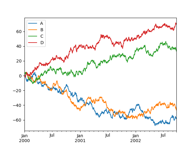
我当前的输出是这样的:
示例数据

最佳答案
如果不查看确切的数据,就很难提供解决方案。也许这值得一试。
for user in data_frame.User.unique():
     d = data_frame[data_framef['User']==user]
     plt.plot(d['Date'],d['Favourites'],'o')

plt.plot()
关于python - 如何使用 Matplotlib 对 Pandas 数据框中的数据进行分类和绘图?,我们在Stack Overflow上找到一个类似的问题: https://stackoverflow.com/questions/55315796/