您好,我正在尝试更改条形图在条形图上的开始和停止位置。我的目标是拥有一个跨越整个月的酒吧。现在我的代码是:
    cumulative = go.Bar(y=self.gb[self.y_column],
                        x=self.gb.index,
                        name='Cumulative',
                        hoverinfo='x+y',
                        hovertemplate="Month: %{x} <br>Cumulative Tank " + self.units + ": %{y}",
                        opacity=0.6,
                        marker=dict(color='rgb(158,202,225)',
                                    line=dict(color='rgb(8,48,107)',
                                              width=1.5,
                                              ),
                                    )
                        )
我的输出是:
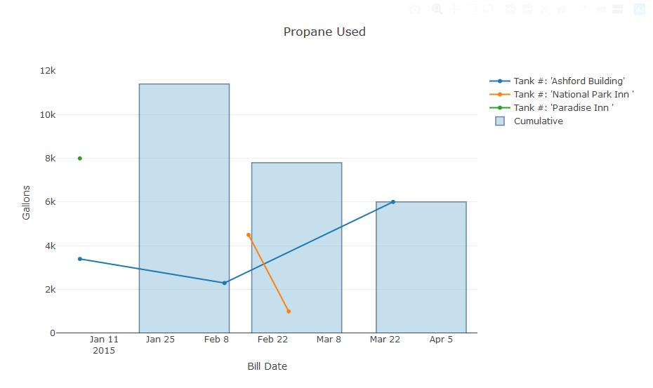
我目前在月底设置了 xtick。如果我可以使条形图与 xtick 右对齐,我可以使用自定义条形图宽度使其到达月底。我认为我无法计算该月的中间一天,因为在有 31 天的月份中,我要么有一天的差距,要么超过一天。任何帮助将不胜感激!
我在论坛上发了一篇关于这个问题的帖子:https://community.plot.ly/t/set-alignment-of-vertical-bar-on-x-axis/23185
最佳答案
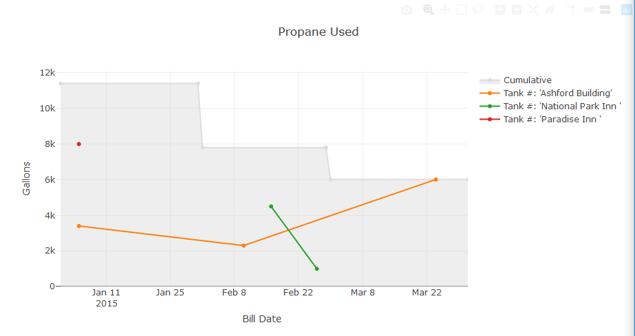
这不是一个解决方案,而是一个我满意的解决方案
因此,我决定通过使用填充线图来实现解决方案。这是代码,一个用于计算每月累积值和绘图填充区域散点对象的辅助函数:
def cumulative_df(df, date_term, y_term, v_print):
    v_print('Making the Monthly Sum DF')
    df = df[[date_term, y_term]]
    df = df.set_index(date_term)
    gb = df.groupby(pd.Grouper(freq="M")).sum()

    starts = []
    for index, row in gb.iterrows():
        new_start = index - pd.offsets.MonthBegin(1, normalize=True)
        starts.append([new_start, row.values[0]])

    starts_df = pd.DataFrame(starts, columns=[date_term, y_term])
    starts_df = starts_df.set_index(date_term)
    gb = gb.append(starts_df, sort=False)
    gb.sort_values(date_term, inplace=True)
    return gb
以及 plotly 调用:
        cumulative = [go.Scatter(y=self.gb[self.y_column],
                                x=self.gb.index,
                                name='Cumulative',
                                hoverinfo='x+y',
                                hovertemplate="Month: %{x} <br>Cumulative Meter " + self.units + ": %{y}",
                                fill='tozeroy',
                                fillcolor=self.fill_color,
                                line={'color': self.cum_line_color,}
                                )]

        scatters = cumulative + scatters
这是输出:
关于python - 设置 Plotly Bar graph x 轴的对齐方式,我们在Stack Overflow上找到一个类似的问题: https://stackoverflow.com/questions/56030852/