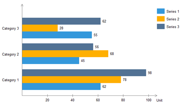
如何绘制水平条形图,其值位于条形末尾,类似于 this
我试过了
plt.barh(inc.index,inc)
plt.yticks(inc.index)
plt.xticks(inc);
plt.xlabel("Order Count")
plt.ylabel("Date")
最佳答案
答案可以在这里找到: How to display the value of the bar on each bar with pyplot.barh()?
只需按照 cphlewis 所说添加 for 循环即可:
for i, v in enumerate(inc):
    ax.text(v + 3, i + .25, str(v), color='blue', fontweight='bold')
plt.show()
这是我针对您的情况尝试的代码:
import matplotlib.pyplot as plt
import numpy as np
inc = [12, 25, 50, 65, 40, 45]
index = ["2019-10-31", "2019-10-30", "2019-10-29", "2019-10-28", "2019-10-27", "2019-10-26"]

fig, ax = plt.subplots()
ax.barh(index,inc, color='black')
plt.yticks(index)
plt.xticks(inc);
plt.xlabel("Order Count")
plt.ylabel("Date")

# Set xticks
plt.xticks(np.arange(0, max(inc)+15, step=10))

# Loop for showing inc numbers in the end of bar
for i, v in enumerate(inc):
    ax.text(v + 1, i, str(v), color='black', fontweight='bold')
plt.show()
情节如下:

关于python - 在 matplotlib 上绘制条形图,我们在Stack Overflow上找到一个类似的问题: https://stackoverflow.com/questions/58678862/