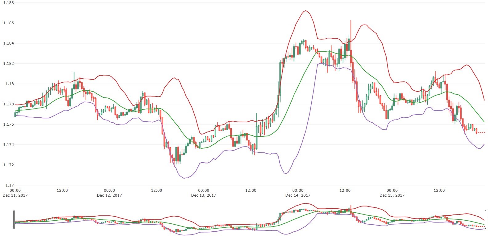
Plotly 似乎有一个非常烦人的功能,它会在主图表下打印图表的微型版本。谁能解释一下如何摆脱底部图表?我不确定为什么 plotly 甚至这样做,似乎毫无意义。
查看我的代码,然后查看附加的图像。
ohlcv = go.Candlestick(x=df.index, open=df.Open, high=df.High, low=df.Low, close=df.Close, name='Currency Quote.html')
rolling_mean = go.Scatter(x=df.index, y=df.Rolling_Mean)
boll_upper = go.Scatter(x=df.index, y=df.Upper_Bollinger)
boll_lower = go.Scatter(x=df.index, y=df.Lower_Bollinger)
fig = tools.make_subplots(rows=1, cols=1, shared_xaxes=True)
fig.append_trace(ohlcv, 1, 1)  # row 1 col 1
fig.append_trace(rolling_mean, 1, 1)
fig.append_trace(boll_upper, 1, 1)
fig.append_trace(boll_lower, 1, 1)
py.offline.plot(fig, filename='CandleStick.html')
最佳答案
由于没有提供示例数据,我无法复制您的确切图表,但我获取了一个示例烛台图,正如您所提到的,默认情况下带有范围 slider 。
我尝试了这些选项,并通过使用布局下 xaxis 的 rangeslider 属性下的 visible 属性,我们可以禁用范围完全 slider !
基本上通过设置如下所示的布局,我们可以删除范围 slider !
layout = {
            "xaxis": {
                "rangeslider": {
                    "visible": False
                }
            }
         }
请引用以下代码,如果您的问题得到解决,请告诉我!
from plotly.offline import download_plotlyjs, init_notebook_mode, plot, iplot
import plotly.graph_objs as go
from datetime import datetime
init_notebook_mode(connected=True)

open_data = [33.0, 33.3, 33.5, 33.0, 34.1]
high_data = [33.1, 33.3, 33.6, 33.2, 34.8]
low_data = [32.7, 32.7, 32.8, 32.6, 32.8]
close_data = [33.0, 32.9, 33.3, 33.1, 33.1]
dates = [datetime(year=2013, month=10, day=10),
         datetime(year=2013, month=11, day=10),
         datetime(year=2013, month=12, day=10),
         datetime(year=2014, month=1, day=10),
         datetime(year=2014, month=2, day=10)]

trace = go.Candlestick(x=dates,
                       open=open_data,
                       high=high_data,
                       low=low_data,
                       close=close_data)
layout = {"xaxis": {
            "rangeslider": {
            "visible": False}
        }}
fig = go.Figure(data=[trace], layout=layout)
iplot(fig, filename='candlestick_datetime')
关于Python Plotly 打印两个图表,我们在Stack Overflow上找到一个类似的问题: https://stackoverflow.com/questions/48131484/