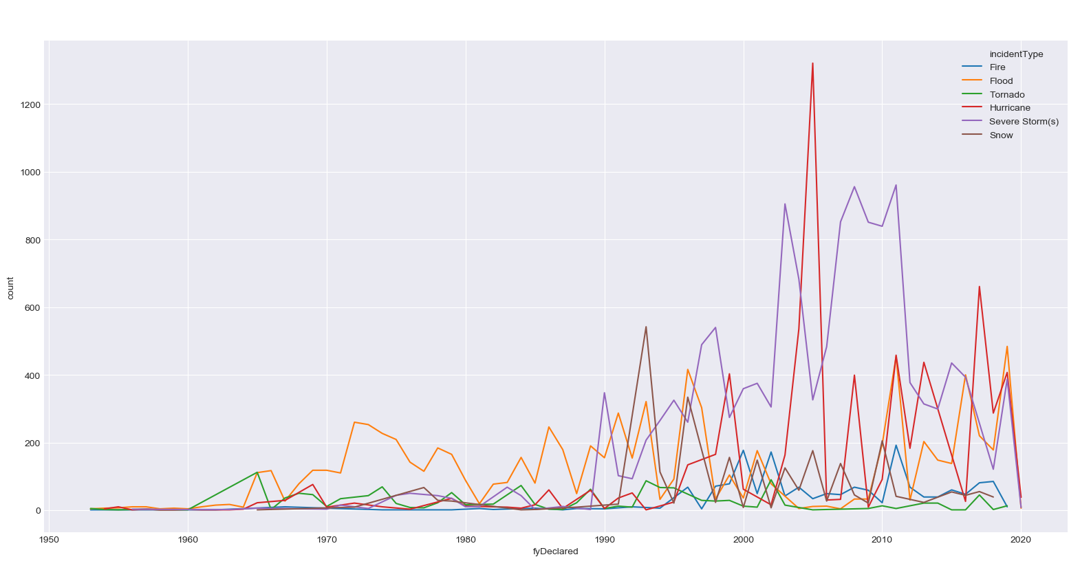
目前我有一个线图,可以将所有内容绘制在一起:
import seasborn as sns
sns.lineplot(data=years_total, x='fyDeclared', y='count', hue='incidentType')
这使得这个图表很好
但是,我希望将每个类别分成自己的子图。我已经尝试过了
f, axes =  plt.subplots(3, 2, figsize=(12, 6), sharex=True, sharey=True)

sns.lineplot(data=years_total, x='fyDeclared', y='count', hue='incidentType' == 'Tornado', ax=axes[0,0], legend=False)
sns.lineplot(data=years_total, x='fyDeclared', y='count', hue='incidentType' == 'Flood', ax=axes[0,1], legend=False)
sns.lineplot(data=years_total, x='fyDeclared', y='count', hue='incidentType' == 'Fire', ax=axes[1,0], legend=False)
sns.lineplot(data=years_total, x='fyDeclared', y='count', hue='incidentType' == 'Hurricane', ax=axes[1,1], legend=False)
sns.lineplot(data=years_total, x='fyDeclared', y='count', hue='incidentType' == 'Severe Storm(s)', ax=axes[2,0], legend=False)
sns.lineplot(data=years_total, x='fyDeclared', y='count', hue='incidentType' == 'Snow', ax=axes[2,1], legend=False)
但是它并没有按照我的预期工作。似乎每次都重复相同的图表
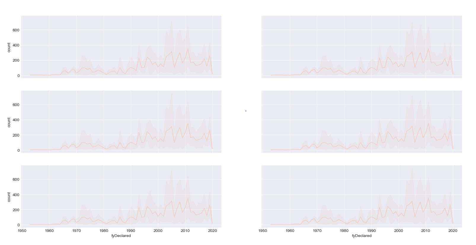
我只是想将原始图中的每个折线图拆分为其自己的子图,但我不太确定我做错了什么。
另外,作为旁注,是否有更好、更复杂的方法来绘制每个子图,而无需逐字复制和粘贴每个不同的类别?
最佳答案
您尝试执行的操作在语法上不正确,您应该编写:
f, axes =  plt.subplots(3, 2, figsize=(12, 6), sharex=True, sharey=True)

sns.lineplot(data=years_total[years_total.incidentType=='Tornado'], x='fyDeclared', y='count', ax=axes[0,0], legend=False)
sns.lineplot(data=years_total[years_total.incidentType=='Flood'], x='fyDeclared', y='count', ax=axes[0,1], legend=False)
(...)
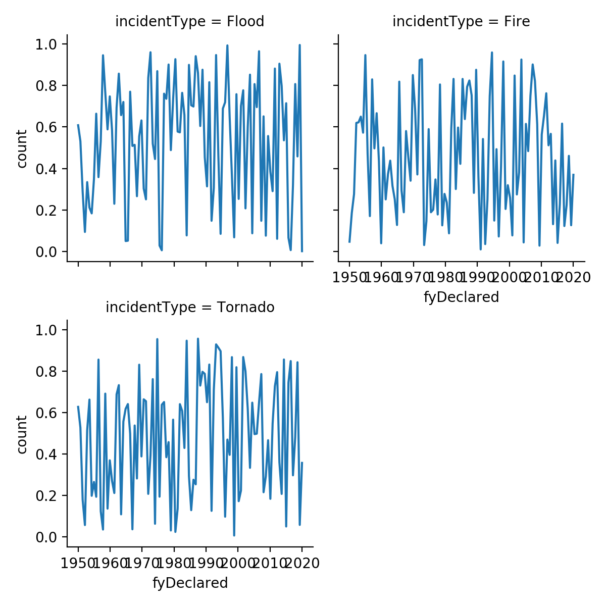
但是,为了避免繁琐的重复,您可以利用seaborn的FacetGrid,它正是为此目的而设计的。 FacetGrid 创建一个图形,其中每行/列对应于分类变量的特定值。因此:
idx = pd.date_range(start='1950-01-01', end='2019-12-31', periods=100)
df = pd.DataFrame()
for type in ['Flood','Fire','Tornado']:
    temp = pd.DataFrame({'fyDeclared':idx, 'count':np.random.random(100), 'incidentType':type})
    df = pd.concat([df,temp])

g = sns.FacetGrid(data=df, col='incidentType', col_wrap=2)
g.map(sns.lineplot, 'fyDeclared', 'count')
关于python - 如何在 Python 中将折线图拆分为子图?,我们在Stack Overflow上找到一个类似的问题: https://stackoverflow.com/questions/58870186/