我有一个数据框如下:
data = {'Contact':['Email', 'SMS', 'Email', 'Other', 'In Person', 'Other', 'SMS', 'Other', 'Phone', 'Email', 'Other', 'Phone',
                   'Phone', 'In Person', 'Email', 'Email', 'Other', 'Other', 'Other', 'Phone', 'Other', 'Email', 'Other',
                   'Other'],
        'Age': [34, 50, 30, 43, 38, 43, 26, 37, 30, 30, 34, 38, 48, 30, 46, 37, 29, 36, 31, 31, 53, 25, 37, 25]}

data = pd.DataFrame(data, columns=['Contact', 'Age'])
data

我想将 Age 列分为 10 个组,然后将每个组的百分比绘制为线图,分别针对每个唯一的 Contact 值。由于 Contact 中有 5 个唯一值,分别是 'Email'、'SMS'、'Other'、'In Person'、'Phone',我希望是 1 个图,其中应有 5 条线,每条线对应每个唯一的 Contact 值。但我得到以下信息:
contacts = data['Contact'].unique()

for c in contacts:
    df = data[data['Contact']==c]
    y,binEdges=np.histogram(df['Age'], bins=10)
    y = 100*y/sum(y)
    bincenters = 0.5*(binEdges[1:]+binEdges[:-1])

    plt.plot(bincenters,y,label=c)
    plt.xlabel('Age')
    plt.ylabel('Percentage count')
    plt.show()

最佳答案
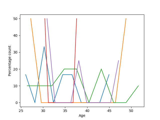
如果取消 plt.show(),所有绘图将显示在同一个图形上
import matplotlib.pyplot as plt
import pandas as pd
import numpy as np

data = {'Contact':['Email', 'SMS', 'Email', 'Other', 'In Person', 'Other', 'SMS', 'Other', 'Phone', 'Email', 'Other', 'Phone',
                   'Phone', 'In Person', 'Email', 'Email', 'Other', 'Other', 'Other', 'Phone', 'Other', 'Email', 'Other',
                   'Other'],
        'Age': [34, 50, 30, 43, 38, 43, 26, 37, 30, 30, 34, 38, 48, 30, 46, 37, 29, 36, 31, 31, 53, 25, 37, 25]}

data = pd.DataFrame(data, columns=['Contact', 'Age'])

contacts = data['Contact'].unique()

for c in contacts:
    df = data[data['Contact']==c]
    y,binEdges=np.histogram(df['Age'], bins=10)
    y = 100*y/sum(y)
    bincenters = 0.5*(binEdges[1:]+binEdges[:-1])

    plt.plot(bincenters,y,label=c)
    plt.xlabel('Age')
    plt.ylabel('Percentage count')
plt.show()
关于python - 如何使线图出现在同一个图形上而不是不同的图形上?,我们在Stack Overflow上找到一个类似的问题: https://stackoverflow.com/questions/52161219/