我在将盒子的大小与移动设备匹配时遇到了问题(使用 Bootstrap ) 我有 3 个盒子,1 号和 2 号是图片,3 号是文字, 它看起来like this
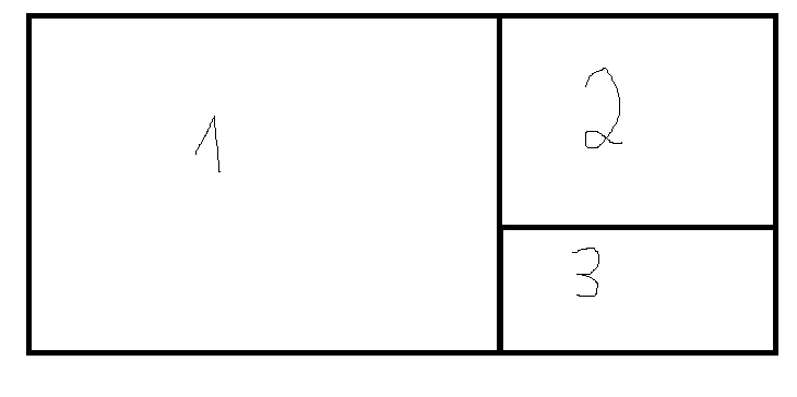
当我将屏幕调整为移动尺寸时,会发生这种情况(框号 3 高于或在某些设备中比框号 2 短,如下所示:error
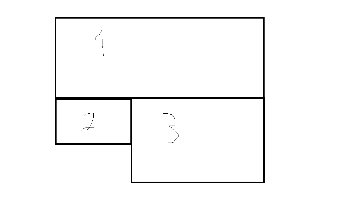
我需要它看起来像那样(3 号框与 2 号框高度相同):desired output
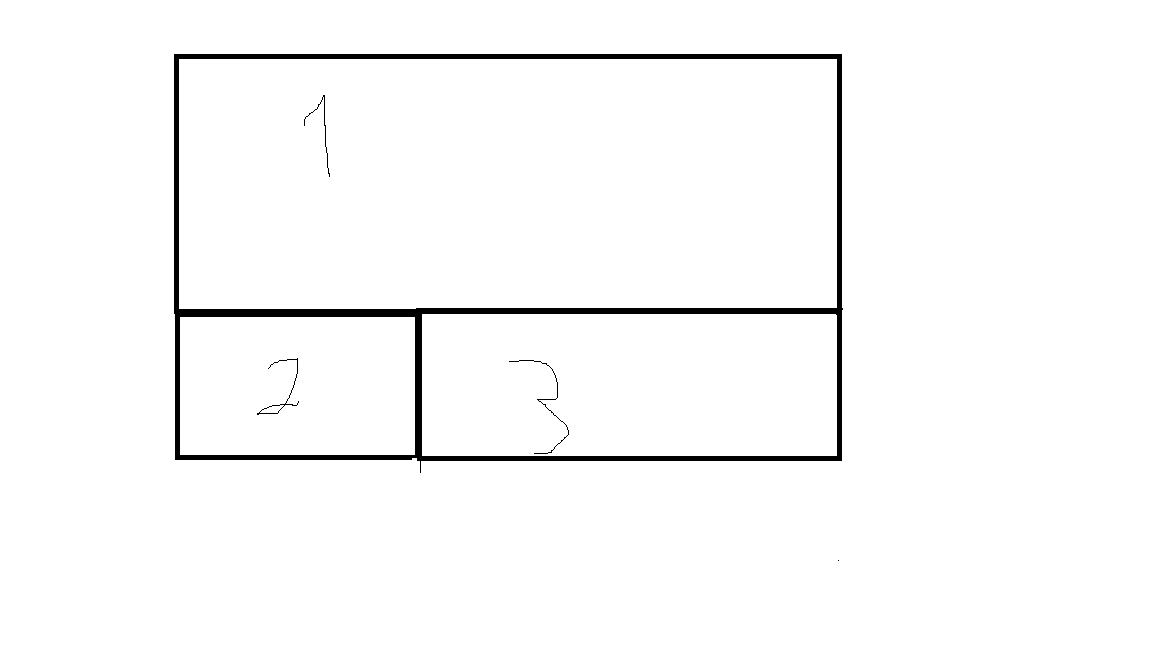
我尝试将最大高度和最小高度设置为 box3,但这不是解决方案,因为它不匹配所有设备。
html:
 <section id="carousel-section">

  <div class="container-fluid">

     <div class="row feature">
         <div class="col-lg-8 col-xl-8 col-md-12 col-xs-12 col-sm-12 ">
             <div class="carousel-margin">
<div id="myCarousel" class="carousel1 slide container-carousel" data-
 ride="carousel1">
  <!-- Indicators -->
 <ol class="carousel-indicators">
<li data-target="#myCarousel" data-slide-to="0" class="active"></li>
<li data-target="#myCarousel" data-slide-to="1"></li>
<li data-target="#myCarousel" data-slide-to="2"></li>
 </ol>

 <!-- Wrapper for slides -->
 <div class="carousel-inner">
<div class="item active">
  <img src="images/dragon_hunter_pic.png" alt="dragon_hunter_pic"
   id="mainImage1" >
</div>

 </div>

    </div>
         </div>
         </div>
            <div class="col-lg-4 col-xl-4 col-md-5 col-xs-5 col-sm-5 ">

       <div class="women-margin">
  <img src="images/women_3.png" alt="live" id="women-eyes1" >
            </div>
            </div>


  <div class="col-lg-4 col-xl-4 col-md-7 col-xs-7 col-sm-7 ">

      <div class="yellow-box">


      <h2 id="change_h2">THE DRAGON HUNTER</h2>
            <br/>
            <p id="change_p"> Lorem ipsum dolor sit amet, consectetur
       adipiscing elit, sed do eiusmod tempor incididunt ut labore et
        dolor aliqua. </p>

         </div>


      </div>

  </div>
 </div>

  </section>
这是有问题的框,框号 3:
<div class="yellow-box">
CSS:
  .yellow-box{
 position: relative;

 display: block;
  background-repeat: no-repeat;
  background-size: cover;

    min-height: 204px;
 margin-top:150px;
background-color: #e6ff00;
margin-left: -15px;
margin-right: -15px;


   }
这是2号盒子:
  .women-margin{
  margin: -1px -15px -2px -17px;
position: relative;
display: block;
padding-right: 0;
   }
最佳答案
<!DOCTYPE html>
<html lang="en">
<head>
<meta charset="utf-8">
<meta http-equiv="X-UA-Compatible" content="IE=edge">
<meta name="viewport" content="width=device-width, initial-scale=1">
<title>Example of Bootstrap 3 Nested Rows and Columns</title>
<link rel="stylesheet" href="https://maxcdn.bootstrapcdn.com/bootstrap/3.3.7/css/bootstrap.min.css">
<script src="https://ajax.googleapis.com/ajax/libs/jquery/1.12.4/jquery.min.js"></script>
<script src="https://maxcdn.bootstrapcdn.com/bootstrap/3.3.7/js/bootstrap.min.js"></script>
<style type="text/css">
	/* Some custom styles to beautify this example */
    .main-content{
		min-height: 330px;
        background: #dbdfe5;
    }
    .sidebar-content{
        min-height: 150px;
        margin-bottom: 30px;
        background: #b4bac0;
    }
</style>
</head>
<body>
	<!-- Open the output in a new blank tab (Click the arrow next to "Show Output" button) and resize the browser window to understand how the Bootstrap responsive grid system works. -->
	<div class="container">
        <div class="row">
            <div class="col-xs-12 col-lg-4">
                <div class="main-content"></div>
            </div>
            <div class="col-xs-6 col-lg-4">
                <!--Nested rows within a column-->

                        <div class="sidebar-content"></div></div>
                    <div class="col-xs-6 col-lg-4">
                        <div class="sidebar-content"></div>
                    </div>
                </div>
            </div>

</body>
</html>
尝试此代码.. 了解更多信息 click here
关于html - 在较小的设备中,框高度不是所需的大小 - css,我们在Stack Overflow上找到一个类似的问题: https://stackoverflow.com/questions/47286366/