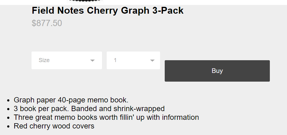
我想在我的产品页面的下拉框下方移动一个按钮。以便每行显示一个信息。我尝试在按钮周围放置一个 div 标签,看看它是否被视为位于前一个元素下方的单独元素,但这不起作用,所以我不知道该怎么做才能使购买按钮位于 size 和 1 下方盒子。
HTML:
<!DOCTYPE html>
<html lang="en">
<head>
      <meta charset="UTF-8">
      <meta name="viewport" content="width=device-width, initial-scale=1.0">
      <meta http-equiv="X-UA-Compatible" content="ie=edge">
      <link rel="shortcut icon" type="image/png" href="images/favicon.png">
      <title>Responsive Sticky Navbar</title>
      <link rel="stylesheet" href="bike-1-style.css">
      <link rel="stylesheet" href="https://maxcdn.bootstrapcdn.com/font-awesome/4.7.0/css/font-awesome.min.css">
      <script src="https://code.jquery.com/jquery-3.3.1.js"></script>
</head>
<body>
        <div class="Menu">
            <header>

                <nav>

                <div class="menu-icon">
                        <i class="fa fa-bars fa-2x"></i>
                </div>

                <div class="logo">
                        Croydon Cycles
                </div>

                <div class="menu">
                        <ul>
                                <li><a class="menu-text" href="index.html">Home</a></li>
                                <li><a class="menu-text" href="location.html">Location</a></li>
                                <li><a class="menu-text" href="shop.html">Shop</a></li>
                                <li><a class="menu-text" href="contact.html">Contact</a></li>
                        </ul>
                </div>
                </nav>

            </header>
        </div>

        <div id="space"></div>


        <link href='https://fonts.googleapis.com/css?family=Open+Sans:400,300,700' rel='stylesheet' type='text/css'>

<link rel="stylesheet" >

<div class="wrapper">


  <div class="product group">
    <div class="col-1-2 product-image">
      <div class="bg"></div>
      <div class="indicator">

      </div>
    </div>
    <div class="col-1-2 product-info">
      <h1>Field Notes Cherry Graph 3-Pack</h1>
      <h2>$877.50</h2>

      <div class="select-dropdown">
        <select>
          <option value="size">Size</option>
          <option value="size">Small</option>
          <option value="size">Medium</option>
          <option value="size">Large</option>
        </select>
      </div>

      <div class="select-dropdown">
        <select>
          <option value="quantity">1</option>
          <option value="quantity">2</option>
          <option value="quantity">3</option>
          <option value="quantity">4</option>
        </select>
      </div>

      <br>
      <div class="Buy"></div>

      <a href="" class="add-btn">Buy</a>
      </div>


      <ul>
        <li>Graph paper 40-page memo book.</li>
        <li>3 book per pack. Banded and shrink-wrapped</li>
        <li>Three great memo books worth fillin' up with information</li>
        <li>Red cherry wood covers</li>
      </ul>


    </div>
  </div>

  <div id="footer"></div>

</div>


    <script type="text/javascript">

    // Menu-toggle button

    $(document).ready(function() {
    $(".menu-icon").on("click", function() {
            $("nav ul").toggleClass("showing");
    });
    // add this instruction !
    setTimeout(function() {plusSlides(1) }, 1000)
})

    // Scrolling Effect

    $(window).on("scroll", function() {
        if($(window).scrollTop()) {
                $('nav').addClass('black');
        }

        else {
                $('nav').removeClass('black');
        }
    })


    </script>

</body>
</html>
CSS:
body{
    margin: 0;
    padding: 0;
    border: 0;

    background-color:  #eee;

    font-family: "Helvetica", sans-serif;
    height: 100%;
    width: 100%;
  }

  *{
    box-sizing: border-box;
  }

  h1, h2, h3, h4, h5, h6{
    margin: 0;
    padding: 0;
    border: 0;
  }

  h1{
    font-size: 130%;
  }

  h2{
    color: #aaa;
    font-size: 18px;
    font-weight: 400;
  }


  p{
    font-size: 12px;
    line-height: 1.5;
  }

  /*.wrapper{
    padding: 20px 0px;
  }*/

  .content {
    width: 94%;
    margin: 4em auto;
    font-size: 20px;
    line-height: 30px;
    text-align: justify;
}

nav.black .logo {
    color: #fff;
}

nav.black ul li a {
   color: #fff;
}

.menu-text {
    color: #000;
}

.logo {
    line-height: 60px;
    position: fixed;
    float: left;
    margin: 16px 46px;
    color: #000;
    font-weight: bold;
    font-size: 20px;
    letter-spacing: 2px;
}

nav {
    position: fixed;
    width: 100%;
    line-height: 60px;
    z-index:2;
}

nav ul {
    line-height: 60px;
    list-style: none;
    background: rgba(0, 0, 0, 0);
    overflow: hidden;
    color: #fff;
    padding: 0;
    text-align: right;
    margin: 0;
    padding-right: 40px;
    transition: 1s;
}

nav.black ul {
    background: #000;
}

nav ul li {
    display: inline-block;
    padding: 16px 40px;;
}

nav ul li a {
    text-decoration: none;
    color: #fff;
    font-size: 16px;
}

.menu-icon {
    line-height: 60px;
    width: 100%;
    background: #000;
    text-align: right;
    box-sizing: border-box;
    padding: 15px 24px;
    cursor: pointer;
    color: #fff;
    display: none;
}

@media(max-width: 786px) {

    .logo {
          position: fixed;
          top: 0;
          margin-top: 16px;
    }

    nav ul {
          max-height: 0px;
          background: #000;
    }

    nav.black ul {
          background: #000;
    }

    .showing {
          max-height: 34em;
    }

    nav ul li {
          box-sizing: border-box;
          width: 100%;
          padding: 24px;
          text-align: center;
    }

    .menu-icon {
          display: block;
    }

}

#space {
    width: 100%;
    height: 86px;
}

 .product{
    background-color: #eee;
    border-bottom: 1px solid #ddd;
    clear: both;
    padding: 0px 10% 70px 10%;
  }

  .group:after {
    content: "";
    display: table;
    clear: both;
  }


  .col-1-2{
    width: 100%;
    height: 100%;
    float: left;
  }

  .product-image{
    /*border: 1px dotted #aaa;*/
  }

  .product-image .bg{
    background-image: url('images/slider-1.jpg');
    background-size: cover;
    background-position: center top;

    min-height: 550px;
  }

  .product-image .indicator{
    text-align:center;
  }


  .dot:hover{
    background-color: #444;
  }

  .product-info{
    padding: 0px 8%;
  }

  .product-info h1{
    margin-bottom: 5px;
  }

  .product-info h2{
    margin-bottom: 50px;
  }

  .product-info .select-dropdown{
    display: inline-block;
    margin-right: 10px;
    position: relative;
    width: auto;
    float: left;
  }

  .product-info select{
    cursor: pointer;
    margin-bottom: 20px;
    padding: 12px 92px 12px 15px;
    background-color: #fff;
    border: none;
    border-radius: 2px;
    color: #aaa;
    font-size: 12px;
    -webkit-appearance: none;
       -moz-appearance: none;
            appearance: none;
  }

  select:active, select:focus {
    outline: none;
    box-shadow: none;
  }

  .select-dropdown:after {
      content: " ";
    cursor: pointer;
      position: absolute;
      top: 30%;
    right: 10%;
      width: 0;
      height: 0;
      border-left: 5px solid transparent;
      border-right: 5px solid transparent;
      border-top: 5px solid #aaa;
    }

  .product-info a.add-btn{
    background-color: #444;
    border-radius: 2px;
    color: #eee;
    display: inline-block;
    font-size: 14px;
    margin-bottom: 30px;
    padding: 15px 100px;
    text-align: center;
    text-decoration: none;
    transition: all 400ms ease;
  }

  a.add-btn:hover{
    background-color: #555;
  }

  .product-info p{
    margin-bottom: 30px;
  }

  .product-info p a{
    border-bottom: 1px dotted #444;
    color: #444;
    font-weight: 700;
    text-decoration: none;
    transition: all 400ms ease;
  }

  .product-info p a:hover{
    opacity: .7;
  }

  .product-info ul{
    font-size: 12px;
    padding: 0;
    margin-bottom: 50px;
  }

  .product-info li{
    list-style-type: none;
    margin-bottom: 5px;
  }

  .product-info li::before{
    content:"\2022";
    margin-right: 20px;
  }


  .product-info a.share-link{
    color: #aaa;
    font-size: 11px;
    margin-right: 30px;
    text-decoration: none;
  }

  .product-info a.share-link:hover{
    border-bottom: 2px solid #aaa;
  }

#footer {
    width:100%;
    background-color:#222;
    padding: 60px 0px;
    position: relative;
    bottom: 0;
    clear:both;
    height:10%;
}
最佳答案
这里有很多错误。
<br>标签不应该用于元素定位。这应该严格保留用于文本。- 如果您不希望您的元素显示一行,最好不要设置它们的
display。inline-block的属性(property)对于初学者。 - 甚至还有一些语法错误(例如过多的
</div>标签等等)。一般来说,我建议您使用某种 linter 编写代码,因为它存在一些可读性问题。
我做了最低限度的删除不必要的 <br>标记并添加 clear:both到 .Buy类格式化。产生期望的结果。
body {
  margin: 0;
  padding: 0;
  border: 0;
  background-color: #eee;
  font-family: "Helvetica", sans-serif;
  height: 100%;
  width: 100%;
}

* {
  box-sizing: border-box;
}

h1,
h2,
h3,
h4,
h5,
h6 {
  margin: 0;
  padding: 0;
  border: 0;
}

h1 {
  font-size: 130%;
}

h2 {
  color: #aaa;
  font-size: 18px;
  font-weight: 400;
}

p {
  font-size: 12px;
  line-height: 1.5;
}


/*.wrapper{
    padding: 20px 0px;
  }*/

.content {
  width: 94%;
  margin: 4em auto;
  font-size: 20px;
  line-height: 30px;
  text-align: justify;
}

nav.black .logo {
  color: #fff;
}

nav.black ul li a {
  color: #fff;
}

.menu-text {
  color: #000;
}

.logo {
  line-height: 60px;
  position: fixed;
  float: left;
  margin: 16px 46px;
  color: #000;
  font-weight: bold;
  font-size: 20px;
  letter-spacing: 2px;
}

nav {
  position: fixed;
  width: 100%;
  line-height: 60px;
  z-index: 2;
}

nav ul {
  line-height: 60px;
  list-style: none;
  background: rgba(0, 0, 0, 0);
  overflow: hidden;
  color: #fff;
  padding: 0;
  text-align: right;
  margin: 0;
  padding-right: 40px;
  transition: 1s;
}

nav.black ul {
  background: #000;
}

nav ul li {
  display: inline-block;
  padding: 16px 40px;
  ;
}

nav ul li a {
  text-decoration: none;
  color: #fff;
  font-size: 16px;
}

.menu-icon {
  line-height: 60px;
  width: 100%;
  background: #000;
  text-align: right;
  box-sizing: border-box;
  padding: 15px 24px;
  cursor: pointer;
  color: #fff;
  display: none;
}

.Buy {
  clear: both;
}

@media(max-width: 786px) {
  .logo {
    position: fixed;
    top: 0;
    margin-top: 16px;
  }
  nav ul {
    max-height: 0px;
    background: #000;
  }
  nav.black ul {
    background: #000;
  }
  .showing {
    max-height: 34em;
  }
  nav ul li {
    box-sizing: border-box;
    width: 100%;
    padding: 24px;
    text-align: center;
  }
  .menu-icon {
    display: block;
  }
}

#space {
  width: 100%;
  height: 86px;
}

.product {
  background-color: #eee;
  border-bottom: 1px solid #ddd;
  clear: both;
  padding: 0px 10% 70px 10%;
}

.group:after {
  content: "";
  display: table;
  clear: both;
}

.col-1-2 {
  width: 100%;
  height: 100%;
  float: left;
}

.product-image {
  /*border: 1px dotted #aaa;*/
}

.product-image .bg {
  background-image: url('images/slider-1.jpg');
  background-size: cover;
  background-position: center top;
  min-height: 550px;
}

.product-image .indicator {
  text-align: center;
}

.dot:hover {
  background-color: #444;
}

.product-info {
  padding: 0px 8%;
}

.product-info h1 {
  margin-bottom: 5px;
}

.product-info h2 {
  margin-bottom: 50px;
}

.product-info .select-dropdown {
  display: inline-block;
  margin-right: 10px;
  position: relative;
  width: auto;
  float: left;
}

.product-info select {
  cursor: pointer;
  margin-bottom: 20px;
  padding: 12px 92px 12px 15px;
  background-color: #fff;
  border: none;
  border-radius: 2px;
  color: #aaa;
  font-size: 12px;
  -webkit-appearance: none;
  -moz-appearance: none;
  appearance: none;
}

select:active,
select:focus {
  outline: none;
  box-shadow: none;
}

.select-dropdown:after {
  content: " ";
  cursor: pointer;
  position: absolute;
  top: 30%;
  right: 10%;
  width: 0;
  height: 0;
  border-left: 5px solid transparent;
  border-right: 5px solid transparent;
  border-top: 5px solid #aaa;
}

.product-info a.add-btn {
  background-color: #444;
  border-radius: 2px;
  color: #eee;
  display: inline-block;
  font-size: 14px;
  margin-bottom: 30px;
  padding: 15px 100px;
  text-align: center;
  text-decoration: none;
  transition: all 400ms ease;
}

a.add-btn:hover {
  background-color: #555;
}

.product-info p {
  margin-bottom: 30px;
}

.product-info p a {
  border-bottom: 1px dotted #444;
  color: #444;
  font-weight: 700;
  text-decoration: none;
  transition: all 400ms ease;
}

.product-info p a:hover {
  opacity: .7;
}

.product-info ul {
  font-size: 12px;
  padding: 0;
  margin-bottom: 50px;
}

.product-info li {
  list-style-type: none;
  margin-bottom: 5px;
}

.product-info li::before {
  content: "\2022";
  margin-right: 20px;
}

.product-info a.share-link {
  color: #aaa;
  font-size: 11px;
  margin-right: 30px;
  text-decoration: none;
}

.product-info a.share-link:hover {
  border-bottom: 2px solid #aaa;
}

#footer {
  width: 100%;
  background-color: #222;
  padding: 60px 0px;
  position: relative;
  bottom: 0;
  clear: both;
  height: 10%;
}
<!DOCTYPE html>
<html lang="en">
<head>
<meta charset="UTF-8">
<meta name="viewport" content="width=device-width, initial-scale=1.0">
<meta http-equiv="X-UA-Compatible" content="ie=edge">
<link rel="shortcut icon" type="image/png" href="images/favicon.png">
<title>Responsive Sticky Navbar</title>
<link rel="stylesheet" href="bike-1-style.css">
<link rel="stylesheet" href="https://maxcdn.bootstrapcdn.com/font-awesome/4.7.0/css/font-awesome.min.css">
<script src="https://code.jquery.com/jquery-3.3.1.js"></script>
</head>
<body>
<div class="Menu">
<header>
<nav>
<div class="menu-icon">
<i class="fa fa-bars fa-2x"></i>
</div>
<div class="logo">
Croydon Cycles
</div>
<div class="menu">
<ul>
<li><a class="menu-text" href="index.html">Home</a></li>
<li><a class="menu-text" href="location.html">Location</a></li>
<li><a class="menu-text" href="shop.html">Shop</a></li>
<li><a class="menu-text" href="contact.html">Contact</a></li>
</ul>
</div>
</nav>
</header>
</div>
<div id="space"></div>
<link href='https://fonts.googleapis.com/css?family=Open+Sans:400,300,700' rel='stylesheet' type='text/css'>
<link rel="stylesheet">
<div class="wrapper">
<div class="product group">
<div class="col-1-2 product-image">
<div class="bg"></div>
<div class="indicator">
</div>
</div>
<div class="col-1-2 product-info">
<h1>Field Notes Cherry Graph 3-Pack</h1>
<h2>$877.50</h2>
<div class="select-dropdown">
<select>
<option value="size">Size</option>
<option value="size">Small</option>
<option value="size">Medium</option>
<option value="size">Large</option>
</select>
</div>
<div class="select-dropdown">
<select>
<option value="quantity">1</option>
<option value="quantity">2</option>
<option value="quantity">3</option>
<option value="quantity">4</option>
</select>
</div>
<div class="Buy"></div>
<a href="" class="add-btn">Buy</a>
</div>
<ul>
<li>Graph paper 40-page memo book.</li>
<li>3 book per pack. Banded and shrink-wrapped</li>
<li>Three great memo books worth fillin' up with information</li>
<li>Red cherry wood covers</li>
</ul>
</div>
</div>
<div id="footer"></div>
</div>
<script type="text/javascript">
// Menu-toggle button
$(document).ready(function() {
$(".menu-icon").on("click", function() {
$("nav ul").toggleClass("showing");
});
// add this instruction !
setTimeout(function() {
plusSlides(1)
}, 1000)
})
// Scrolling Effect
$(window).on("scroll", function() {
if ($(window).scrollTop()) {
$('nav').addClass('black');
} else {
$('nav').removeClass('black');
}
})
</script>
</body>
</html>关于javascript - 如何将购买按钮移到下拉框下方?,我们在Stack Overflow上找到一个类似的问题: https://stackoverflow.com/questions/52062698/