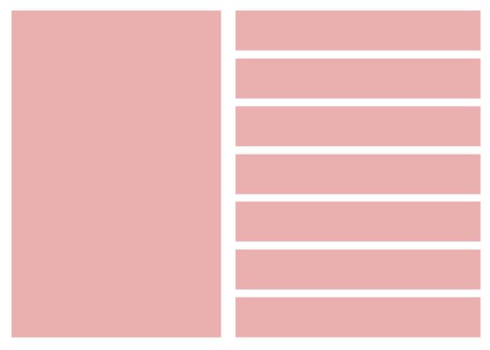
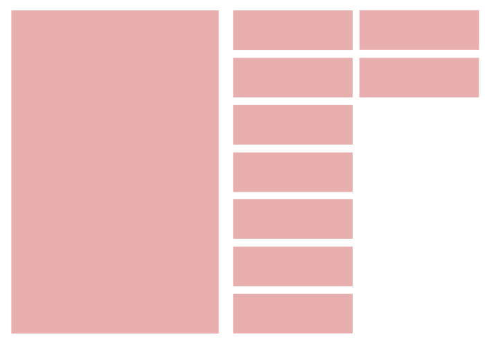
我想知道是否有可能实现这种事情(附图)。假设我有 7 个按钮,它们跨越声明的宽度,但是当我想添加其他元素或更多元素时,这些按钮应该缩小。是否可以仅使用 flex 或 grid 等 css 来实现此目的。我所能做的就是跨宽一个按钮,但是当我添加另一个按钮时,它会立即显示为内联并向其添加下一个按钮,而不是在下方。
最佳答案
使用flebox
关于 div 数量的技巧是:
        .right-side button:nth-last-child(8):first-child,
        .right-side button:nth-last-child(8):first-child ~ *{
           //set style if only when you have more then 7 buttons inside .right-side dive....
              else(less then 8) nothing will happend
        }
同时定位 8+ 的 div:
.right-side button:nth-child(n+8){
float: right;
position: relative;
top: calc(-100vh + (100vh / 7 - 1px));
}
完整代码如下:
    .wrap{
        display:flex;
        width:100%;
        height:100%;
    }
    .left-side,.right-side{
        width:50%;
        height:100vh;
        margin: 5px;
    }
    .left-side{
      background:pink;
    }
    .right-side{
   position: relative;
    }
    .right-side button{
     width:100%;
     height:calc(100vh / 7 - 1px);
     background:pink;

    }

    .right-side button:nth-last-child(n+8):first-child,
    .right-side button:nth-last-child(n+8):first-child ~ *{
     width:50%;
    }
    .right-side button:nth-child(n+8){
    float: right;
    position: relative;
    top: calc(-100vh + (100vh / 7 - 1px));
    }
<div class="wrap">
<div class="left-side"></div>
<div class="right-side">
<button></button>
<button></button>
<button></button>
<button></button>
<button></button>
<button></button>
<button></button>
<button></button>
<button></button>
</div>
</div>
<h1>Same style with 7 buttons</h1>
<div class="wrap">
<div class="left-side"></div>
<div class="right-side">
<button></button>
<button></button>
<button></button>
<button></button>
<button></button>
<button></button>
<button></button>
</div>
</div>关于html - 元素收缩和增长与CSS,我们在Stack Overflow上找到一个类似的问题: https://stackoverflow.com/questions/53810063/