<分区>
最佳答案
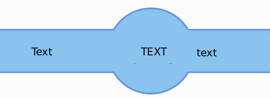
你可以用一个元素和 :before 和 :after 伪元素来做到这一点。
.el {
  position: relative;
  display: inline-block;
  text-align: center;
  line-height: 100px;
  background: #89C3EE;
  margin: 50px 150px;
  width: 100px;
  height: 100px;
  border: 3px solid #6295DC;
  border-radius: 50%;
}
.el:before,
.el:after {
  content: 'Text';
  position: absolute;
  height: 50px;
  line-height: 50px;
  width: 100px;
  top: 50%;
  transform: translateY(-50%);
  background: #89C3EE;
  border-top: 3px solid #6295DC;
  border-bottom: 3px solid #6295DC;
}
.el:before {
  width: 150px;
  left: -143px;
}
.el:after {
  right: -94px;
}
<div class="el">Text</div>关于html - CSS/HTML 复杂形状,我们在Stack Overflow上找到一个类似的问题: https://stackoverflow.com/questions/38770964/