我编写了一些简单的代码来监听“orientationchange”(Safari/iOS) 事件,然后尝试将 div 的大小调整为新的窗口方向/大小。
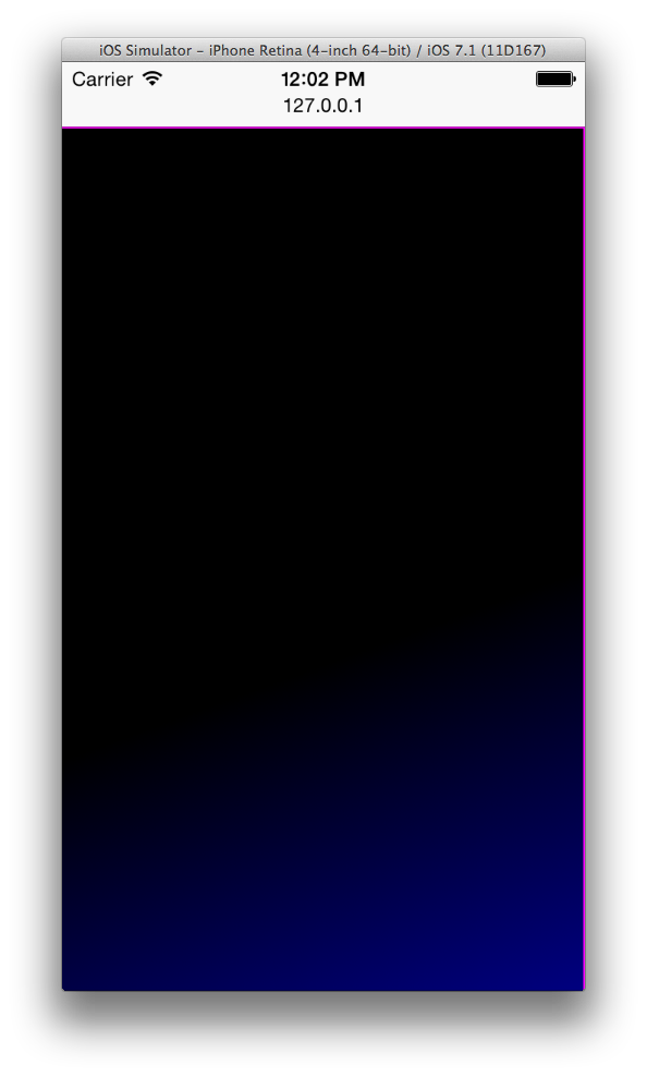
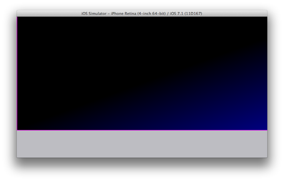
问题是调整大小和定位没有按照我预期的方式工作。我希望 div 调整大小(具有渐变背景)并填满屏幕。我附上了屏幕截图以突出显示问题。
如果有人能告诉我为什么我的代码不起作用,我将不胜感激。
我的测试是使用 Apple 的 iPhone 模拟器,打开 Safari(在模拟器上)并将其指向我的本地主机,其中包含以下测试代码:
<!DOCTYPE html>
<html>
<head>
<meta charset="utf-8">
<title>Div Resizing/positioning Test</title>

<meta name="apple-mobile-web-app-capable" content="yes">
<meta name="apple-mobile-web-app-status-bar-style" content="black">
<meta name="viewport" content="width=device-width, initial-scale=1.0, maximum-scale=1.0, minimum-scale=1.0, user-scalable=no, minimal-ui">

<script src="http://code.jquery.com/jquery-1.11.0.min.js"></script>
<style>
    .masterTemplate {
        position: absolute;
        left:0px;
        top:0px;
        background: -webkit-linear-gradient( -70deg, black 60%, navy );
        border: 1px solid magenta;
        overflow: hidden;
    }
</style>
</head>
<body>
<div id="masterTemplate"></div>
<script>
    $(document).ready( function() {

        console.log("document ready");

        window.addEventListener("orientationchange", onOrientationChange );

        $("#masterTemplate").css( { width:window.innerWidth, height:window.innerHeight } );
        $("#masterTemplate").addClass("masterTemplate");

        function onOrientationChange(event) {
            console.log('onOrientationChange',event);
            $("#masterTemplate").removeClass("masterTemplate");
            $("#masterTemplate").css({ width:window.innerWidth, height:window.innerHeight, top:"0px", left:"0px" });
            $("#masterTemplate").addClass("masterTemplate");
        }

     } );

</script>
</body>
</html>

最佳答案
这似乎不对... -> width:window.innerWidth, height:window.innerHeight。如果你只想给 div 窗口宽度和高度,为什么不通过 css 设置它呢?
width: 100%;
height: 100%;
关于javascript - 在 orientationchange 事件后调整 div 的大小/位置,我们在Stack Overflow上找到一个类似的问题: https://stackoverflow.com/questions/23608074/