我正在使用 Bootstrap 2.3.2 并想实现如下布局;
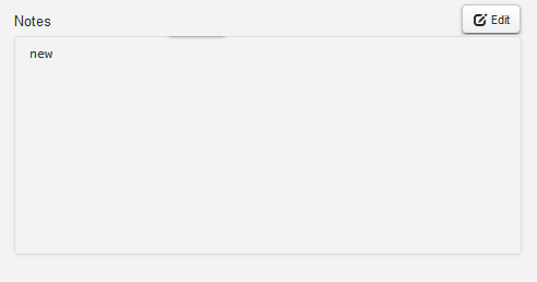
我如何更新下面的代码以实现相同的目的(基本上是将“编辑”按钮与标签“注释”右对齐);
<div class="control-group">
    <div class="row-fluid">
        <div><label for="Notes" class="control-label" style="text-align:left">Notes</label></div>
        <div><button class='btn btn-small editNotes globalNotes' src='' title='Edit notes'><i class="icon-edit"></i> Edit</button></div>
    </div>
    <div style="clear:both;">
        <div class="thumbnail clearfix" style="width:455px; height: 190px; overflow: auto">
            <span id="notesPanel"><pre id="notesTxt" style="border:none; background: none; display:inline;">new</pre></span>
        </div>
    </div>
</div>
最佳答案
您只需要添加在 Bootstrap 中定义的类,即 pull-left、pull-right
<label for="Notes" class="control-label pull-left">Notes</label>
<button class='btn btn-small editNotes globalNotes pull-right' src='' title='Edit notes'><i class="icon-edit"></i> Edit</button>
关于javascript - Bootstrap 自定义布局,我们在Stack Overflow上找到一个类似的问题: https://stackoverflow.com/questions/24777630/