是否可以像图片一样保持 iframe 的大小和位置?
浅灰色 View 是 iframe 的一个示例,该网站是响应式的,因此我需要根据图像设置 iframe 大小和位置(iframe 必须放置在 iphone 屏幕图像上)。 像那样:
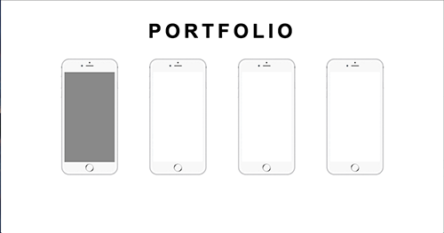
我试图将 iframe 固定到正确的位置,但是在更改页面大小时,它们不会以与 iphone 图像相同的方式跟随。
最佳答案
您可以使用 position: relative 和 position:absolute 然后计算屏幕在背景图片中的百分比位置。
div {
  float: left;
}
.phone {
  background: url(http://federicomalagoni.it/images/iphone6.png);
  background-size: contain;
  width: 100%;
  padding-bottom: 201.1848341%;
  height: 0;
  position: relative;
}
iframe {
  background: #000;
  z-index: 1;
  position: absolute;
  border: 0;
  width: 87.2%;
  height: 77.856%;
  top: 11.54%;
  left: 6.2%;
}
<div style="width:100px;">
<div class="phone"><iframe src="#"></iframe></div>
</div>
<div style="width:150px;">
<div class="phone"><iframe src="#"></iframe></div>
</div>
<div style="width:200px;">
<div class="phone"><iframe src="#"></iframe></div>
</div>关于html - iframe 大小根据图像,我们在Stack Overflow上找到一个类似的问题: https://stackoverflow.com/questions/33261600/