我正在构建一个类似于向导的订购流程,其中我有这个菜单:

事件页面为绿色(在本例中为模型)。
如何仅使用 CSS 制作此箭头?
目前我正在通过使用多个 div 和图像来实现我的目标:
<div class="menuItem">
<div></div> <!-- The left image -->
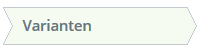
<div>Varianten</div>
<div></div> <!-- The right image -->
</div>
左图:
右图:
我找到了一个 SO answer,它完成了其中的一部分: Arrow Box with CSS ,但是我在处理左侧缩进时遇到了问题。
如果您对如何执行此操作有更好的想法,请告诉我!
最佳答案
如果箭头之间的空间不需要透明(它是纯色)你可以使用:before和:after 创建边缘(DOM 中没有新元素)
基本上,它会创建具有我们想要的边框的旋转正方形并相应地放置它们
#flowBoxes {
    margin:auto;
    padding:20px;
    min-width:700px;

}
#flowBoxes div {
    display:inline-block;
    position:relative;
    height:25px;
    line-height:25px;
    padding:0 20px;
    border:1px solid #ccc;
    margin-right:2px;
    background-color:white;
}

#flowBoxes div.right:after{
    content:'';
    border-top:1px solid #ccc;
    border-right:1px solid #ccc;
    width:18px;
    height:18px;
    position:absolute;
    right:0;
    top:-1px;
    background-color:white;
    z-index:150;

    -webkit-transform: translate(10px,4px) rotate(45deg);
       -moz-transform: translate(10px,4px) rotate(45deg);
        -ms-transform: translate(10px,4px) rotate(45deg);
         -o-transform: translate(10px,4px) rotate(20deg);
            transform: translate(10px,4px) rotate(45deg);
}

#flowBoxes div.left:before{
    content:'';
    border-top:1px solid #ccc;
    border-right:1px solid #ccc;
    width:18px;
    height:18px;
    position:absolute;
    left:0;
    top:-1px;
    background-color:white;
    z-index:50;

    -webkit-transform: translate(-10px,4px) rotate(45deg);
       -moz-transform: translate(-10px,4px) rotate(45deg);
        -ms-transform: translate(-10px,4px) rotate(45deg);
         -o-transform: translate(-10px,4px) rotate(20deg);
            transform: translate(-10px,4px) rotate(45deg);
}
#flowBoxes .active{
    background-color:green;
    color:white;
}
#flowBoxes div.active:after{
    background-color:green;
}
<div id="flowBoxes">
<div class="right">Diersoort / I&R</div>
<div class="left right active">Model</div>
<div class="left right">Varianten</div>
<div class="left right">Bedrukkingen</div>
<div class="left">Bevestiging</div>
</div>关于html - 如何仅在 CSS 中制作此箭头?,我们在Stack Overflow上找到一个类似的问题: https://stackoverflow.com/questions/35933252/