这是我第一次尝试创建一个完整的 html 页面。我在我的 MacBook 上开发它,它看起来不错。 Mac View :
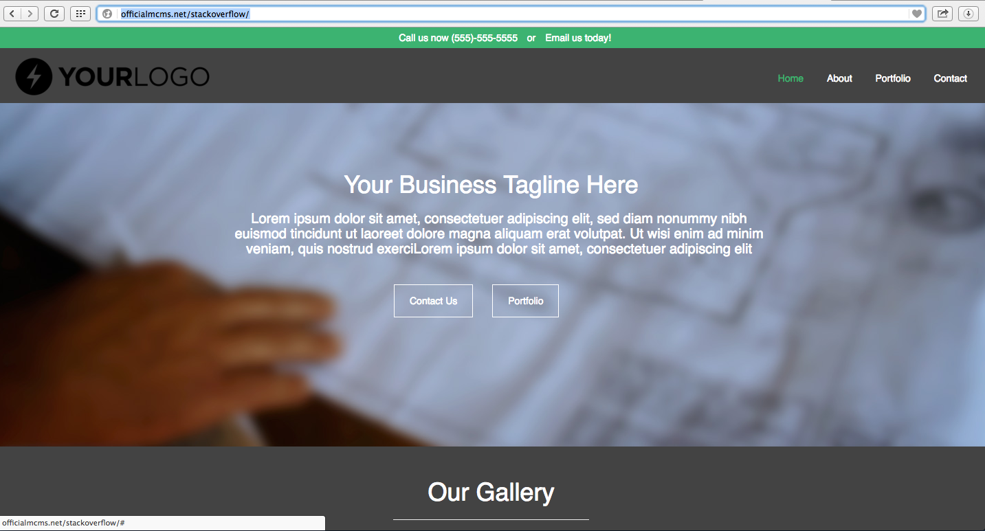
但是当我在桌面上查看它时,我看到:

(来源:gyazo.com)
我应该添加一些东西来调整更大的屏幕尺寸吗?在大屏幕上开发和在小屏幕上观看会更好吗?
代码如下:
*
{
    box-sizing: border-box;
    -moz-box-sizing: border-box;
    font-family: sans-serif;

    user-select: none;
    -webkit-user-select: none;
    -moz-user-select: none;
    -ms-user-select: none;
}

body
{
    margin: 0;
    background-color: #434343;
}

/* Topbar, above navbar */
.topbar
{
    width: 100%;
    height: 30px;
    background-color: #3cb371;
    padding: 0;
    position: fixed;
    top: 0;
    color: white;
    z-index: 2;
}

.topbar .links ul
{
    list-style-type: none;
    margin: 0;
    overflow: hidden;
    text-align: center;
}

.topbar .links ul li
{
    display: inline-block;
    padding: 5px 5px 0px 5px;
}

.topbar .links ul li a
{
    text-decoration: none;
    color: white;
    transition:color .4s ease-out;
    display: block;
    position: relative;
}

.topbar .links ul li a:hover
{
    color: #434343;
}

.topbar .links ul li a.active
{
    color: #3cb371;
}

.topbar .links ul li a.active:hover
{
    top: 0px;
}

.navbar
{
    width: 100%;
    height: 80px;
    background-color: #434343;
    padding: 0;
    position: fixed;
    top: 0;
    margin-top: 30px;
    color: white;
    z-index: 2;
}

.navbar .links
{
    margin-top: 23px;
    margin-right: 10px;
}

.navbar #brand
{
    width: 20%;
    height: 20%;
    margin-top: -10px;
    margin-left: 15px;
    position: relative;
}

.navbar #brand:hover
{
    margin-left: 25px;
    transition:margin-left .1s ease-out;
}

.navbar .links ul
{
    list-style-type: none;
    margin: 0;
    padding: 0;
    overflow: hidden;
    float: right;
}

.navbar .links ul li
{
    display: inline-block;
}

.navbar .links ul li a
{
    text-decoration: none;
    color: white;
    transition:color .4s ease-out;
    display: block;
    padding: 10px 15px;
    position: relative;
}

.navbar .links ul li a:hover
{
    color: #3cb371;
    top: -2px;
}

.navbar .links ul li a.active
{
    color: #3cb371;
}

.navbar .links ul li a.active:hover
{
    top: 0px;
}


/* jumbotron image */
.largeheading
{
    color: white;
    margin-top: 110px;
}

.largeheading h1
{
    margin-top: -400px;
    text-align: center;
    font-size: 35px;
}

.largeheading h3
{
    width: 800px;
    margin-left: 330px;
    text-align: center;
    font-size: 20px;
}

.largeheading .contact-btns
{
    display: inline-block;
    margin-left: 565px;
    margin-top: 25px;
    overflow: hidden;
}

.largeheading .contact-btns ul
{
    list-style-type: none;
    margin: 0;
    padding: 0;
    overflow: hidden;
}

.largeheading .contact-btns ul li
{
    display: inline-block;
    padding: 5px 12px 0px 12px;
}

.largeheading .contact-btns ul li a
{
    text-decoration: none;
    color: white;
    transition:color .6s ease-out;
    transition:border .5s ease-out;
    display: block;
    padding: 13px 22px;
    position: relative;
    border: 1.6px solid white;
    z-index: 1;
}

.largeheading .contact-btns ul li a:hover
{
    color: #333;
    border: 1.6px solid #3bc371;
}

.nextGallery
{
    color: white;
    margin-top: 230px;
    text-align: center;
}

.nextGallery hr
{
    width: 25%;
}

.gallery
{
    margin-top: 50px;
}

.gallery .container p
{
    margin-top: 15px;
    color: white;
}

.col-md-4 a:hover
{
    text-decoration: none;
}

.gallery li
{
    display: inline-block;
    padding: 5px 12px 0px 12px;
    overflow: hidden;
    z-index: 1;
}

.gallery li a
{
    text-decoration: none;
    color: white;
    transition:color .6s ease-out;
    transition:border .6s ease-out;
    display: block;
    padding: 13px 22px;
    position: relative;
    border: 1.6px solid white;
    z-index: 1;
}

.gallery li a:hover
{
    color: #3bc371;
    border: 1.6px solid #3bc371;
}

/*
.jumbotron img
{
    width: 100%;
    height: 500px;
}
*/
<!DOCTYPE html>
<html>
<head>
<link rel="stylesheet" href="https://maxcdn.bootstrapcdn.com/bootstrap/3.3.6/css/bootstrap.min.css"
integrity="sha384-1q8mTJOASx8j1Au+a5WDVnPi2lkFfwwEAa8hDDdjZlpLegxhjVME1fgjWPGmkzs7" crossorigin="anonymous">
<link rel="stylesheet" type="text/css" href="master.css" />
<title>Navbar attempt 1</title>
</head>
<body>
<div class="topbar">
<div class="links">
<ul>
<li>Call us now (555)-555-5555</li>
<li>or</li>
<li><a href="#">Email us today!</a></li>
</ul>
</div>
</div>
<div class="navbar">
<div class="links">
<a href="#"><img src="https://i.gyazo.com/e67b302b7b4ebb7695190d9835bba06b.png" id="brand"></a>
<ul>
<li class="active"><a href="#" class="active">Home</a></li>
<li><a href="about.html">About</a></li>
<li><a href="#">Portfolio</a></li>
<li><a href="#">Contact</a></li>
</ul>
</div>
</div>
<div class="largeheading">
<div class="img">
<img src="https://emcfinancial.com/wp-content/uploads/2015/05/plans_blurred.jpg" id="jumbotron-img">
</div>
<h1>Your Business Tagline Here</h1>
<h3>Lorem ipsum dolor sit amet, consectetuer adipiscing elit, sed diam nonummy nibh euismod tincidunt
ut laoreet dolore magna aliquam erat volutpat. Ut wisi enim ad minim veniam, quis nostrud exerciLorem ipsum dolor sit
amet, consectetuer adipiscing elit</h3>
<div class="contact-btns">
<ul>
<li><a href="#">Contact Us</a></li>
<li><a href="#">Portfolio</a></li>
</ul>
</div>
</div>
<div class="container">
<div class="nextGallery">
<h1>Our Gallery</h1>
<hr />
</div>
</div>
<div class="gallery">
<div class="container">
<div class="row">
<div class="col-md-4">
<a href="#">
<img src="http://www.placehold.it/350x350">
<p>Gallery item # 1 description here</p>
</a>
<center><li><a href="#">Portfolio</a></li></center>
</div>
<div class="col-md-4">
<a href="#">
<img src="http://www.placehold.it/350x350">
<p>Gallery item # 2 description here</p>
</a>
<center><li><a href="#">Portfolio</a></li></center>
</div>
<div class="col-md-4">
<a href="#">
<img src="http://www.placehold.it/350x350">
<p>Gallery item # 3 description here</p>
</a>
<center><li><a href="#">Portfolio</a></li></center>
</div>
</div>
</div>
</div>
<br>
<br>
<br>
</body>
</html>最佳答案
对于带图片的header,我建议你使用一个百分比作为它相对于导航栏的高度(看起来是掉出来的)。那么对于图像问题,你可以尝试这样做:
.img{
    width:100%;
}
关于html - 网站在笔记本电脑上看起来不错,但在台式机上却搞砸了,我们在Stack Overflow上找到一个类似的问题: https://stackoverflow.com/questions/38537496/