我的 3 列图像在移动设备上舍入像素时出现问题。
当然,在桌面上,图片只显示为 200px 宽,而在移动设备上,我将它们设置为 33%(我将其设置为 33.334%,以避免图片右侧出现大间隙)
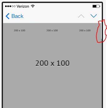
但是,我在右侧仍然有一个像素的间隙,我无法在移动设备上摆脱它。 Here's the pixel I'm talking about
谁能帮忙?
<style type="text/css">a {
  text-decoration: none !important;
  color: #666666;
}

html {
  height: 100%;
  width: 100%;
  margin: 0;
  padding: 0;
}

body {
  -webkit-text-size-adjust: none;
  -ms-text-size-adjust: none;
  -webkit-font-smoothing: antialiased;
  margin: 0 !important;
  padding: 0 !important;
  width: 100% !important;
  width: auto !important;
  background: #ffffff;
}

@media screen and (max-width: 600px) {
  *,
  *::before,
  *::after {
    box-sizing: border-box;
  }
  body {
    width: auto !important;
  }
  .rsd33,
  td.rsd33 img {
    width: 33.334%!important;
    height: auto!important;
  }
  .rsd,
  td.rsd img {
    width: 100%!important;
    height: auto!important;
  }
}

</style>
<html>
<head>
<meta http-equiv="Content-Type" content="text/html; charset=utf-8" />
<meta name="viewport" content="width=device-width, initial-scale=1.0" />
</head>
<body>
<table width="600" border="0" cellspacing="0" cellpadding="0" align="center" bgcolor="#FFFFFF" class="rsd">
<tbody>
<tr>
<td class="rsd">
<!--[if gte mso 9]>
<table width="100%" border="0" cellpadding="0" cellspacing="0" align="center">
<tr valign="top">
<td>
<![endif]-->
<table width="200" border="0" cellpadding="0" cellspacing="0" align="left" class="rsd33">
<tbody>
<tr>
<td class="rsd"><img src="http://image.e.bianco.com/lib/fe8a13727261017972/m/1/200x100.gif" width="200" height="" align="center" border="0" link="" /></td>
</tr>
</tbody>
</table>
<!--[if gte mso 9]>
</td>
</tr>
</table>
<![endif]-->
</td>
</tr>
</tbody>
</table>
</body>
</html>最佳答案
尝试使用 div 的完全混合方法。我已经重新编码了您的电子邮件中的一些内容,以添加我认为最有效的内容。如果您有任何问题,请告诉我。
我还删除了您的类,因此在 iOS 中,下面的代码将不依赖于媒体查询。
<html>

<head>
  <meta http-equiv="Content-Type" content="text/html; charset=utf-8" />
  <meta name="viewport" content="width=device-width, initial-scale=1.0" />


<style type="text/css">a {
  text-decoration: none !important;
  color: #666666;
}

html {
  height: 100%;
  width: 100%;
  margin: 0;
  padding: 0;
}

body {
  -webkit-text-size-adjust: none;
  -ms-text-size-adjust: none;
  -webkit-font-smoothing: antialiased;
  margin: 0 !important;
  padding: 0 !important;
  width: 100% !important;
  width: auto !important;
  background: #ffffff;
}

@media screen and (max-width: 600px) {
  *,
  *::before,
  *::after {
    box-sizing: border-box;
  }
  body {
    width: auto !important;
  }
  .rsd33,
  td.rsd33 img {
    width: 33.334%!important;
    height: auto!important;
  }
  .rsd,
  td.rsd img {
    width: 100%!important;
    height: auto!important;
  }
}

</style>

</head>

<body>
  <table width="600" border="0" cellspacing="0" cellpadding="0" align="center" bgcolor="#FFFFFF" class="rsd">
    <tbody>
      <tr>
        <td class="rsd" style="text-align: center; vertical-align: top; font-size: 0px; padding: 0px; width: 600px;">
          <!--[if gte mso 9]>
			<table width="100%" border="0" cellpadding="0" cellspacing="0" align="center">
				<tr valign="top">
					<td width="200">
		 <![endif]-->
         <div style="max-width: 200px;display: inline-block; vertical-align: top;">
          <table width="100%" border="0" cellpadding="0" cellspacing="0" align="left" class="">
            <tbody>
              <tr>
                <td><img src="http://image.e.bianco.com/lib/fe8a13727261017972/m/1/200x100.gif" height="" align="center" border="0" link="" style="width:100%;max-width:200px; height:auto;" /></td>
              </tr>
            </tbody>
          </table>
			</div>
          <!--[if gte mso 9]>
					</td>
					<td width="200">
					<![endif]-->
         <div style="max-width: 200px;display: inline-block; vertical-align: top;">
          <table width="100%" border="0" cellpadding="0" cellspacing="0" align="left" class="">
            <tbody>
              <tr>
                <td class=""><img src="http://image.e.bianco.com/lib/fe8a13727261017972/m/1/200x100.gif" height="" align="center" border="0" link="" style="width:100%;max-width:200px; height:auto;" /></td>
              </tr>
            </tbody>
          </table>
			</div>
          <!--[if gte mso 9]>
					</td>
				</tr>
			</table>
			<![endif]-->
        </td>
      </tr>
    </tbody>
  </table>
</body>

</html>
干杯
关于HTML 电子邮件 : 3 column images on mobile - Rounding down issue,我们在Stack Overflow上找到一个类似的问题: https://stackoverflow.com/questions/45056043/