在我的网站上,右侧有一个面板(图 1),单击按钮即可滑入和滑出。我已经设置了面板的尺寸,使其覆盖屏幕的整个高度。 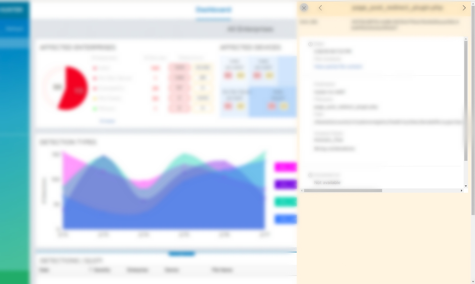
这是我用于此面板的 CSS-
slide-in-panel-component{ display:none; position: fixed;top: -10px; margin-right: 20px; height: 100vh; width:600px; right: -600px; background-color: #fff3e2;z-index:9999999}
当我更改屏幕尺寸(或在较小的屏幕上)时,我希望面板完整显示,但要根据屏幕尺寸进行调整,即它的高度应根据屏幕的高度而变化。
目前,如图 2 所示,如果我减小屏幕尺寸,它会越过面板并隐藏面板的某些组件。 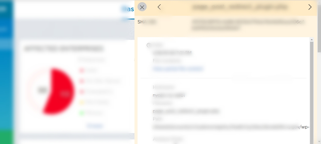
我尝试使用 position:fixed,设置 min-height 但无法获得所需的结果。
最佳答案
使用位置固定和顶部、右侧、底部属性。像这样:
.panel {
  position: fixed;
  right: 0px;
  top: 0px;
  bottom: 0px;
  width: 50%;
  background: green;
}
<div class="panel">
</div>关于html - 根据屏幕尺寸更改面板尺寸,我们在Stack Overflow上找到一个类似的问题: https://stackoverflow.com/questions/48874373/