我需要创建一个相当静态的页面,该页面分为多个区域,右侧有一个图像轮播(hcentered 和 vcentered) 这需要与浏览器非常兼容,所以 flexbox 不是一个真正的选择
这是我所追求的模型图像: Mockup
到目前为止,我的代码如下,但我一生都无法使右手图像居中和中间对齐:
$(function() {

  //	var exits = ['fadeOut', 'fadeOutDown', 'fadeOutUpBig', 'bounceOut', 'bounceOutDown', 'hinge',
  //				'bounceOutUp', 'bounceOutLeft', 'rotateOut', 'rotateOutUpLeft', 'lightSpeedOut', 'rollOut'];

  //	var entrances = ['fadeIn', 'fadeInDown', 'fadeInRight', 'bounceIn', 'bounceInRight', 'rotateIn',
  //					 'rotateInDownLeft', 'lightSpeedIn', 'rollIn', 'bounceInDown' ];

  var exits = ['fadeOut'];

  var entrances = ['fadeInRight'];


  var photos = $('#photos'),
    ignoreClicks = false;

  $('.arrow').click(function(e, simulated) {
    if (ignoreClicks) {

      // If clicks on the arrows should be ignored,
      // stop the event from triggering the rest
      // of the handlers

      e.stopImmediatePropagation();
      return false;
    }

    // Otherwise allo this click to proceed,
    // but raise the ignoreClicks flag

    ignoreClicks = true;

    if (!simulated) {
      // Once the user clicks on the arrows,
      // stop the automatic slideshow
      clearInterval(slideshow);
    }
  });

  // Listen for clicks on the next arrow
  $('.arrow.next').click(function(e) {

    e.preventDefault();

    // The topmost element
    var elem = $('#photos #innerdiv:last');

    // Apply a random exit animation
    elem.addClass('animated')
      .addClass(exits[Math.floor(exits.length * Math.random())]);

    setTimeout(function() {

      // Reset the classes
      elem.attr('class', '').prependTo(photos);

      // The animation is complate!
      // Allow clicks again:
      ignoreClicks = false;

    }, 10);
  });


  // Start an automatic slideshow
  var slideshow = setInterval(function() {

    // Simulate a click every 1.5 seconds
    $('.arrow.next').trigger('click', [true]);

  }, 1000);

});
/* https://tutorialzine.com/2013/02/animated-css3-photo-stack */
body {
/* overflow:hidden;*/
}
* {
box-sizing: border-box;
padding: 0;
margin: 0;
}
#photos {
/* margin:0 auto; */
/*position:relative; */
}
#photos .outerdiv {
position: relative;
}
#photos .middlediv {
/* position:absolute; */
/* display:inline-block; */
/* width:450px; */
/* height:450px; */
/* overflow:hidden; */
background-color: #fff;
z-index: 10;
border: 1px solid #aaa;
/* -webkit-animation-duration: 1s; */
-moz-animation-duration: 1s;
/* animation-duration: 1s; */
}
#photos .innerdiv {
/* position:absolute; */
/* top:0px; */
/* left:0px; */
/* right:0px; */
/* bottom:0px; */
width: 450px;
height: 450px;
background-size: cover;
background-position: center;
/*overflow:hidden;*/
/* width:400px; */
/* height:400px; */
position: absolute;
}
.lefttop {
grid-area: lefttop;
width: 50vw;
height: 33.3vh
}
.leftcenter {
grid-area: leftcenter;
width: 50vw;
height: 33.3vh
}
.leftbottom {
grid-area: leftbottom;
width: 50vw;
height: 33.3vh
}
.rightfull {
grid-area: rightfull;
width: 50vw;
}
.grid-container {
display: grid;
grid-template-areas: 'lefttop rightfull' 'leftcenter rightfull' 'leftbottom rightfull';
grid-gap: 1px;
background-color: #2196F3;
padding: 1px;
}
.grid-container>div {
background-color: rgba(255, 255, 255, 0.8);
text-align: center;
padding: 0px;
font-size: 30px;
}<script src="https://cdnjs.cloudflare.com/ajax/libs/jquery/3.3.1/jquery.min.js"></script>
<div class="grid-container">
<div class="lefttop">left top</div>
<div class="leftcenter">left center</div>
<div class="leftbottom">left bottom </div>
<div class="rightfull">
<div id="photos" class="outerdiv">
<div class="middlediv">
<div class="innerdiv" style="background-image:url(http://127.0.0.1:81/wordpress/wp-content/uploads/2018/08/20180823_132842-01-400x347.jpeg)"></div>
</div>
<div class="middlediv">
<div class="innerdiv" style="background-image:url(http://127.0.0.1:81/wordpress/wp-content/uploads/2018/07/20180806_162813-01-1-400x389.jpeg)"></div>
</div>
<div class="middlediv">
<div class="innerdiv" style="background-image:url(http://127.0.0.1:81/wordpress/wp-content/uploads/2018/08/20180820_153720-01-400x356.jpeg)"></div>
</div>
</div>
</div>
</div>理想情况下,我想使用网格或表格,但表格似乎不允许垂直合并单元格。 需要支持IE10及以上版本。
轮播中的图片应该是右侧栏的宽度或高度的百分比,以使其相对响应不同的屏幕尺寸。
我在 https://tutorialzine.com/2013/02/animated-css3-photo-stack 使用了照片轮播并稍微修改了代码和 javascript,因为我认为使用 div 比 UL 和 LI 更容易,但结果几乎相同。
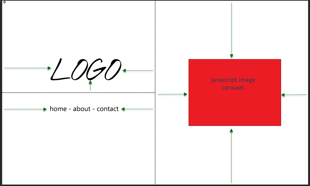
任何关于如何在没有太多脏修复的情况下实现这一目标的指导将不胜感激! 换句话说:
- 一个简单的页面,分为两个相等的列。
- 左栏应该有一个 Logo 和一些链接,它们与屏幕的中间水平线垂直间隔开。
- 右侧的列应为屏幕宽度的一半和整个屏幕的高度,图像轮播居中,列的中间具有自适应宽度和高度。
最佳答案
这是你的要求,我是基于你问题中的模拟图像,我希望这对你有帮助。
这是 HTML:
<div class="grid-container">
    <div class="lefttop">
        <h1>
            LOGO
        </h1>
    </div>
    <div class="leftbottom">
        <ul>
            <li>
                <a href="">home</a>
            </li>
            <li>
                <a href="">about</a>
            </li>
            <li>
                <a href="">contact</a>
            </li>
        </ul>
    </div>
    <div class="rightfull">
        <div id="photos" class="outerdiv">
            <div class="middlediv">
                <img class="innerdiv" src="https://picsum.photos/200/300/?random">
            </div>
            <div class="middlediv">
                <img class="innerdiv" src="https://picsum.photos/200/300/?random">
            </div>
            <div class="middlediv">
                <img class="innerdiv" src="https://picsum.photos/200/300/?random">
            </div>
        </div>
    </div>
</div>
还有 SCSS
/* https://tutorialzine.com/2013/02/animated-css3-photo-stack */

* {
    box-sizing: border-box;
    padding: 0;
    margin: 0;
}

html, body {
    height: 100%;
}
.grid-container {

    overflow: hidden;
    display: grid;
    height: 100% !important;
    grid-template-columns: repeat(2, 50%);
    grid-template-rows: repeat(2, 50%);
    background-color: #2196F3;

    & > div {
        background-color: rgba(255, 255, 255, 0.8);
        text-align: center;
        padding: 0px;
        // font-size: 30px;
    }

    .lefttop, .leftbottom {
        grid-column: 1;
    }
    .lefttop {
        &::before, & > h1 {
            display: inline-block;
            vertical-align: bottom;
        }
        &::before {
            content: '';
            height: 100%;
        }
        grid-row: 1;
        position: relative;
        h1 {
            font-size: 3rem;
           font-weight: 100;
        }
    }
    .leftbottom {
        grid-row: 2;
        ul {
            margin: 1rem auto;
            li {
                list-style: none;
                display: inline;

                &:not(:first-child):not(:last-child)::before {
                    content: '-';
                }
                &:not(:first-child):not(:last-child)::after {
                    content: '-';
                }

                a {
                    text-decoration: none;
                    color: inherit;
                }
            }
        }
    }
    .rightfull {
        grid-column: 2 / 3;
        grid-row: 1 / 3;
        position: relative;
        img {
            top: 0;
            left: 0;
            padding: 1rem;
            position: absolute;
            width: 100%;
            height: 100%;
            object-fit: cover;
        }
    }
}
https://jsfiddle.net/cisco336/wpfzL03k/1/
这是 MS Edge 截图

MS IE11 截图

关于html - 将屏幕拆分为网格并相对垂直和水平对齐元素,我们在Stack Overflow上找到一个类似的问题: https://stackoverflow.com/questions/53848570/