我无法使用 Bootstrap 4 将两张较小的图像放在一张较大的图像旁边。但是,我似乎无法将其中一张较小的图像与底部对齐,使其与较大的图像对齐。
网格应该像图像文本一样具有响应性。
感谢任何帮助。
<div class="container">
<div class="row">
<div class="col-md-6">
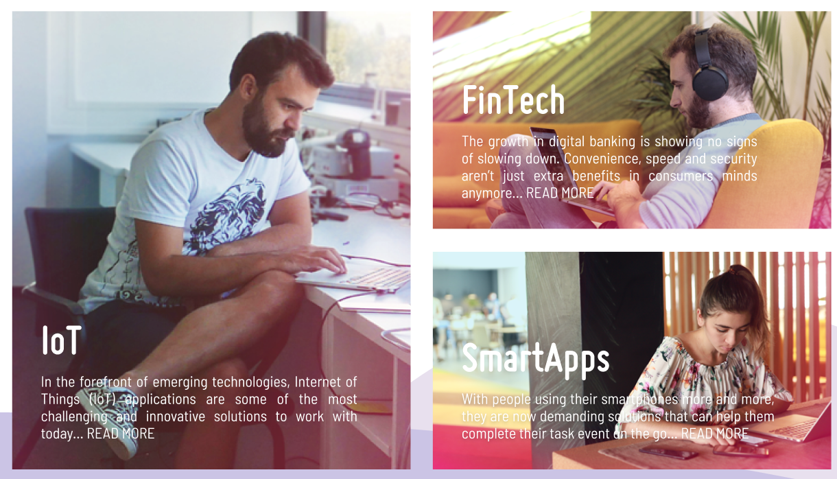
<img src="../assets/img/Iot.png" class="img-fluid">
<div class="carousel-caption text-justify" style="bottom: 0px;left: 10%;">
<h1 style="color:white !important">IoT</h1>
<p style="color:white !important">In the forefront of emerging technologies,
Internet of Things (IoT) applications are some of the most challenging and
innovative solutions to work with today... READ MORE</p>
</div>
</div>
<div class="col-md-6">
<div class="row">
<div class="col">
<img src="../assets/img/fintech.png" class="img-fluid">
<div class="carousel-caption text-justify" style="bottom: 0px;left: 10%;">
<h1 style="color:white !important">FinTech</h1>
<p style="color:white !important">The growth in digital banking is showing no
signs of slowing down. Convenience, speed and security aren’t just extra
benefits in consumers minds anymore... READ MORE</p>
</div>
</div>
</div>
<div class="row">
<div class="col">
<img src="../assets/img/smartapps.png" class="img-fluid">
<div class="carousel-caption text-justify" style="bottom: 0px;left: 10%;">
<h1 style="color:white !important">SmartApps</h1>
<p style="color:white !important">With people using their smartphones more and
more, they are now
demanding solutions that can help them complete their task event on the go…
READ MORE</p>
</div>
</div>
</div>
</div>
</div>
</div>
最佳答案
为每个图像添加了height和width
.big img{
height: calc(500px + 1.5em);
}

.small img{
  height:250px;
  width:100%
}
<link rel="stylesheet" href="https://maxcdn.bootstrapcdn.com/bootstrap/4.2.1/css/bootstrap.min.css">
<script src="https://ajax.googleapis.com/ajax/libs/jquery/3.3.1/jquery.min.js"></script>
<script src="https://cdnjs.cloudflare.com/ajax/libs/popper.js/1.14.6/umd/popper.min.js"></script>
<script src="https://maxcdn.bootstrapcdn.com/bootstrap/4.2.1/js/bootstrap.min.js"></script>
<div class="container">
<div class="row">
<div class="col-md-6 big">
<img src="https://www.w3schools.com/w3css/img_lights.jpg" class="img-fluid">
<div class="carousel-caption text-justify" style="bottom: 0px;left: 10%;">
<h1 style="color:white !important">IoT</h1>
<p style="color:white !important">In the forefront of emerging technologies,
Internet of Things (IoT) applications are some of the most challenging and
innovative solutions to work with today... READ MORE</p>
</div>
</div>
<div class="col-md-6">
<div class="row small">
<div class="col">
<img src="https://www.w3schools.com/w3css/img_lights.jpg" class="img-fluid">
<div class="carousel-caption text-justify" style="bottom: 0px;left: 10%;">
<h1 style="color:white !important">FinTech</h1>
<p style="color:white !important">The growth in digital banking is showing no
signs of slowing down. Convenience, speed and security aren’t just extra
benefits in consumers minds anymore... READ MORE</p>
</div>
</div>
</div>
<div class="row mt-4 small">
<div class="col">
<img src="https://www.w3schools.com/w3css/img_lights.jpg" class="img-fluid">
<div class="carousel-caption text-justify" style="bottom: 0px;left: 10%;">
<h1 style="color:white !important">SmartApps</h1>
<p style="color:white !important">With people using their smartphones more and
more, they are now
demanding solutions that can help them complete their task event on the go…
READ MORE</p>
</div>
</div>
</div>
</div>
</div>
</div>关于html - 如何在嵌套列中将行底部对齐?,我们在Stack Overflow上找到一个类似的问题: https://stackoverflow.com/questions/54531468/