我在将我的 div 置于容器中心时遇到了一点问题。我尝试了所有我能找到的东西,但问题仍然存在。 目标是将绿色框放在黄色框的中间。它应该是响应式的。主要问题是 float 框未居中。
我也不明白为什么黄色空间仍然存在于小 View 中。绿色框应该覆盖整个地方(下面的示例看起来很奇怪)。
body,html{
  width:100%;
  height:100%;

}

#hans{
  background:red;
  width:50rem;
  height:28%;
  display:table;


}

.test-center{
  height:30rem;
  width:90vw;
  display: block;
  margin: 0 auto;
  background: yellow;
}


.content-block{
  background: green;
  width:45rem;
  height:90%;
  margin-left:1%;
  5margin-top: 8rem;
  display: inline-block;
  5padding-top:2rem;

}
<!DOCTYPE html>
<html lang="en">
<head>
<meta charset="UTF-8">
<meta name="viewport" content="width=device-width, initial-scale=1.0">
<link rel="stylesheet" href="https://maxcdn.bootstrapcdn.com/bootstrap/3.3.7/css/bootstrap.min.css" integrity="sha384-BVYiiSIFeK1dGmJRAkycuHAHRg32OmUcww7on3RYdg4Va+PmSTsz/K68vbdEjh4u" crossorigin="anonymous">
<link href="https://fonts.googleapis.com/css?family=Roboto:300" rel="stylesheet">
<link href="test.css" rel="stylesheet">
<!--TzITT-->
<title>Test right site</title>
</head>
<body>
<div class="container" id="hans">
<div class= "test-center">
<div class = "content-block">
<p>fwfwf</p>
</div>
<div class = "content-block">
<p>fwfwf</p>
</div>
<div class = "content-block">
<p>fwfwf</p>
</div>
</div>
</div>
<div class = "footer">
</div>
</body>
</html> 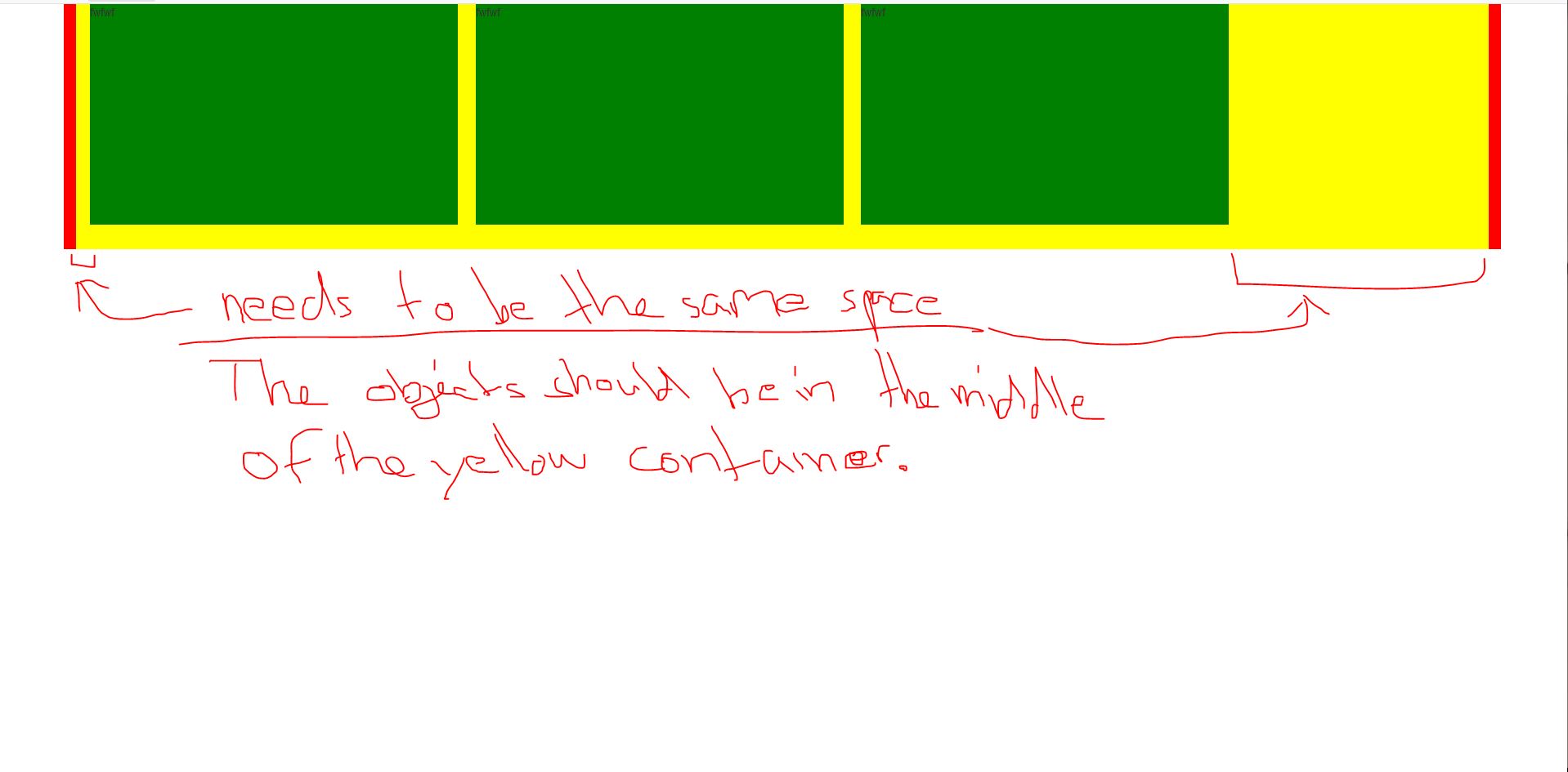
最佳答案
body,html{
  width:100%;
  height:100%;

}

#hans{
  background:red;
  width:50rem;
  height:28%;
  display:table;


}

.test-center{
  height:30rem;
  width:90vw;
  display: block;
  margin: 0 auto;
  background: yellow;
  display:flex;
  justify-content:center;
  align-items:center;
}


.content-block{
  flex:1;
  background: green;
  height:90%;
  display: inline-block;
  margin:1%;
}

@media screen and (max-width:728px){
  .test-center {
    flex-direction:column;
  }

  .content-block{
    width:100%;

  }
}
<!DOCTYPE html>
<html lang="en">
<head>
<meta charset="UTF-8">
<meta name="viewport" content="width=device-width, initial-scale=1.0">
<link rel="stylesheet" href="https://maxcdn.bootstrapcdn.com/bootstrap/3.3.7/css/bootstrap.min.css" integrity="sha384-BVYiiSIFeK1dGmJRAkycuHAHRg32OmUcww7on3RYdg4Va+PmSTsz/K68vbdEjh4u" crossorigin="anonymous">
<link href="https://fonts.googleapis.com/css?family=Roboto:300" rel="stylesheet">
<link href="test.css" rel="stylesheet">
<!--TzITT-->
<title>Test right site</title>
</head>
<body>
<div class="container" id="hans">
<div class= "test-center">
<div class = "content-block">
<p>fwfwf</p>
</div>
<div class = "content-block">
<p>fwfwf</p>
</div>
<div class = "content-block">
<p>fwfwf</p>
</div>
</div>
</div>
<div class = "footer">
</div>
</body>
</html>关于html - 将一排 div 在容器中居中,我们在Stack Overflow上找到一个类似的问题: https://stackoverflow.com/questions/54736759/