我正在尝试使用 Bootstrap 流体行作为显示表,这样我就可以将子 span 从上到下居中。
注意:我不会知道行的高度或跨度的高度,也不想使用 JavaScript。
这是 html:
<div class="container-fluid">
    <div class="row-fluid vCenterParent">
        <div class="span6 left-style vCenterChild">
            <div>Left Side</div>
            <div>Left Side</div>
            <div>Left Side</div>
            <div>Left Side</div>
        </div>

        <div class="span6 right-style vCenterChild">
            <div>Right Side</div>
        </div>
    </div>
</div>
这是 CSS:
.left-style {
    background-color: green;
}

.right-style {
    background-color: blue;
}

.vCenterParent {
    display: table !important;
}

.vCenterChild {
    display: table-cell !important;
    vertical-align: middle;
}
这是 JSFiddle:http://jsfiddle.net/rsparrow/q2Ted/
(注意:运行演示的浏览器窗口需要至少 750px 以防止响应式设计启动)
我希望绿色和蓝色框在行内从上到下居中。
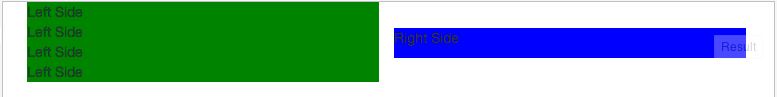
现在看起来像这样:

我希望它看起来像这样:
最佳答案
为此你需要使用 jquery..
$(document).ready(function() {
var ver_top = ($(window).height() - $('#left').height()) / 2;
$('#left').css( "margin-top", ver_top+'px' );

var ver_top2 = ($(window).height() - $('#right').height()) / 2;
$('#right').css( "margin-top", ver_top2+'px' );

$(window).resize(function(){
    var ver_top = ($(window).height() - $('#left').height()) / 2;
    $('#left').css( "margin-top", ver_top+'px' );

    var ver_top2 = ($(window).height() - $('#right').height()) / 2;
    $('#right').css( "margin-top", ver_top2+'px' );
});
});
HTML代码
<div class="container-fluid">
  <div class="row-fluid">
    <div id="left" class="span6" style="background: red;">
       <div>Left Side</div>
        <div>Left Side</div>
        <div>Left Side</div>
        <div>Left Side</div>
    </div>
    <div id="right" class="span6" style="background: blue;">
      right side
    </div>
</div>
bootply 链接在这里 http://bootply.com/88320
关于html - Bootstrap 行流体显示 : table with vertical-align?,我们在Stack Overflow上找到一个类似的问题: https://stackoverflow.com/questions/19416472/