( fiddle 链接:https://jsfiddle.net/xdo6u5p6/1/)
我很难将搜索栏放入我的默认导航栏,而不会在调整大小时完全弄乱格式。在桌面 View 中,我的标题看起来像这样:

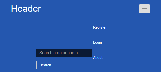
现在,如果我要将窗口宽度调整得足够小(或转到移动设备)。标题看起来像:

搜索栏将列表项踢到下一行,看起来很丑陋。更糟糕的是,如果我将其调整到菜单折叠的程度:
问题的根本原因是我的 form-inline,因为没有那个搜索栏,标题就可以正常工作。如何让标题将所有内容都放在一行中直到它折叠,然后将搜索栏正确对齐折叠窗口中的某处?我最初的猜测是将内联表单的 margin-left 设置为 70 是问题的重要组成部分,但我不希望表单紧挨着横幅。这是 html:
<div class="navbar navbar-default">
  <div class="container-fluid">
    <div class="navbar-header">
      <button type="button" class="navbar-toggle" data-toggle="collapse" data-target="#header">
        <span class="icon-bar"></span>
        <span class="icon-bar"></span>
        <span class="icon-bar"></span>
      </button>
      <a href="../index.html" class="navbar-brand">Highli.ne</a>
    </div>
    <div class="collapse navbar-collapse" id="header">
      <form class="form-inline">
        <div class="form-group">
          <input type="text" class="form-control" id="search" placeholder="Search area or name" />
        </div>
        <button type="submit" class="btn btn-default">Search</button>
      </form>
      <ul class="nav navbar-nav navbar-right">
        <li><a href="register.html">Register</a></li>
        <li><a href="login.html">Login</a></li>
        <li><a href="about.html">About</a></li>
      </ul>
    </div>
  </div>
</div>
和CSS:
/* header -- begin */
.navbar-default {
    z-index: 1;
    background-color: #2457af;
    border-radius: 0;
    border-style: none;
    position: fixed;
    left: 0;
    right: 0;
    margin: 0 auto 0 auto;
    padding: 10px 30px;
}

.navbar-header .navbar-brand,
.navbar-header .navbar-brand:hover {
    color: white;
    text-decoration: none;
    font-size: 36px;
}

.navbar-default .form-inline {
    display: inline-block;
    margin-top: 10px;
    margin-left: 100px;
}

.navbar-default .form-control {
    background-color: rgba(0,0,0,0.7);
    border-style: none;
    border-radius: 0;
    font-size: 16px;
    color: white;
}

.navbar-default .btn-default {
    border-radius: 0;
    display: inline;
    background-color: rgba(0,0,0,0);
    color: white;
}

.navbar-default .navbar-nav {
    list-style: none;
    display: inline-block;
}

.navbar-default .navbar-nav li {
    display: inline;
    padding: 0 10px;
}

.navbar-default .navbar-nav li a {
    color: white;
}

.navbar-default .navbar-nav li a:hover {
    color: white;
    text-decoration: underline;
}
/* header -- end */
最佳答案
我在Bootstrap网站上看到有同样的例子。请尝试将您的代码修改为以下内容,更改仅从表单元素中删除类 .form-inline 并添加另外 2 个类 .navbar-form 和 .navbar-left
<form class="navbar-form navbar-left">
  <div class="form-group">
    <input type="text" class="form-control" id="search" placeholder="Search area or name" />
  </div>
</form>
关于html - 带搜索栏的 Bootstrap 可折叠导航栏 : form-inline does not scale well with resizing,我们在Stack Overflow上找到一个类似的问题: https://stackoverflow.com/questions/38287444/