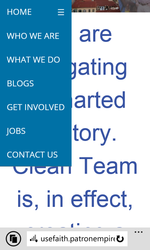
我做了一个menu在卷轴上变得粘稠。 问题是在高度较小的屏幕(例如移动设备)上无法完全看到菜单,因为它比您在下图中看到的高度长得多。

但在更长的移动屏幕上,菜单可以完全看到
这是用来制作菜单并使其粘在滚动条上的代码
CSS
/* Remove margins and padding from the list, and add a black background color */
ul.topnav {
    list-style-type: none;
    margin:0 auto; /* pour centrer le menu */
    padding: 0;
    overflow:hidden;

    background-color: #FFF;
     text-align: center;
     width:1400px; /* pour centrer le menu */
     max-width:100%;
     max-width:100%;
}

/* Float the list items side by side */
ul.topnav li {float: left;    }

/* Style the links inside the list items */
ul.topnav li a {
    display: inline-block;
    color: #0071a6;
    text-align: center;

    padding: 14px 16px;
    text-decoration: none;
    transition: 0.3s;
     font-family: 'Open Sans', sans-serif;
    font-size: 20px;
    transition: all .2s ease-in-out;
    width:185px; /* Pour centrer le menu */
}

/* Change background color of links on hover */
ul.topnav li a:hover {
    background-color: #0071a6;
    color:#FFF;
    transform: scale(1.1);
    }

/* Hide the list item that contains the link that should open and close the topnav on small screens */
ul.topnav li.icon {display: none;}


/*
##############################################################################
Add media query
*/


@media screen and (max-width:768px) {
  ul.topnav li:not(:first-child) {display: none;}
  ul.topnav li.icon {
    float: right;
    display: inline-block;
  }

  ul.topnav li a {
      width:auto;
  }

  ul.topnav {
      width:auto;
  }
}

/* The "responsive" class is added to the topnav with JavaScript when the user clicks on the icon. This class makes the topnav look good on small screens

Normalement @media screen and (max-width:768px)

*/
@media screen and (max-width:768px) {
  ul.topnav.responsive {position: relative;}
  ul.topnav.responsive li.icon {
    position: absolute;
    right: 0;
    top: 0;
  }
  ul.topnav.responsive li {
    float: none;
    display: inline;
  }
  ul.topnav.responsive li a {
    display: block;
    text-align: left;
  }

  ul.topnav li a {
      width:auto;
  }


  ul.topnav {
      width:auto;
  }

}


/*

Pour le menu sticky
*/


.menu {

 }

.menu-padding {

    padding-top:0px;
}

.sticky {
    position:fixed;
    top:0;
    z-index:1;
    overflow:hidden;


}

.sticky ul.topnav {
    background-color:#0071a6;
    border-bottom: 1px solid #666;

    /*
    border: 1px solid #FFFFFF;
    */

}

.sticky ul.topnav li a {
    color:#FFF;
}
Javascript 和 Jquery
/* Toggle between adding and removing the "responsive" class to topnav when the user clicks on the icon */
function myFunction() {
    document.getElementsByClassName("topnav")[0].classList.toggle("responsive");
}

/*
Jquery to make the menu sticky on scroll
*/

$(document).ready(function () {

    var menu = $('.menu');
    var origOffsetY = menu.offset().top;

    function scroll() {
        if ($(window).scrollTop() >= origOffsetY) {
            $('.menu').addClass('sticky');
            $('.content').addClass('menu-padding');
        } else {
            $('.menu').removeClass('sticky');
            $('.content').removeClass('menu-padding');
        }


    }

    document.onscroll = scroll;

});
HTML
<div class="menu">
<ul class="topnav">
<li><a href="#home">HOME</a></li>
<li><a href="#news">WHO WE ARE </a></li>
<li><a href="#contact">WHAT WE DO</a></li>
<li><a href="#about">BLOGS</a></li>
<li><a href="#about">GET INVOLVED</a></li>
<li><a href="#about">JOBS</a></li>
<li><a href="#about">CONTACT US</a></li>
<li class="icon">
<a href="javascript:void(0);" onclick="myFunction()">☰</a>
</li>
</ul>
</div>
问题: 如何让粘性菜单在屏幕上滚动高度小,到达正常位置后不再粘性固定?
最佳答案
如果菜单显示在小屏幕上,您似乎希望菜单本身可以滚动。
试试这个:
.menu {
  max-height:100vh;
  overflow-y:auto;
}
除非菜单大于屏幕,否则它不会执行任何操作。或者,使用媒体查询重新设计一开始就不会被 chop 的移动版菜单(在这种情况下,减少链接上的填充可能会做到这一点)。
关于javascript - 如何根据高度在较小的屏幕上滚动粘性菜单,我们在Stack Overflow上找到一个类似的问题: https://stackoverflow.com/questions/38546962/