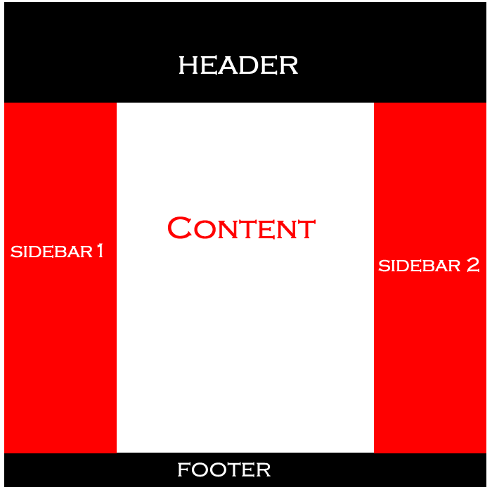
我正在尝试使用双侧栏设计布局样式。左栏和右栏。我试过用下面的 html/css 解决它。下面是有人可以帮助我的代码。 example of the layout
下面的 CSS 代码
    #wrap {
      margin: auto;
      position: relative;
      width: 700px;
      border: 3px solid black;
      background-color: grey;
      height: 700px;
      padding: 10px
    }

    #header {
      margin: auto;
      background-color: white;
      height: 70px;
      padding: 10px;
    }

    #left {
      margin: auto;
      width: 150px;
      height: 70%;
      background-color: white;
      float: left;
      padding: 10px;
    }

    #content{
      background-color: red;
    }

    #right {
      margin: auto;
      width: 150px;
      height: 70%;
      background-color: white;
      float: right;
      padding: 10px;
    }

    #footer {
      margin: auto;
      height: 10%;
      background-color: blue;
      padding: 10px;
    }
这是 HTML
    <div id="wrap">
        <div id="header">
        <p>header will be here</p>
        </div>
        <div id="left">
            <ul>
              <li><a href="#">Link 1</a></li>
              <li><a href="#">Link 2</a></li>
              <li><a href="#">Link 3</a></li>
            </ul>
        </div>
        <div id="content">
            content here
        </div>
        <div id="right">
            <p> name and address here</p>
        </div>
        <div id="footer">
            <p> copyright </p>
        </div>

    </div>
最佳答案
这就是所谓的 chalice 布局,它很容易用 Flexbox 解决
#wrap {
  margin: auto;
  position: relative;
  width: 90%;
  border: 3px solid black;
  background-color: grey;
  height: 700px;
  padding: 10px;
  display: flex;
  flex-direction: column;
}
#header {
  background-color: pink;
  height: 70px;
  padding: 10px;
}
.center {
  flex: 1;
  display: flex;
}
#left {
  width: 150px;
  background-color: goldenrod;
  padding: 10px;
}
#content {
  background-color: red;
  flex: 1
}
#right {
  width: 150px;
  background-color: #c0ffee;
  padding: 10px;
}
#footer {
  height: 10%;
  background-color: blue;
  padding: 10px;
}
<div id="wrap">
<div id="header">
<p>header will be here</p>
</div>
<div class="center">
<div id="left">
<ul>
<li><a href="#">Link 1</a>
</li>
<li><a href="#">Link 2</a>
</li>
<li><a href="#">Link 3</a>
</li>
</ul>
</div>
<div id="content">
content here
</div>
<div id="right">
<p>name and address here</p>
</div>
</div>
<div id="footer">
<p>copyright</p>
</div>
</div>关于html - 如何使用双侧边栏设置 html 布局的样式,我们在Stack Overflow上找到一个类似的问题: https://stackoverflow.com/questions/38746004/