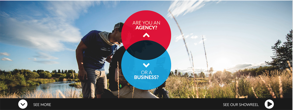
我正在使用骨架网格和重置 CSS 设计网站样式。我在每一页的顶部都有一张图片,每张图片的底部都有一小部分,两端都有一些文字和一个图标,我似乎无法正确定位。这就是它应该看起来的样子 -
这是我的编码版本 -
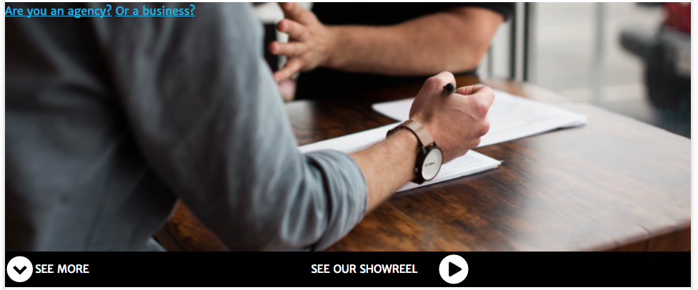
(背景图片不同,代理/商家图片待补充) 我似乎根本无法让 showreel 文本/图标移动,我不确定是因为我正在使用的网格还是我自己的代码。这是我到目前为止所拥有的 -
HTML
<section id="home">

        <a href="agency.html">Are you an agency?</a>
        <a href="business.html">Or a business?</a>

        <div class="container showreel">
            <div class="seemore">
                <span class="fa-stack fa-lg">
                    <i class="fa fa-circle fa-stack-2x" style="color:#fff"></i>
                    <i class="fa fa-chevron-down fa-stack-1x" style="color: #000000;"></i>
                </span>
                <p>SEE MORE</p>
            </div>
            <div class="seeour">
                <p>SEE OUR SHOWREEL</p>
                <i class="fa fa-play-circle fa-3x" aria-hidden="true"></i>
            </div>
        </div>
    </section>
CSS
body {
  width: 960px;
  margin: 0 auto 0 auto;
  box-shadow: 0 0 10px rgba(0, 0, 0, 0.25);
}

.container {
    margin: auto;
    padding-left: 10px;
    padding-right: 10px;
}

/* HOME PAGE */

section#home {

    height: 400px;
    max-width: 100%;
    background: url(../images/homepagemain.jpg) center center no-repeat;
    background-size: 960px;
    background-position: center;
    overflow: hidden;

    position: relative;
}


.showreel {
  height: 50px;
  width: 960px;
  position: absolute;
  background-color: black;
  bottom: 0;
  padding: 0 30px;
  justify-content: space-between;
}

.showreel, .showreel > div {
  display: flex;
  align-items: center;
}

.showreel p {
  font-size: 15px;
  font-weight: normal;
  margin: 0;
  color: #ffffff;
}

.showreel i {
  color: #ffffff;
}

.seemore i {
  margin-right: 30px;
}

.seeour i {
  margin-left: 30px;
}
最佳答案
我已经记录了我在源代码中应用的所有更改。
* {
  box-sizing: border-box;
}

body {
  width: 960px;
  margin: 0 auto 0 auto;
  box-shadow: 0 0 10px rgba(0, 0, 0, 0.25);
}

.container {
  margin: 0 auto; /* Changed from auto */
  padding-left: 10px;
  padding-right: 10px;
}


/* HOME PAGE */

section#home {
  height: 400px;
  max-width: 100%;
  width: inherit; /* Added */
  background: url(http://placehold.it/960x400) center center no-repeat;
  background-size: inherit; /* Changed from 960px */
  background-position: center;
  overflow: hidden;
  position: relative;
}

.showreel {
  display: flex; /* Added */
  color: white; /* Added */
  align-items: center; /* Added */
  height: 50px;
  width: inherit; /* Changed from 960px */
  position: absolute;
  background-color: black;
  bottom: 0;
  /* padding: 0 30px; */
  justify-content: space-between;
}
/* Added */
.seeour {
  display: flex;
  align-items: center;
}
/* Added */
.seeour > span {
  margin-right: 1em;
}
<link href="https://maxcdn.bootstrapcdn.com/font-awesome/4.7.0/css/font-awesome.min.css" rel="stylesheet" />
<section id="home">
<a href="agency.html">Are you an agency?</a>
<a href="business.html">Or a business?</a>
<div class="container showreel">
<div class="seemore">
<span class="fa-stack fa-lg">
<i class="fa fa-circle fa-stack-2x" style="color:#fff"></i>
<i class="fa fa-chevron-down fa-stack-1x" style="color: #000000;"></i>
</span>
<!-- Changed from <p> to <span> -->
<span>SEE MORE</span>
</div>
<div class="seeour">
<!-- Changed from <p> to <span> -->
<span>SEE OUR SHOWREEL</span>
<i class="fa fa-play-circle fa-3x" aria-hidden="true"></i>
</div>
</div>
</section>关于html - CSS - 在容器中定位不同的元素,我们在Stack Overflow上找到一个类似的问题: https://stackoverflow.com/questions/44878322/