<分区>
javascript - 如何使用jquery根据屏幕宽度更改div的类
我在我的 HTML 页面上展示产品。有些产品有大细节,有些有小细节。当我展示那些产品时,具有较大细节的产品的 div 比具有较小细节的产品具有更高的高度。为解决此问题,我将高度分配给 div,但它不起作用,因为当我在移动 View 中打开我的页面时,产品的详细信息从其 div 溢出。然后我尝试使用媒体查询更改 div 的类:如果宽度 < 991px 将 col-md-6 更改为 col-md-12。我使用 jquery 进行了此更改,但它只影响第一个 div。
这个问题的标准解是什么?。

$(window).resize(function() {
  if ($(window).width() < 991) {
    alert("window");
    $( "product612" ).removeClass( "col-md-6" ).addClass( "col-md-12" );
    $("product612").toggleClass('col-md-6 col-md-12');
  }
});
.product{
background-color: rgba(92, 90, 90, 0.096);
word-wrap:break-word;
position: relative;
text-align: center;
padding: 40px 20px;
margin: 15px 0px;
height: 433.4px !important;
}
.product:after {
content: "";
background-color: rgba(2, 2, 2, 0.781);
position: absolute;
left: 0;
top: 0;
bottom: 0;
width: 0%;
z-index: -1;
-webkit-transition: 0.2s width;
transition: 0.2s width;
}
.product:hover p{
color: white !important;
}
.product:hover:after
{
width: 100%;
height: auto;
}
.product p{
color: rgb(80, 80, 80) !important;
font-size: 17px;
line-height: 18px;
font-weight: 500;
font-family: Avant Garde, Avantgarde, Century Gothic, CenturyGothic, AppleGothic, sans-serif;
}
.product>img {
height: 150px;
width: 250px;
margin: 0px auto 12px auto;
margin-left: auto;
border-radius: 15%;
}<div class="container" >
<div class="row">
<div class="section-header text-center" >
<h1 class="glow title">Products</h1>
</div>
{% for product in products %}
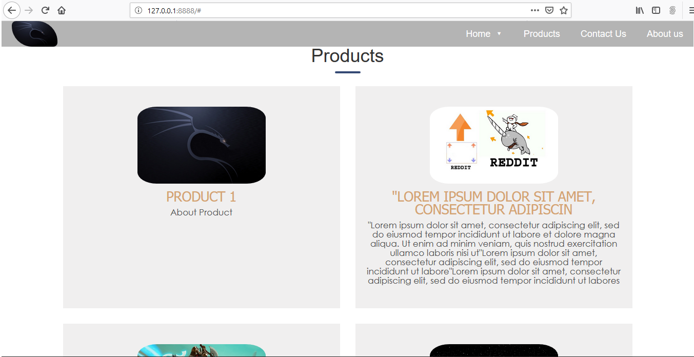
<div id="product612" class="col-md-6 col-sm-12 col-xs-12">
<div class="product">
<img src="{{product.image.url}}" class="img-responsive " alt="product picture">
<h4>{{product.name}}</h4>
<p>{{product.detail}}</p><br>
</div>
</div>
{% endfor %}
</div>
</div>最佳答案
在回答您实际提出的问题之前的两件事:
- Bootstrap 的网格系统应该可以避免做这样的事情,所以你可能想发布一个带有 MCVE 的新问题。了解您正在做什么,并询问如何避免更改
col-md-x类。 id必须在文档中是唯一的,因此这是您需要解决的第一件事。
虽然回答了您提出的问题:
你说过:
i made this change using jquery but it only affect the first div.
但是你展示的代码使用了
$( "product612" ).removeClass( "col-md-6" ).addClass( "col-md-12" );
$("product612").toggleClass('col-md-6 col-md-12');
这不会做任何事情,因为 $("product612") 不会匹配任何东西(你的意思是 $("#product612"),我猜如果你看到一个变化,你一定在某个时候使用过它)。
使用类代替 id,然后在您的 resize 函数中:
$(window).resize(function() {
  var isNarrow = $(window).width() < 991;
  $(".the-class")
      .toggleClass("col-md-6", !isNarrow)
      .toggleClass("col-md-12", isNarrow);
});
您可能会使用 matchMedia而不是为此 resize 所以你只在大小变化真正重要时运行你的回调而不是每次微小的调整大小变化,例如:
(function() {
    function widthUpdate(mqle) {
          $(".the-class")
              .toggleClass("col-md-6", !mqle.matches)
              .toggleClass("col-md-12", mqle.matches);
    }
    var mql = window.matchMedia('(max-width: 990px)');
    mql.addListener(widthUpdate);
    widthUpdate(mql);
})();
当您第一次连接时它不会触发监听器,因此您必须手动执行此操作。
(考虑到 Pete 识别的 duplicate 和 Bootstrap 的东西,我一开始删除了它。但后来决定可能它 对以后的人有用。不想不过,从中获得任何代表,所以我将其标记为社区 Wiki。)
关于javascript - 如何使用jquery根据屏幕宽度更改div的类,我们在Stack Overflow上找到一个类似的问题: https://stackoverflow.com/questions/56021108/