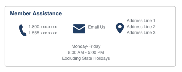
我正在尝试使用 Flexbox 创建看起来像这样的东西,但我遇到了困难。见图片示例:
我尝试过使用 float 来做这件事,但我认为这太具有挑战性了。所以我正在玩 flexbox。
我还使用我的 css 来传递图像。
.flex-container {
  display: flex;
  justify-content: center;
  background-color: DodgerBlue;
}

.flex-container>div {
  border: 1px solid #fff;
  width: 300px;
  justify-content: space-around;
  background-color: #f1f1f1;
  margin: 10px;
  padding: 20px;
  font-size: 30px;
}

.row {
  display: flex;
  justify-content: center;
}

.row_cell {
  flex: 1
}

.phoneimg {
  display: flex;
  background-image: url(%image(MS_HR_MR_PHONE_FL));
  background-repeat: no-repeat;
  content: "";
  background-color: rgba(255, 255, 255, 0.0);
  background-size: 55px 90px;
  */ width: 55px;
  height: 90px;
}
<div class="flex-container">
<div>
<div class="phoneimg">
<div>column1</div>
</div>
</div>
<div>
<div class="phoneimg">
<div>column2</div>
</div>
</div>
<div>
<div class="phoneimg">
<div>column3</div>
</div>
</div>
<div class="row">
<div class="rowcell">row</div>
</div>
</div>我期待看到列,但所有内容都是垂直堆叠的。
最佳答案
您可以通过 flex 的分层方法实现这一点。首先在两行的列方向使用 flex,然后在第一行,您可以按照您的方式在行方向使用 flex。
<!doctype html>
<html>

<head>
  <meta charset="UTF-8">
  <title>Untitled Document</title>
  <style>
    .parent-container {
      background-color: DodgerBlue;
      display: flex;
      flex-direction: column;
      justify-content: center;
    }

    .flex-container {
      display: flex;
      justify-content: center;
    }

    .flex-container>div {
      border: 1px solid #fff;
      width: 300px;
      justify-content: space-around;
      background-color: #f1f1f1;
      margin: 10px;
      padding: 20px;
      font-size: 30px;
    }

    .row {
      display: flex;
      justify-content: center;
      border: 1px solid #fff;
      background-color: #f1f1f1;
      margin: 10px;
      padding: 20px;
      font-size: 30px;
    }

    .row_cell {
      flex: 1
    }

    .phoneimg {
      display: flex;
      background-image: url(%image(MS_HR_MR_PHONE_FL));
      background-repeat: no-repeat;
      content: "";
      background-color: rgba(255, 255, 255, 0.0);
      background-size: 55px 90px;
      */ width: 55px;
      height: 90px;
    }
  </style>
</head>

<body>
  <div class="parent-container">
    <div class="flex-container">
      <div>
        <div class="phoneimg">
          <div>column1</div>
        </div>
      </div>
      <div>
        <div class="phoneimg">
          <div>column2</div>
        </div>
      </div>
      <div>
        <div class="phoneimg">
          <div>column3</div>
        </div>
      </div>
    </div>
    <div class="row">
      <div class="rowcell">row</div>
    </div>
  </div>
</body>

</html>
关于html - 包含文本和图像时的 Flexbox 格式问题,我们在Stack Overflow上找到一个类似的问题: https://stackoverflow.com/questions/56437350/