我有一个 3d 按钮,我想在点击时模拟点击的压力。我使用 :active 隐藏一个级别(完整按钮)并显示另一个级别(按下按钮),只是它不是一个流畅的动画。我想要一个流畅的动画。
最佳答案
我整理了一个 codepen 示例和其中一个可能的答案 here .
它很粗糙,但你可以很容易地改进它。动画的速度可以在 css 中的 transition 属性中进行调整,时间越长,移动速度越慢。第一个圆圈提供背景和一些透视幻觉,但您也可以设计自定义路径。
顺便说一下,在发布问题时,您可能需要考虑使用 codepen 或其他替代方案来提供工作示例。这是遵守 guidelines 的简单方法.
评论后编辑:
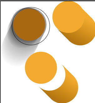
这是我所想的更详细的示例,试图更接近您的示例。如果您对 svg 和 css 很认真,我希望这个答案对您有用,而不是为您的问题提供一个简单的协议(protocol)。我正在学习自己。在这方面有几点:
您似乎是使用编辑器创建了
svg代码。这没什么不对,但它使其他任务变得更加困难。我使用编辑器从头开始创建了这个示例。可能正因为如此,您在开始时有一个改变坐标系的 viewBox。我保留了它,但是,据我所知,在这种情况下它没有任何用处。
示例中的阴影是一个椭圆数组。这是创建自定义颜色渐变的便捷方式,但如果您正在编辑它,它会很麻烦。我已经用线性渐变替换了它。我的答案中的动画技术也可以与原始渐变一起使用。
保存时,您可能使用了设置
Save text as paths或类似的设置。文本BIOGRAFIA不是实际文本,之后很难编辑(假设您想将其翻译成其他语言)。
您最初的问题是关于平稳过渡。如果你想模拟按钮的按下,你需要移动圆柱体和灯罩,而不是让它们出现/消失。为了营造按钮被按下的错觉,我设置了以下元素:
带有圆圈和按钮路径的复合对象 (id
cyl)。这意味着按钮的顶部具有不同的类(darker)并且可以单独更改。顺便说一下,该路径包含一个类似于您使用的渐变填充 (idSVGID_1_mp)。为阴影 (id
shadeShape) 填充线性渐变的路径。标题中的两个
clipPath元素,用于创建按钮或阴影的一部分正在消失的错觉。如您所见,clip-path声明位于父级g元素的路径之外,如下所示:
    <g clip-path='url(#cyl2)'>
      <use xlink:href="#cyl" id="butanim" x="100" y="150" />
    </g>
使用此设置,我们可以为 butanim 元素设置动画并保持 clip-path 固定。
同样重要的是要注意,要使阴影与按钮同时移动,两者必须在同一元素 (id banim) 内。这也意味着动画也将通过插入阴影来触发。我找不到解决此限制的方法。这两个动画都由 --button-press-time CSS 变量链接在 css 部分的开头。
我在准备这个例子的时候学到了其他有趣的细节,但我认为你最好修改一下这个例子。也可以找here .
:root{
  --button-press-time: 0.4s
}

#butanim{
  transition: transform var(--button-press-time, 0.2s) ease;
  stroke: #000000;
  fill: url(#SVGID_1_mp);
}

#shade{
  fill: url(#shadeGradient);
  transition: transform var(--button-press-time, 0.2s) ease;
}

#banim:active #butanim{
  transform: translate(42.4px, 42.4px);
}

#banim:active #shade{
  transform: translate(34.2px, -94.6px);
}

#btext{
  fill: #FF8B0D;
}

.darker{
  fill: #f4971a;
  stroke: none;
}
.mybutton{
  stroke: none;
}

.outline{
  fill: none;
  stroke: #000;
  stroke-width: 2;
}
<html>
<head>
</head>
<body>
<div >Push the button</div>
<svg class="svgfig" version="1.1" id="Livello_1" xmlns="http://www.w3.org/2000/svg" xmlns:xlink="http://www.w3.org/1999/xlink" x="0px" y="0px" viewBox="0 0 309 330" style="enable-background:new 0 0 309 330;" xml:space="preserve" width="90" height="150">
<defs>
<linearGradient id="SVGID_1_mp" x1="0%" y1="0%" x2="100%" y2="0%">
<stop offset="0%" stop-color="#F4971A" />
<stop offset="100%" stop-color="#A76101" />
</linearGradient>
<linearGradient id="shadeGradient" x1="0%" y1="100%" x2="0%" y2="0%">
<stop offset="50%" stop-color="#000" stop-opacity="0.4" />
<stop offset="100%" stop-color="#000" stop-opacity="0.1" />
</linearGradient>
<clipPath id="shadePath">
<path d="M -50 0 a 50 50 0 0 0 100 0 l 10 -90 a 60 60 0 0 0 -110 0 Z" transform="translate(142.4 192.4) rotate(200)" />
</clipPath>
<path d="M -50 0 a 50 50 0 0 0 100 0 l 10 -90 a 60 60 0 0 0 -110 0 Z" transform="translate(142.4 192.4) rotate(200)" id="shadeShape"/>
<g id="cyl">
<path d="M -50 0 a 50 50 0 0 0 100 0 l 0 -60 a 50 50 0 0 0 -100 0 Z" transform="rotate(135)" class="mybutton" />
<circle x="0" y="0" r="50" class="darker" />
</g>
<clipPath id="cyl2"> <path d="M -50 0 a 50 50 0 0 0 100 0 l 0 -60 a 50 50 0 0 0 -100 0 Z" transform="translate(100 150) rotate(135)" />
</clipPath>
</defs>
<circle class="outline" cx="142.2" cy="192.2" r="60" />
<g id="banim">
<g clip-path='url(#shadePath)'>
<use xlink:href="#shadeShape" id="shade" />
</g>
<g clip-path='url(#cyl2)'>
<use xlink:href="#cyl" id="butanim" x="100" y="150" />
</g>
</g>
<text id='btext' x="161" y="80" font-size="24" font-family="sans-serif" font-weight="700">BIOGRAFIA</text>
</svg>
</body>
</html>关于css - svg 中的 3d 按钮动画,我们在Stack Overflow上找到一个类似的问题: https://stackoverflow.com/questions/57196103/