我在垂直和水平居中的 div 中有四个图像。当屏幕尺寸允许时,我希望这些图像位于适合我的 div 的同一行上。如果屏幕大小调整(或在智能手机上),我希望前两个在一行,另外两个在第二行。
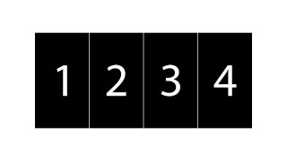
宽屏幕上的行为应该是这样的:
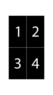
在紧凑的屏幕上变成这样:
我不知道怎么得到这个...
我的 html:
<div class="wrapper">
    <img src="img1.png" class="img-responsive" alt="man1">
    <img src="img2.png" class="img-responsive" alt="man2">
    <img src="img3.png" class="img-responsive" alt="man3">
    <img src="img4.png" class="img-responsive" alt="man4">
</div>
和CSS:
html, body {
    height: 100%;
    width: 100%;
    margin: 0;
    padding: 0;
}

.wrapper {
    margin: auto;
    position: absolute;
    top: 0;
    left: 0;
    bottom: 0;
    right: 0;
    width: 80%;
    height: 80%;
    text-align: center;
}

.img-responsive {
    max-height: 100%;
    width: auto;
}
最佳答案
我想你可以做这么简单的事情:
@media only screen and (min-width: 768px) {
.wrapper img {position:relative; float:left; width:25%; height: auto}
}

@media only screen and (max-width: 767px) {
.wrapper img {position:relative; float:left; width:50%; height: auto}
}
第一部分说:当屏幕尺寸超过 768px 时,使每个图像的宽度为包含 div 的 25%,因此可以并排显示 4 个图像。
第二部分说:当屏幕尺寸小于 767px 时,使每个图像的宽度为包含 div 的 50%,因此 2 个图像将并排显示。
断点显然会根据您的喜好而改变。我在没有 .img-responsive 类的情况下定位了您的图像,但如果您愿意,可以将 .wrapper img 替换为 .img-responsive。
关于html - 多个响应图像,我们在Stack Overflow上找到一个类似的问题: https://stackoverflow.com/questions/24601349/