我正在尝试设计如下图所示的菜单

这是一个响应式菜单,在较小的屏幕上应该看起来像那个菜单。
我现在面临的问题很少。
- 我必须在两个菜单之间添加一个边框,如下图所示,并将子菜单保持在距主菜单基线约 40 像素的位置。当我将底部边距添加到 ul li 时,子菜单会显示,但当我尝试将指针移到它上面时会消失。
我希望子菜单显示在父菜单的中央,即使子菜单的宽度大于父菜单的宽度,我试过了但没能完美。
响应式版本

  /*Menu*/
    .nav-center
    {
        text-align:center;
    }
    .menu-link {
        display: none;
        float: right;
        text-decoration: none;
        padding: 19px 10px;
    }
    .menu {
        max-width: 60em;
        -webkit-transition: all 0.3s ease-out;
        -moz-transition: all 0.3s ease-out;
        -ms-transition: all 0.3s ease-out;
        -o-transition: all 0.3s ease-out;
        transition: all 0.3s ease-out;
    }
    .menu ul {
        padding: 0px;
        margin: 0px;
        list-style: none;
        position: relative;
        display: inline-table;
    }
    .menu > li > ul.sub-menu {
        min-width: 10em;
        padding: 4px 0;
        background-color: #f4f4f4;
        border: 1px solid #CCC;
        border: 1px solid rgba(0, 0, 0, 0.2);
        -webkit-border-radius: 5px;
        -moz-border-radius: 5px;
        border-radius: 5px;
        -webkit-box-shadow: 0 5px 10px rgba(0, 0, 0, 0.2);
        -moz-box-shadow: 0 5px 10px rgba(0, 0, 0, 0.2);
        box-shadow: 0 5px 10px rgba(0, 0, 0, 0.2);
        -webkit-background-clip: padding-box;
        -moz-background-clip: padding;
        background-clip: padding-box;
    }
    .menu ul:after {
        content: ""; clear: both; display: block;
    }
    .menu ul li {
        padding: 0px;
        border-right:1px solid #053A7D;
    }
    .menu > ul > li {
        display: inline-block;

    }
    .menu ul li a {
        display: block;
        text-decoration: none;
        color: #053A7D;
        font-size: .9em;
    }
    .menu ul li > a {
        padding: 5px 20px;
    }
    .menu ul ul {
        display: none;
        position: absolute;
        top:100%;
        min-width: 160px;
        border-top: 2px solid #053A7D;
        /*background-color: #f4f4f4;
    border: 1px solid rgba(0, 0, 0, 0.2);
        -webkit-box-shadow: 0 5px 10px rgba(0, 0, 0, 0.2);
        -moz-box-shadow: 0 5px 10px rgba(0, 0, 0, 0.2);
        box-shadow: 0 5px 10px rgba(0, 0, 0, 0.2);
    */
    }
    .menu ul li:hover > ul {
        display: block;
    }
    .menu ul ul > li {
        position: relative;
    }
    .menu ul ul > li a {
        padding: 5px 2px 5px 2px;
        height: auto;
        background-color: #fff;
        -webkit-transition: background-color 0.2s ease-out;
        -moz-transition: background-color 0.2s ease-out;
        -ms-transition: background-color 0.2s ease-out;
        -o-transition: background-color 0.2s ease-out;
        transition: background-color 0.2s ease-out;
    }
    .menu ul ul > li a:hover {
        /*background-color: #AE5C10;
        background-color: rgba(174, 92,16, 0.9);
        color: #fff;
    */
    }
    .menu ul ul ul {
        position: absolute;
        left: 100%;
        top:0;
    }


    @media screen and (max-width: 768px) {

        a.menu-link {
            display: block;
            color: #fff;
            background-color: #AE5C10;
            background-color: rgba(174, 92,16, 0.9);
        }
        .menu {
            clear: both;
            min-width: inherit;
            float: none;
        }
        .menu, .menu > ul ul {
            overflow: hidden;
            max-height: 0;
            background-color: #f1f1f1;
        }
        .menu > li > ul.sub-menu {
        padding: 0px;
        border: none;
        -webkit-border-radius: 0px;
        -moz-border-radius: 0px;
        border-radius: 0px;
        -webkit-box-shadow: none;
        -moz-box-shadow: none;
        box-shadow: none;
        -webkit-background-clip: padding-box;
        -moz-background-clip: padding;
        background-clip: padding-box;
        }
        .menu.active, .menu > ul ul.active {
            max-height: 55em;
        }
        .menu ul {
            display: inline;
        }
        .menu > ul {
            border-top: 1px solid #808080;
        }
        .menu li, .menu > ul > li {
            display: block;
        }
        .menu li a {
            color: #000;
            display: block;
            padding: 0.8em;
            border-bottom: 1px solid #808080;
            position: relative;
        }
        .menu li.has-submenu > a:after {
            content: '+';
            position: absolute;
            top: 0;
            right: 0;
            display: block;
            font-size: 1.5em;
            padding: 0.55em 0.5em;
        }
        .menu li.has-submenu > a.active:after {
            content: "-";
        }
        .menu ul ul > li a {
            background-color: #e4e4e4;
            height:58px;
            padding: 19px 18px 19px 30px;
        }
        .menu ul ul, .menu ul ul ul {
            display: inherit;
            position: relative;
            left: auto; top:auto;
            box-shadow: none;
            border:none;
        }
    }
    /*Menu End*/
我已经设置了 fiddle 示例,非常感谢这方面的帮助。
更新:为避免混淆,我正在上传另一张图片,该图片以红色显示子菜单位置的指南
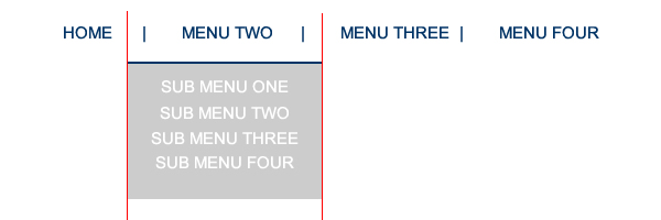
最佳答案
这是我对这个导航菜单的看法:http://jsfiddle.net/bG46Z/ .我在 CSS 代码中添加了一些注释,用于处理链接之间的垂直线和子菜单的水平居中。
对于此预览,请使用 Firefox。 WebKit 浏览器也可以工作,但我在更改视口(viewport)大小时遇到异常(可能是错误)。也就是说,当屏幕宽度较小(低于 600 像素)并调整其大小以显示完整菜单,然后将其调整回更小的宽度时,悬停菜单“按钮”将不会显示菜单。它在 Firefox 中运行良好,所以我认为这只是 WebKit 浏览器中的一个错误。要克服后一种异常,您只需添加一些 jQuery 代码即可。
HTML:
<div id = "menuContainer">
    <p>Menu</p>
    <ul>
        <li><a href = "#">Home</a></li>
        <li><a href = "#">Menu Two</a>
            <ul>
                <li><a href = "#">Sub Menu One</a></li>
                <li><a href = "#">Sub Menu Two</a></li>
                <li><a href = "#">Sub Menu Three</a></li>
                <li><a href = "#">Sub Menu Four</a></li>
            </ul>
        </li>
        <li><a href = "#">Menu Three</a></li>
        <li><a href = "#">Menu Four</a></li>
    </ul>
</div>
<p>Sample paragraph</p>
CSS:
/*
    a mini-reset to eliminate default formatting
    applied by the browser
*/

* {
    margin: 0;
    padding: 0;
}

ul {
    list-style-type: none;
}

body {
    padding: 10px;
}

#menuContainer > p {
    display: none;
}

/*
    the main ul is displayed as a table.  This makes
    it shrinkwrap around its children while remaining
    a block element.  This allows to apply margin: 0 auto
    to center it.  Additionally, no clearfix is required
    if elements are floated in the table element.
*/

#menuContainer > ul {
    display: table;
    margin: 0 auto;
}

#menuContainer > ul > li {
    float: left;
    padding: 5px 0;
    position: relative;
}

#menuContainer > ul > li:hover > a {
    color: #aaa;
}

/*
    The links are displayed as blocks, which allows
    changing their width and height indirectly through
    paddings, line-heights, etc.
*/

#menuContainer li a {
    display: block;
    font: bold 15px/1 Sans-Serif;
    text-transform: uppercase;
    text-decoration: none;
    color: #002B81;
    text-align: center;
    padding: 0 20px;
    white-space: nowrap;
}

/*
    The border is added on the left for the links that are
    children of the list item that follows another list
    item.  In other words, the border is set for every
    link that is a child of every list item, except the
    first list item.
*/

#menuContainer > ul > li + li > a {
    border-left: 2px solid #002B81;
}

/*
    This chunk of code does the horizontal centering of the
    nested list under its list item parent.  The left of 50%
    moves the left edge of the list to the center of its li
    parent; and, translateX() of -50% moves the nested list
    to the left by 50% of its width.
*/

#menuContainer ul ul {
    position: absolute;
    left: 50%;
    top: 100%;
    -webkit-transform: translateX(-50%);
    transform: translateX(-50%);
    padding: 20px 0 30px 0;
    display: none;
}

/*
    This is a "trick" to apply the background to
    only a part of the nested ul.  In reality the
    ul is immediately below its li parent, but this
    makes it look as if it is farther down.
*/

#menuContainer ul ul:before {
    content: "";
    position: absolute;
    top: 20px;
    left: 0;
    right: 0;
    bottom: 0;
    background-color: #ccc;
    z-index: -1;
}

#menuContainer ul ul > li:first-child {
    border-top: 2px solid #002B81;
    padding-top: 10px;
}

#menuContainer ul ul a {
    padding: 0 10px;
    color: #fafafa;
    line-height: 2;
}

#menuContainer ul ul a:hover {
    color: #ccc;
    background-color: #fafafa
}

#menuContainer > ul > li:hover > ul {
    display: block;
}

/*
    media queries code that makes the menu "button"
    visible, reformats the menus for more narrow display,
    and creates the appropriate dropdown effect.
*/

@media screen and (max-width: 600px) {
    #menuContainer > p {
        cursor: pointer;
        display: table;
        margin: 0 auto;
        padding: 5px 10px;
        font: bold 15px/1 Sans-Serif;
        text-transform: uppercase;
        color: #fafafa;
        background-color: #002B81;
    }

    #menuContainer > ul {
        padding: 10px 0 30px 0;
        position: absolute;
        display: none;
        left: 50%;
        -webkit-transform: translateX(-50%);
        transform: translateX(-50%);
    }

    #menuContainer > ul:before {
        content: "";
        position: absolute;
        top: 10px;
        left: 0;
        right: 0;
        bottom: 0;
        background-color: #ccc;
        z-index: -1;
    }

    #menuContainer > ul > li {
        float: none;
    }

    #menuContainer > ul > li:first-child {
        border-top: 2px solid #002b81;
    }

    #menuContainer > ul > li {
        padding: 5px 0;
    }

    #menuContainer > ul > li > a {
        font-size: 14px;
    }

    #menuContainer > ul > li:hover > a {
        color: #585858;
    }

    #menuContainer > ul > li + li > a {
        border: 0;
    }

    #menuContainer ul ul {
        position: static;
        display: block;
        border-top: 0;
        padding: 0;
        -webkit-transform: none;
        transform: none;
        margin-top: 5px;
    }

    #menuContainer ul ul > li:first-child {
        border: 0;
        padding-top: 0;
    }

    #menuContainer ul ul a {
        font-size: 12px;
    }

    #menuContainer:hover > p:hover + ul,
    #menuContainer:hover ul:hover {
        display: block;
    }
}
干杯。
关于javascript - CSS 菜单格式问题,我们在Stack Overflow上找到一个类似的问题: https://stackoverflow.com/questions/24812010/