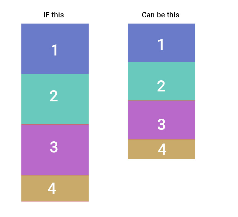
我有一个 Main div position absolute, top:0, bottom:0 width:500px;其中有 4 个 div。见附图。如果我调整窗口高度,我希望 Main div 的内部框响应。 1、2 和 3 的高度固定为 100 像素,第 4 个框是响应式的。
最佳答案
(感谢 nashcheez 创建代码)我建议使用 flex:
.parent {
  top: 0;
  bottom: 0;
  width: 500px;
  height: 100%;
  background-color: red;
  display: flex;
  flex-direction: column;
  position: absolute;
  display: -webkit-flex;
}

.child {
  width: 100%;
  height: 100px;
}

.last{
  background-color: green;
  flex-grow: 1;
}
<div class="parent">
<div style="background-color: yellow;" class="child">
</div>
<div style="background-color: blue;" class="child">
</div>
<div style="background-color: purple;" class="child">
</div>
<div style="background-color: green;" class="last">
</div>
</div>关于html - 我怎样才能在不同高度的 div 中垂直放置 4 个盒子?,我们在Stack Overflow上找到一个类似的问题: https://stackoverflow.com/questions/41851463/