所以我有这些比手机宽度 (412px) 还宽的 bootstrap div。为什么? 我该怎么做才能使 div 与手机的宽度一样宽?
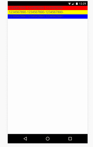
    <div class="row">
    <div class="col-lg-3 col-md-4 col-sm-6 col-xs-12" style="background: red">
        1234567890-1234567890-1234567890-
    </div>
    <div class="col-lg-3 col-md-4 col-sm-6 col-xs-12" style="background: yellow">
        1234567890-1234567890-1234567890-
    </div>
    <div class="col-lg-3 col-md-4 col-sm-6 col-xs-12" style="background: blue">
        1234567890-1234567890-1234567890-
    </div>
    </div>
最佳答案
您缺少类 container 作为 bootstrap 的父级,因此请使用:
<link href="https://maxcdn.bootstrapcdn.com/bootstrap/3.3.7/css/bootstrap.min.css" rel="stylesheet"/>
<div class="container">
  <div class="row">
    <div class="col-lg-3 col-md-4 col-sm-6 col-xs-12" style="background: red">
      1234567890-1234567890-1234567890-
    </div>
    <div class="col-lg-3 col-md-4 col-sm-6 col-xs-12" style="background: yellow">
      1234567890-1234567890-1234567890-
    </div>
    <div class="col-lg-3 col-md-4 col-sm-6 col-xs-12" style="background: blue">
      1234567890-1234567890-1234567890-
    </div>
  </div>
</div>
编辑
根据您的链接,问题是 body 中的 min-width:600px 您在 CSS 文件中的位置
关于html - Bootstrap div 比手机宽度宽,我们在Stack Overflow上找到一个类似的问题: https://stackoverflow.com/questions/43546645/