我试图找到这个解决方案,但我只能找到在图像上应用滤镜作为 css 背景图像的解决方案。
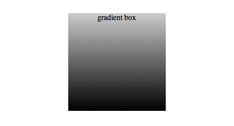
我的 HTML 中有一行包含 3 张大小相等的图像。 我试图复制的效果是对所有提供渐变不透明度的照片的“过滤器”。这个滤镜的底部完全是黑色的,然后开始变得透明,直到到达顶部。 (有点像这样:http://www.webdesignerwall.com/wp-content/uploads/2010/04/css-gradient-box.gif 白色顶部是透明的)
考虑到图像是 100% 响应的,并且每次我们更改浏览器大小时图像都会发生变化,我该怎么做。
PS:渐变代码不是问题,我可以做到,我找不到解决方案的问题是如何在始终遵循图像大小的每个图像上应用“DIV”或其他东西,不不管它的高度和宽度。
这是我的 HTML:
<section class="home-page-gallery">
        <div class="container-fluid">
          <div class="row">

          <!-- FIRST IMAGE -->
            <div class="col-xs-12 col-sm-4 no-padding yellow-bg">
                <div class="gallery-item">
                  <img src="images/photo01.png" alt="">
                </div>
            </div>

          <!-- SECOND IMAGE -->
            <div class="col-xs-12 col-sm-4 no-padding blue-bg">
              <div class="gallery-item">
                  <img src="images/photo02.png" alt="">
                </div>
            </div>

          <!-- THIRD IMAGE -->
            <div class="col-xs-12 col-sm-4 no-padding pink-bg">
              <div class="gallery-item">
                  <img src="images/photo03.png" alt="">
                </div>
            </div>

          </div><!-- ./ row -->
        </div><!-- ./ container-fluid -->
      </section>
和CSS:
.gallery-item{
  width:100%;
}

.gallery-item img{
  width:100%;
  height:auto;
}
我已经尝试用另一个 div 包裹每个图像,给出一个 position: relative 和一个 z-index 试图让这个 div 停留在图像上,但它没有用
非常感谢!
最佳答案
像这样使用伪元素:
.gallery-item {
  width: 100%;
  position:relative;
}
.gallery-item:after {
 content:"";
 position:absolute;
 top:0;
 left:0;
 right:0;
 bottom:0;
 background:linear-gradient(to top,red 20%,transparent 80%);
}
.gallery-item img {
  display:block;
  width: 100%;
  height: auto;
}
<link href="https://maxcdn.bootstrapcdn.com/bootstrap/3.3.7/css/bootstrap.min.css" rel="stylesheet" integrity="sha384-BVYiiSIFeK1dGmJRAkycuHAHRg32OmUcww7on3RYdg4Va+PmSTsz/K68vbdEjh4u" crossorigin="anonymous">
<section class="home-page-gallery">
<div class="container-fluid">
<div class="row">
<!-- FIRST IMAGE -->
<div class="col-xs-12 col-sm-4 no-padding yellow-bg">
<div class="gallery-item">
<img src="https://lorempixel.com/400/200/" alt="">
</div>
</div>
<!-- SECOND IMAGE -->
<div class="col-xs-12 col-sm-4 no-padding blue-bg">
<div class="gallery-item">
<img src="https://lorempixel.com/400/200/" alt="">
</div>
</div>
<!-- THIRD IMAGE -->
<div class="col-xs-12 col-sm-4 no-padding pink-bg">
<div class="gallery-item">
<img src="https://lorempixel.com/400/200/" alt="">
</div>
</div>
</div>
<!-- ./ row -->
</div>
<!-- ./ container-fluid -->
</section>关于html - 在 html 上的图像上应用不透明度过滤器,我们在Stack Overflow上找到一个类似的问题: https://stackoverflow.com/questions/48998728/