如果我们从这种 HTML 元素设置开始:
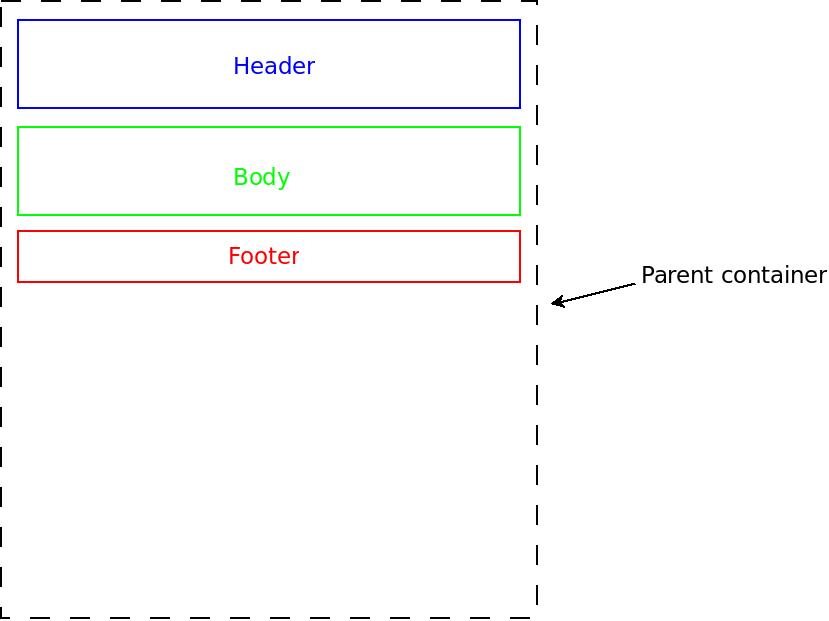
...然后我们使用 CSS flexbox 并将 flex-grow 属性应用于“body”元素,我们得到:
非常棒的是,它的行为可以完全在 CSS 中完成,而无需任何 JavaScript。
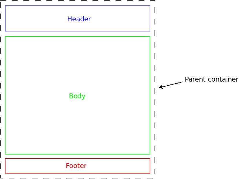
但是,假设我们希望父容器元素具有固定高度,并且子元素(即页眉、正文和页脚)不应溢出父元素。
假设页眉和页脚元素内容是固定的,但正文内容是动态的(服务器端或客户端,这无关紧要)并且当内容太长时我们希望正文元素具有垂直滚动条大,像这样:
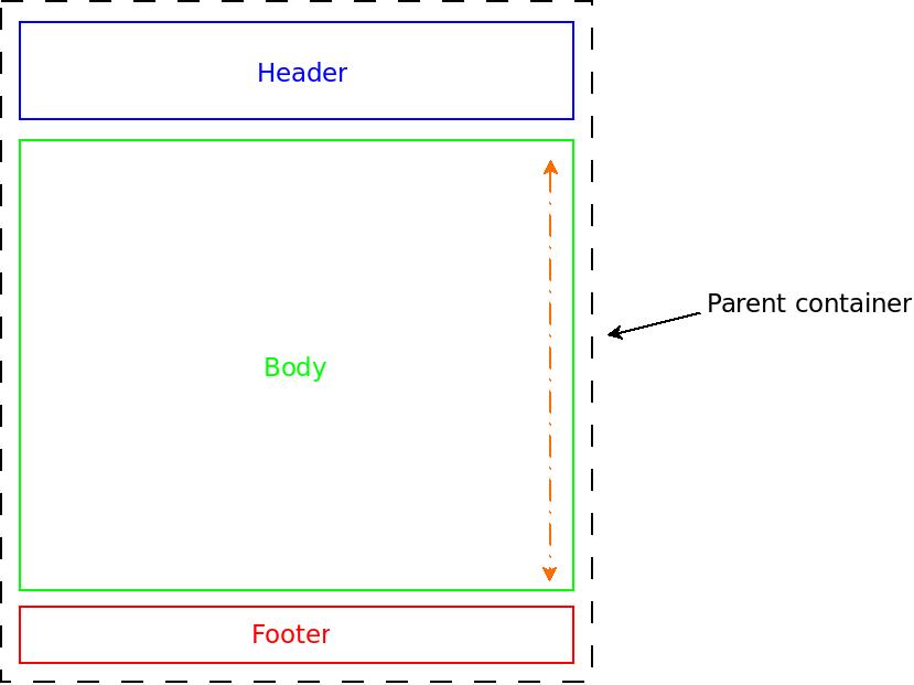
但是,我无法找到一种方法来完全在 CSS 中实现该行为(即不使用 JavaScript)并且不为所有子元素指定固定高度(不可取)。
简单地在父级上使用固定高度的 flex-grow 属性,结果是这样的(当正文内容变得太大时):
有没有办法用纯 CSS 实现?
如果不是,我们认为扩展 flexbox 标准来封装这种行为是否值得?
编辑 1
所以我的用例与我发布的相似,但差异足以隐藏问题,因此引起了一些人的注意,为什么我一开始就遇到了问题。
扩展 LGSon 的回答,这是我的用例:
html, body {
  margin: 0;
}
body {
  display: flex;  /*  IE 11/10 min-height bug fix - or an extra wrapper in the markup  */
}
.wrapper {
  display: flex;
  flex-direction: column;
  height: 100vh;
  width: 100%;
}
.body {
  flex: 1;
}

.content {
  overflow: auto;
}


/* below CSS is just for the extra styling */
.wrapper {
  height: calc(100vh - 44px);   /*  2*2px border + 2*10px margin  */
  width: calc(100% - 44px);     /*  + 2*10px padding = 44px       */
  border: 2px dashed black;
  margin: 10px;
  padding: 10px;
}
.wrapper > div {
  padding: 10px;
}
.header {
  border: 2px solid blue;
  margin-bottom: 10px;
}
.body {
  border: 2px solid green;
}
.footer {
  border: 2px solid red;
  margin-top: 10px;
}
<div class="wrapper">
<div class="header">
Header<br>
</div>
<div class="body">
<h1>
Hello world!
</h1>
<div class="content">
Content<br> Content<br>
Content<br> Content<br>
Content<br> Content<br>
Content<br> Content<br>
Content<br> Content<br>
Content<br> Content<br>
Content<br> Content<br>
</div>
</div>
<div class="footer">
Footer<br>
</div>
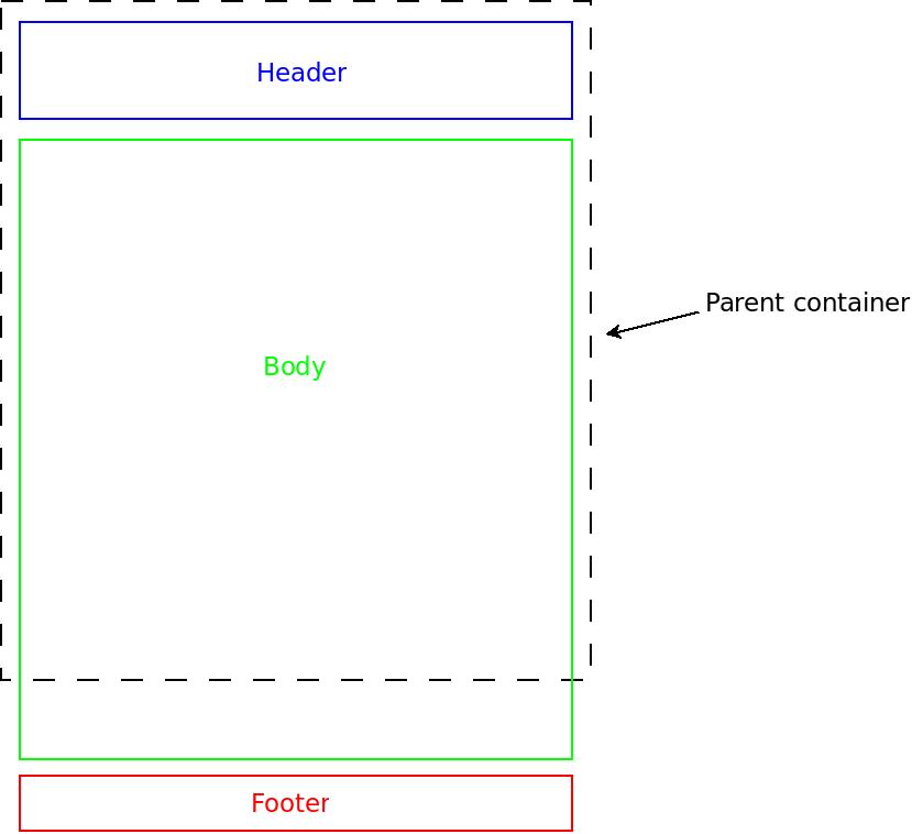
</div>所以我实际上在层次结构中有另一个级别,并且我的 overflow 属性太深了一个级别。
对我来说,让 overflow 在我拥有它的地方似乎是合乎逻辑的,但是根据您的答案/示例,甚至是我的用例,将其提升一个级别,使其工作(计数器- 直觉上,在我看来)。
我能理解它为什么起作用,但我原以为滚动条会跨越整个 body 元素,而不仅仅是内容部分。
对于无意的误导,我们深表歉意。
谢谢大家
编辑2
我将奖励第一个修改答案(或创建新答案)并包含我的澄清(在第一次编辑中)并提供正确答案的人。
最佳答案
这个使用 flexbox 的示例可以满足您的要求,子项没有固定高度。
完全动态的 .header 和 .footer,以及一个会在需要时滚动的 .body,所以它都在其父级中, .wrapper.
请注意,关于滚动,您为希望滚动的元素提供溢出,而不是可能导致溢出的元素。
html, body {
  margin: 0;
}
body {
  display: flex;  /*  IE 11/10 min-height bug fix - or an extra wrapper in the markup  */
}
.wrapper {
  display: flex;
  flex-direction: column;
  height: 100vh;
  width: 100%;
}
.body {
  flex: 1;
  overflow: auto;
}


/* below CSS is just for the extra styling */
.wrapper {
  height: calc(100vh - 44px);   /*  2*2px border + 2*10px margin  */
  width: calc(100% - 44px);     /*  + 2*10px padding = 44px       */
  border: 2px dashed black;
  margin: 10px;
  padding: 10px;
}
.wrapper > div {
  padding: 10px;
}
.header {
  border: 2px solid blue;
  margin-bottom: 10px;
}
.body {
  border: 2px solid green;
}
.footer {
  border: 2px solid red;
  margin-top: 10px;
}
<div class="wrapper">
<div class="header">
Header<br>
</div>
<div class="body">
<h1>
Hello world!
</h1>
<div class="content">
Content<br> Content<br>
Content<br> Content<br>
Content<br> Content<br>
Content<br> Content<br>
Content<br> Content<br>
Content<br> Content<br>
Content<br> Content<br>
</div>
</div>
<div class="footer">
Footer<br>
</div>
</div>当你说整个 body 元素时,如果你指的是实际的 html body,而不是带有 .body 类的元素,然后在 .wrapper 上使用 min-height 并从 .body 中移除溢出。
您可以将溢出设置到 html body 元素,但不需要它,因为它默认滚动
html, body {
  margin: 0;
}
body {
  display: flex;  /*  IE 11/10 min-height bug fix - or an extra wrapper in the markup  */
}
.wrapper {
  display: flex;
  flex-direction: column;
  min-height: 100vh;
  width: 100%;
}
.body {
  flex: 1;
}


/* below CSS is just for the extra styling */
.wrapper {
  min-height: calc(100vh - 44px);   /*  2*2px border + 2*10px margin  */
  width: calc(100% - 44px);     /*  + 2*10px padding = 44px       */
  border: 2px dashed black;
  margin: 10px;
  padding: 10px;
}
.wrapper > div {
  padding: 10px;
}
.header {
  border: 2px solid blue;
  margin-bottom: 10px;
}
.body {
  border: 2px solid green;
}
.footer {
  border: 2px solid red;
  margin-top: 10px;
}
<div class="wrapper">
<div class="header">
Header<br>
</div>
<div class="body">
<h1>
Hello world!
</h1>
<div class="content">
Content<br> Content<br>
Content<br> Content<br>
Content<br> Content<br>
Content<br> Content<br>
Content<br> Content<br>
Content<br> Content<br>
Content<br> Content<br>
</div>
</div>
<div class="footer">
Footer<br>
</div>
</div>关于javascript - 如何在父容器中自动拉伸(stretch)并约束 HTML 子元素?,我们在Stack Overflow上找到一个类似的问题: https://stackoverflow.com/questions/41443909/