<分区>
html - 如何消除所有设备上输入文本和按钮之间的差距?
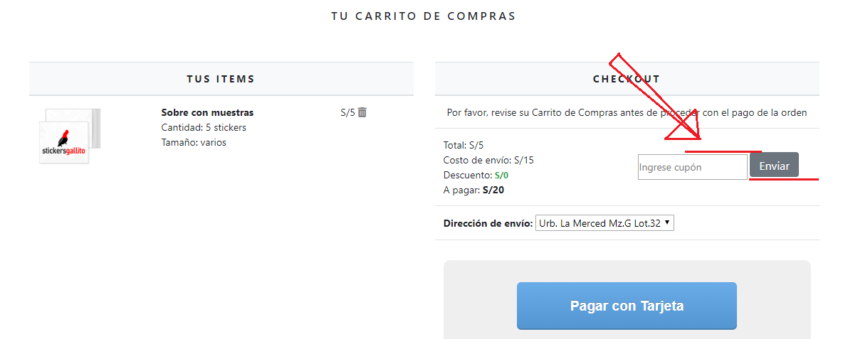
我有一个 输入文本字段 和一个 按钮 彼此相邻。
问题在于这两个元素之间存在间隙。
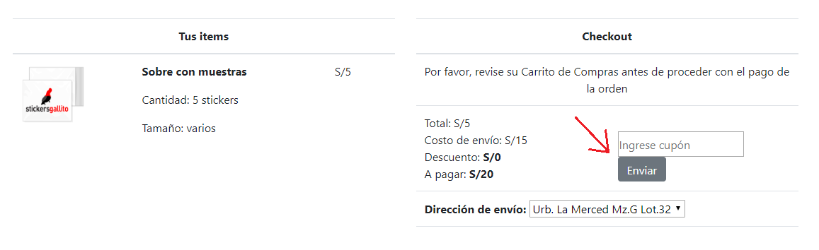
I can fix this by changing the
margin-bottomof the button to5px.
但也许有更聪明的方法来解决这个问题?因为我需要它们在每台设备上都彼此相邻。
有时按钮会向下输入文本。
代码笔:
最佳答案
用 div 包裹 input 和 button 并将其 display 设置为 flex
.flex {
  display: flex;
}

.flex input {
  margin-right: 3px;
}
<link href="https://cdnjs.cloudflare.com/ajax/libs/twitter-bootstrap/4.1.3/css/bootstrap.min.css" rel="stylesheet" />
<div class="container margin-top10 margin-bottom5">
<div class="row">
<div class="col-12 col-sm-12 col-md-12 col-lg-12 text-center">
<h1 class="text-center my_title">
Tu carrito de compras
</h1>
</div>
</div>
<br>
<br>
<div class="row">
<div class="col-12 col-sm-12 col-md-6 col-lg-6 text-center">
<table class="table my_custom_table">
<thead class="my_custom_thead">
<tr>
<th colspan="5">
Tus items
</th>
</tr>
</thead>
<tbody>
<!-- MOSTRAR SAMPLE_ITEMS IN CART_DETAIL -->
<tr>
<td>
<a href="cart_item.product.get_absolute_url"><img src="https://stickers-gallito-uploaded-files.s3.amazonaws.com/sample_images/Artboard_1.png" alt="" class="float-left rounded" width="90" height="90"></a>
</td>
<td class="text-left">
<p class="margin-bottom0"><b>Sobre con muestras</b></p>
<p class="margin-top0 margin-bottom0">Cantidad: 5 stickers</p>
<p class="margin-top0 margin-bottom0">Tamaño: varios</p>
</td>
<td>
<p>S/5
<a href="/carrito_de_compras/full_remove_sample/163/" class="custom_icon"><i class="fas fa-trash-alt custom_icon"></i></a>
</p>
</td>
<td></td>
</tr>
</tbody>
</table>
</div>
<div class="col-12 col-sm-12 col-md-6 col-lg-6 text-center">
<table class="table my_custom_table">
<thead class="my_custom_thead">
<tr>
<th>
Checkout
</th>
</tr>
</thead>
<tboyd>
<tr>
<td>
Por favor, revise su Carrito de Compras antes de proceder con el pago de la orden
</td>
</tr>
<tr>
<td class="text-left">
<div class="row">
<div class="col-6">
Total: S/5<br> Costo de envío: S/15<br> Descuento: <span class="savings"><b>S/0</b></span><br> A pagar: <strong>S/20</strong><br>
</div>
<div class="col-6">
<br>
<div class="flex">
<input type="text" id="user_cupon" style="display: inline-block; height: 36px;" placeholder="Ingrese cupón">
<button type="submit" class="btn btn-secondary" id="cuponButton" style="display: inline-block; height: 35px;">Enviar</button>
</div>
</div>
</div>
</td>
</tr>
<tr>
<td class="text-left">
<b>Dirección de envío:</b>
<select type="text" id="ShippingAddress">
<option value="Urb. La Merced Mz.G Lot.32" selected>
Urb. La Merced Mz.G Lot.32</option>
<option value="">
</option>
</select>
</td>
</tr>
<tr>
<td>
<div class="bg-buttons margin-top3 padding-top6 padding-bottom3">
</div>
</td>
</tr>
</tboyd>
</table>
</div>
</div>
</div>编辑:更新了代码片段以在两者之间添加一些边距
关于html - 如何消除所有设备上输入文本和按钮之间的差距?,我们在Stack Overflow上找到一个类似的问题: https://stackoverflow.com/questions/56577358/